Home › Forums › Explore Media › Pen and Ink › Calligraphy › Tutorial – Copperplate
- This topic has 67 replies, 4 voices, and was last updated 7 years, 3 months ago by
 Cyntada.
-
AuthorPosts
-
September 15, 2016 at 10:37 pm #1251772
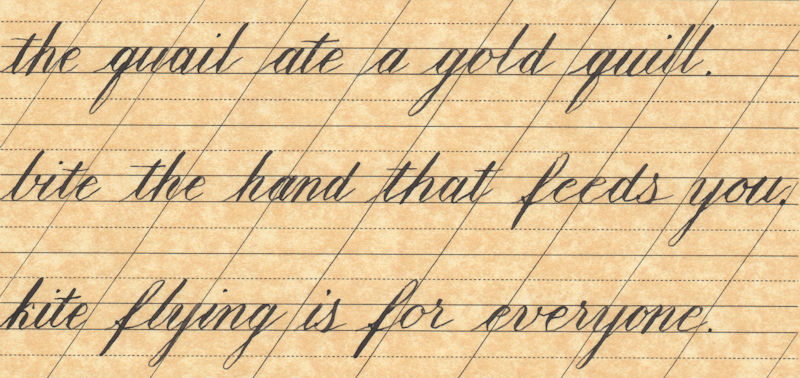
After a few days practice with the straight nib holder, here are four sentences in Copperplate to see if there is an improvement over the oblique nib holder. I have also been trying to improve the roundness and consistency of shape of the letters from lesson 3.
I look forward to your critique:eek: .
Jim
 Reality is the fog that obscures the vision.September 16, 2016 at 3:08 am #1251794
Hi Jim,
The most important thing at this point is how you feel about the change of the holder. You will make quick progress if you feel more confident in your control of the tool.
There is still too much variation in the shapes of the letters and spacing. It seems to me most of it is caused by inconsistent hairlines. A lot of attention is paid to the shaded strokes in Copperplate but the hairlines are just as important and usually the cause of spacing issues.
If you notice the exist hairlines on the very last line, you will see what I mean. Each of these is going in a different direction. Also, the way a-t join in ‘goat’ is off by a big margin.
I know this is not very good news but I guarantee you that this work will pay dividends if you stick with it. One of my favourite masters in Engrosser’s script and Ornamental Penmanship is Earl A. Lupfer. The story goes that he was so bad when he joined the Zanerian School of Penmanship that Charles Zaner, the Principal, offered to refund his fees after seeing his lack of progress after some weeks of work. Luckily, Lupfer refused the refund and hunkered down to work even harder. He eventually rose to become the Principal of the Zanerial College. You can see his ‘before’ and ‘after’ examples here: Earl A. Lupfer – Progress in Script
At this point, I would suggest to focus on getting the hairlines right. You can write the letters shapes without any shading at all and see if that helps. Experiment with speed and see if you can find the sweet spot where you have both control and consistency.
I am right along with you during this journey so please feel free to ask any questions you might have.
– Salman
Those who say it can't be done should get out of the way of those doing it.
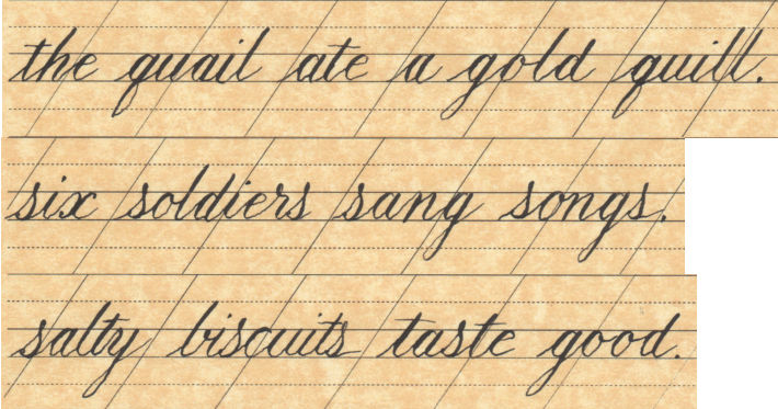
My BlogOctober 1, 2016 at 11:51 pm #1251773Salman, it’s been a long time since I posted any work, but I am still working on the Copperplate and thought I should post something to show I have not given up.
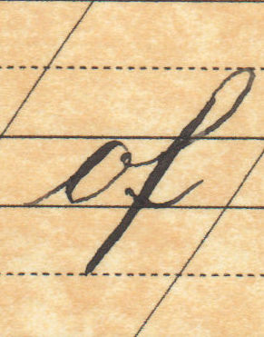
First is three sentences where I’ m working on the hairline entry strokes and also on the new characters from lesson 4. As you can see, I still have room to improve, and some of my round characters still come out looking boxy.
I am also including an inter-character connector question. The word “of.” Since the inter-character connector comes rom the “o” and does not approach the baseline, where does the crossbar stroke start? Please see example.
 Reality is the fog that obscures the vision.October 4, 2016 at 1:03 am #1251795
Hi Jim – it is great that you are still at it. Please don’t feel that there is any hurry or a schedule. I am here to help whenever you need me.
The exit hairline from the ‘o’ should come down to about half the x-height (see my examples of joins earlier in the thread) . This makes for a thin ‘u’ shape that joins the next letter a little higher than normal.
The crossbar of the ‘f’ is not affected by the entry hairline. It is drawn the same way regardless of where the entry hairline starts from.
Regards,
SalmanThose who say it can't be done should get out of the way of those doing it.
My BlogNovember 6, 2016 at 9:29 pm #1251774Salman,
Have been working on the consistency of the letter shapes, and although not perfect, here is my latest work based on all the lower case letters.
Jim
Reality is the fog that obscures the vision.November 8, 2016 at 1:37 pm #1251796Hi Jim – good to see your post.
Your script is fairly consistent except for the ‘s’ and the ‘r’ parts. The right side of the ‘s’ is an upside down ‘c’ – most of the weight i.e. thickness of the stroke, should be in the top half. The letters seems to ‘stand up’ if you put the weight in the lower half.
On the ‘r’ – the shoulder of the second stroke isn’t quite as pointy. the transition from the right moving stroke to the shaded downstroke should be smooth.
Here is a link to a video I made for the group 4 letters some time ago: Group 4 letters.
I hope this helps.
Regards,
SalmanThose who say it can't be done should get out of the way of those doing it.
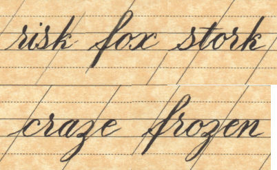
My BlogNovember 11, 2016 at 10:07 pm #1251775Salman, thanks for the link. Your feedback, as usual, was very helpful, and the video was a great reinforcement of what you have said. I have attached my effort at the five words for the lesson 4 assignment.
As always, your feedback is most appreciated.
JimReality is the fog that obscures the vision.November 23, 2016 at 2:42 pm #1251797Jim – sorry for the late reply. I have been ‘away’ from the forum for a bit.
You have done well with the ‘misfit’ letters.
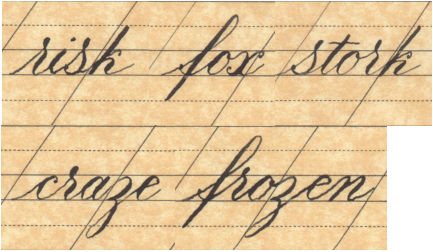
The shaded stroke of the ‘r’ is what many people have problems with but you have done a good job with it. Just make sure you don’t start the shade too early as in the ‘r’ in ‘craze’. The other three are well done.
The ‘s’ in ‘risk’ is ‘standing up’ a bit. The right side of the ‘s’ is an upside down ‘c’ – turn the paper and see how good a ‘c’ it makes. The one in ‘stork’ is much better.
For now, just draw the loop of the ‘f’ with a hairline. You can add the mini-shade later on.
Your exit strokes on the last letters of the words come out at a very shallow angle. The exit stroke should come up at the regular angle even if there is nothing to join after a letter.
Have another go at this group with these in mind.
Salman
Those who say it can't be done should get out of the way of those doing it.
My BlogDecember 6, 2016 at 10:56 pm #1251776Salman,
Here is my second attempt at the five letters of lesson 4.
There is some variation on the downstroke of the letter “z,” but I think the rest is pretty consistent.
Reality is the fog that obscures the vision.December 8, 2016 at 2:07 am #1251798Jim – this example is much improved in terms of letter shapes and consistency.
There is a bit too much space between the ‘z’ and the ‘e’ in frozen but the rest is fairly even .
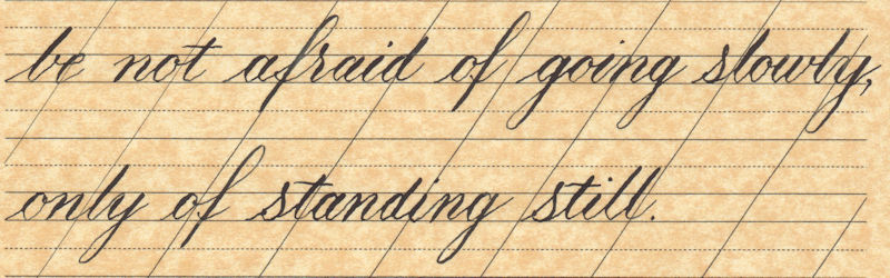
How about doing a whole sentence next as the final exercise for the minuscules:
be not afraid of going slowly, only of standing still
– Salman
Those who say it can't be done should get out of the way of those doing it.
My BlogDecember 13, 2016 at 11:19 pm #1251777Salman,
Here is my go at the final assignment for lesson 4. I noticed that you changed the last word of the first line from “slow” to “slowly” between the first posting of lesson 4 and your most recent e-mail. And of course “slowly” is where my pen went a little wild
 , but here it is anyways.
Hope you like,
JimAs always, comments and critique are welcome.
Reality is the fog that obscures the vision.December 14, 2016 at 12:59 pm #1251799Hi Jim – this is nicely done. I thin you have achieved a fair level of control in the slant and spacing as well as a good understanding of the letter shapes. The shakiness is still there but I am sure it will go away with time and patient practice.
Give me some time to upload the lessons for Majuscules. I have my notes from the workshop but I want do develop them a bit more before presenting them as tutorials here. Given what I have on my plate at the moment, I think it will take me a few weeks to sort that out.
Regards,
SalmanThose who say it can't be done should get out of the way of those doing it.
My BlogDecember 14, 2016 at 9:36 pm #1251778Thanks for the positive review, Salman, and for the heads up on the next lesson. I will continue practising with the lower case letters and complete sentences until the next lesson is posted.
Jim
Reality is the fog that obscures the vision.December 23, 2016 at 7:02 am #1251812Hi Salman and friends
I returned to my journey of learning calligraphy at the beginning of December and was doing ok considering my long break
But one third of the way into the month (minimum of half an hour practise every day) suddenly I cannot get basic strokes correct and yesterday I managed to damage 6 nibs
I am at a loss as to what the problem might be. Any thoughts? I only have one holder and always use brause EF66 nibs so no variables have changed there, is there anything else I should check for?December 23, 2016 at 8:19 am #1251813All this time I thought it must be me but I’m wondering if it could be an external factor now having preservered and increasing my practise time…
-
AuthorPosts
- You must be logged in to reply to this topic.
Register For This Site
A password will be e-mailed to you.
Search