Home › Forums › Explore Media › Pastels › Soft Pastel Learning Center › The Spotlight – June 2014 – The Color Yellow
- This topic has 186 replies, 18 voices, and was last updated 9 years, 9 months ago by
ianos dan.
-
AuthorPosts
-
May 31, 2014 at 9:08 pm #991928
Welcome artists!
[FONT=Verdana]Here is a quick recap of what The Spotlight is all about!
[/FONT]
The Spotlight is an activity thread for pastel artists of all experience levels working from photos chosen by a monthly host. Most months, the host will choose photos from only one subject, putting that subject into “the spotlight,” so to speak! For example, one month the subject will be painting water, another month will spotlight flowers, etc.Some months, rather than spotlight a subject, the focus will be on a challenge of some sort. In those cases, we might have a wider variety of photo references, but “the spotlight” will be on the challenge itself.
Since this is a group activity, we can pool our knowledge and resources, and grow as artists in a fun, “no-pressure” atmosphere.
And, remember, no critiques unless specifically asked for.
The intent is to have fun, try new things, experiment, and perhaps most of all, to see what our friends and colleagues are painting from the same reference material!
Please note: The photos this month were taken by me or are from the Reference Image Library. You have permission to use the photos as reference to create your artwork and to sell them and/or exhibit them. The actual photos still retain the copyright of the photographer. So you cannot copy the photo to your blog, for example, without the permission of the photographer, or digitally alter or reproduce the photo for any purpose other than for your personal use, with the exception of crops, digital alterations and posts of these photos within “The Spotlight” thread.
This month’s Spotlight is on…Yellow!
Earlier this year we put the Spotlight on Black and White. Then last month we celebrated Spring – but my references continued to be in the Black and White mode. So this month I thought we would begin to explore color – starting with the color Yellow!
Not long ago in the Pastel forum, someone commented on having trouble with the color yellow. It is a comment that I have seen more than a few times. More specifically, the questions seem to be about finding the shadow or darker variations of yellow.
So that is what we are going to explore this month in the Spotlight!
Color Basics:I’m going to start with some really basic aspects of color – at least as far as I understand it! Much – if not all – of this material may be familiar to most of you. So feel free to skim over or skip this section on color basics.
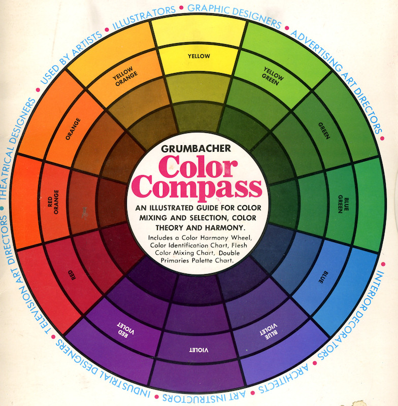
Whenever we discuss color, or color mixing, or the various elements of color, it is a good idea to look at the artist’s color wheel. Of course, since a color wheel is a human invention that tries to approximate the color spectrum, they are not all the same. For our purposes, we will use what I call the traditional color wheel, with red opposite green, yellow opposite violet and blue opposite orange.
Often, when color is discussed, the 3 components of color are mentioned and described. The fact that there are 3 components is one reason that using color is difficult! When trying to pick and choose a color to work with – or when trying to mix a color if we don’t have the exact pastel handy – there are 3 questions to ask to determine what color to use. They are:
What is the hue? The hue is the name of the color on the color wheel, for example: red, yellow, yellow-green, etc.
What is the value? The value is how light or dark the color is. Sometimes referred to as Tone.
What is the intensity? How bright or dull is the color. Often called Chroma.
(Sometimes a 4th component of color is mentioned – temperature. But, for now we will include any discussion of color temperature when we discuss hue.)
As we can see on the color wheel, the color yellow can stretch towards orange on one side and green on the other. So when we consider the hue of a certain yellow, we can ask ourselves – is the color a yellow-orange, or a “straight” yellow, or more of a yellow-green? This will help us define the hue.
The value, as is often discussed, is how light or dark a color is. Not all color wheels are the same in this regard, but the wheel I have shows the colors getting darker as they approach the center of the wheel. Notice that darker versions of yellow are what I would call “greenish-browns.” And as we move around the wheel towards yellow-orange, orange and red, the darker versions of those colors are browns. Folks often get confused about where browns and earth colors are on the color wheel. They are simply darker valued yellows, oranges and reds.
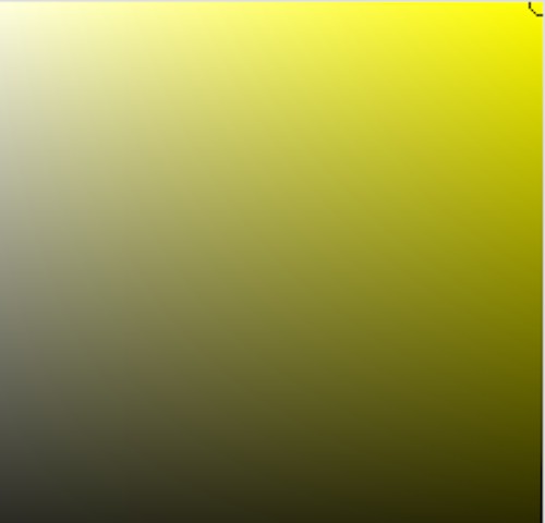
The last component of color is intensity or chroma. Lightening, darkening, or mixing almost anything with a pure yellow will lower its intensity or brightness. The image below is from Photoshop – showing the color yellow and the range of intensities that it can have when “mixed” with white and black. The pure yellow is in the upper right corner – and that is where it is the most intense!
Tints and shades:
Some pastel brands, such as Schmincke, Rembrandt, Blockx and others, sell their pastels in color groups of tints and shades making it a bit easier to use the same hue, but with a change in value and intensity. Tints are created by adding white to the pure color to make lighter versions. Shades are created by adding black to the pure color to make darker versions. Both tints and shades are also less intense than the pure color. Other brands of pastel also sell their colors in groups of differing value and intensity, but may not be pure shades and tints.
Color Temperature:
Color temperature is a way of describing color depending on the perception of whether a color is warm or cool (and how warm or cool). In my opinion, color temperature is an important topic to be familiar with, but it can be a rather vague topic. Because it is vague and hard to define, some folks will argue against the term color temperature and dismiss its usefulness. One reason it can be considered vague, is that it is based on perception – and each artist or person may not have the same perception as to which colors are the warmest or the coolest. Some artists will say yellow is the warmest, others may say orange or even red. The fact that there are individual differences shouldn’t really matter, since art is all about individual perception anyway! Color temperature, in my way of thinking, is a general term that does not need to be measured in any specific way.
In general, when looking at the color wheel, the warm colors are centered around orange, including yellow on one side of the wheel and red on the other. The cool colors are centered around blue, moving towards green on one side and violet on the other. This aspect of color temperature is pretty simple and essentially agreed upon – with minor differences in what is considered the warmest or coolest and where the “boundary” or more neutral (in terms of temperature) colors are.
The more confusing aspect of color temperature is when the term is used to describe variations in individual colors (or hues) – such as yellow. You will hear or read artists talk about a warm yellow or cool yellow – or a warm and cool green, or red. Let’s take a closer look at the color wheel and see what a warm and cool yellow might be.
As we mentioned earlier, yellows can range from yellow-orange to yellow-green. If we use orange as the center point for our warm colors, then the yellows that are closer to orange on the wheel would be warmer – and the yellows that are farther away from orange (and thus moving towards blue on the color wheel) will be considered cooler. So, even though all the yellows might be perceived as warm – those closer to orange will be considered warmer, and those farther from orange will be considered cooler. Reds and greens follow the same pattern – those closer to orange are warmer, those farther from orange (and moving towards blue on the wheel) are cooler.
So, that is one reason why when we are trying to answer question #1 – what is the hue – we try to narrow it down to something more specific than yellow. Yellows that have varying degrees of orange in them are different than those with varying degrees of green in them. The difference in hue may be slight, but an important difference is that they differ in color temperature.
One aspect of color temperature that many (but not all) artists agree upon is that warmer colors tend to appear closer, while cooler colors recede. There are other factors, too – such as more intense colors seem closer than duller colors – but warm and cool can definitely play a role in trying to achieve the perception of depth when working on our 2D paintings. In landscapes, the effect is fairly well known and more obvious, as things become more blue with distance (as more blue atmosphere comes between the viewer and the distant objects), but artists can use this same principle even when trying to depict differences in distance in any painting. A yellow tablecloth, for example, can be painted in warmer yellow shades in the foreground and cooler yellows as it recedes to help achieve the illusion of depth.
Yellow – light and shadow:
When we are painting objects, we often are faced with painting both light and shadow. Creating light and shadow colors of objects is one of the first challenges that any artist faces. There are many recommendations found in various art books and videos. People are always searching for “the formula” that will make it all easier! In my opinion, there are certain principles you can follow as guidelines, but the best way to determine colors is by observation. Formulas often get in the way of really seeing!
So, let’s take a look at a couple photos and see what we observe – keeping in mind that photos are not perfect when it comes to capturing the actual color, nor can photos capture some of the subtlety of color. But they are still fairly accurate and can tell is much!
Here is a photo that I used in a previous Spotlight on the Color of Light.
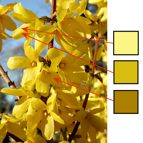
I’ve sampled a few of the colors using the computer. Notice in this photo, that the parts of the yellow petals that are in the most direct light are “washed-out” a bit in terms of the intensity of the color (top swatch). This often happens to areas in strong direct light. The strongest, most intense yellow color is actually where the light area is about to turn to shadow (middle swatch). This area is still in the light – not in the shadow. The shadow color is a darker, somewhat duller yellow-orange color (bottom swatch).
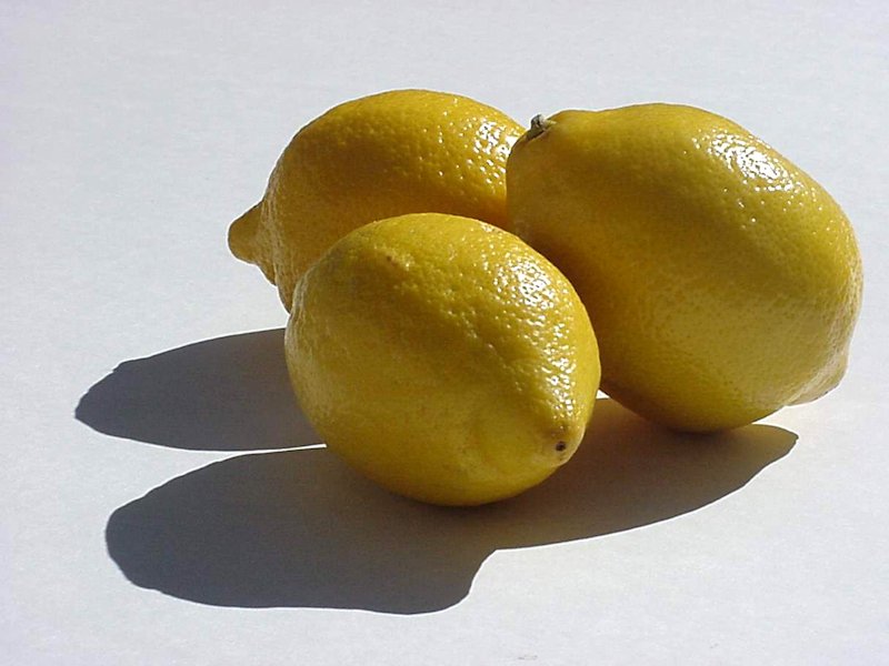
Below is a photo from the RIL by Ivyleaf. In this case, the highlights are very light and almost white, but the other areas in light are quite colorful and intense. The top swatch represents the lemon in light, the middle swatch in this photo is in the shadow – just where the shadow begins – and the bottom swatch is deep within the shadow.
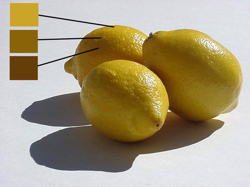
I would describe the lemon in light’s hue as slightly yellow-orange. The first shadow color is darker in value and slightly duller (less intense) than the first swatch. It seems perhaps slightly more orange, as well, based on the color wheel shown earlier. The deep shadow color is even darker, duller and more red-orange in hue.
In these first two examples, I would describe the shadow colors as being essentially darker and duller versions of the color of the lemon in light, with a slight shift in hue towards orange and red-orange.
Here’s another example, photo by WthrLady from the RIL:
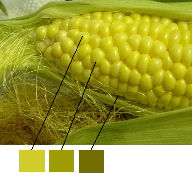
Looking at our color wheel, I would describe the color in light as slightly yellow-green. While my initial impression is that the color swatches in shadow are becoming progressively greener, when I look at the color wheel, those color swatches almost match the darker versions of yellow exactly. So, my description of the shadow colors in this example would be that they are darker and duller versions of the corn in the light, with little or no shift in hue.So, based on these two examples, my “principle’ regarding color in shadow might be stated like this:
The shadow color is usually a darker and duller version of the color in the light, with perhaps a shift in hue.
Now, based on numerous Spotlight discussions we have had in the past, there is one other factor that I think needs to be discussed – the color of the light – and how it influences the color of things. The color of the main light source will influence the object in the light, so a yellow light (or the sun) might make things more yellow than when seen in a more neutral colored light. In the case of yellow objects, however, yellow light shining on yellow will probably have little effect! However, secondary light sources and reflected light will usually influence the colors in shadow. A secondary light source such as the blue sky will often affect shadow colors, and reflected light from nearby objects will also. In the photos above, it is quite possible that the other lemons (photo 1) and the green corn stalks (photo2) are reflecting color into the shadows and influencing the shadow colors.
So, based on the color of the light, my shadow color “principle” might now be stated as:
The shadow color is usually a darker and duller version of the color in the light, with perhaps a shift in hue based on the influence of secondary and reflected light sources.
Now, this may sound like a formula…but I think it is vague enough so that one still needs to make careful observations to determine the best or most appropriate shadow colors!
Rather than talk endlessly about the color yellow, let’s see how a couple well known painters handled yellow in light and shadow!
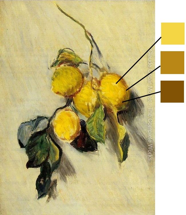
Here’s a Monet oil painting of lemons. It looks like he used colors very similar to the colors in our lemon photo above!
Here’s a van Gogh. That yellow hat has many of the same yellows, oranges and browns that we have seen in the other examples. Plus, you can see touches of cooler greens added as well. Adding touches of cooler colors into the shadows can often work well to help reduce intensity and create the feeling that the shadows contain cooler light than areas lit by warmer, yellow light sources.

Complementary colors:
What about using complementary colors for shadows. Don’t lots of artists recommend that procedure or principle? Yes, they do. In the case of yellow, this would mean adding or mixing yellow with violet, yellow’s complement. Personally – and this is just my opinion – I think mixing complements in more a procedure for creating grays – or very neutralized colors. While shadows are duller (more neutralized) than the color in the light, they usually aren’t gray. So, perhaps you might want to add a touch of the complementary color if you need help in dulling down your shadow color, but it is quite difficult to mix a color with its complement and end up with a realistic shadow color. Again, that’s my opinion.
However, total realism is not necessarily our goal, which leads me to this opinion…
While the above discussion is about choosing colors based on observation, as artists we are always free to choose any color we want. The degree of realism that we are trying to achieve is totally up to each artist to decide. Paintings can be believably realistic without matching colors exactly. And paintings, of course, don’t need to be realistic at all. Using color swatches and computer software can be a useful tool for artists, but, this does not mean that I encourage or advocate matching those colors exactly. They give us information that can help illuminate, but should not regulate, our creative process of painting!
That being said, I created a few pastel mixes where I blended yellow with other colors to see what types of potential shadow colors I could make! Keep in mind that pastels are fairly opaque, so mixing isn’t easy and you don’t get a “complete” mixture. The top color applied will usually be more dominant.

From top to bottom, I mixed a yellow with an orange/brown, violet, green and black. On the right side, I copied a square from the middle of each mix (in the same order). All of them give me a darker, less intense shadow color. Personally, I think the brown and the green work best – I still get the feeling that I am looking at something “yellow.” But you should decide for yourself what colors to try and which ones work best for you and your specific painting!
It is important to remember that pigments are real while color wheels are theoretical. So you may not get the exact mix that you think you will get just by looking at the color wheel! That’s why the best answers come from experimenting – not from reading about it in a book or on the web!
Color Mixing:
In my examples above, I mixed two colors together to achieve those intermediate colors. If I was working in oils, acrylics or watercolors, I may need to do this sort of mixing, but in pastels we normally have a specific pastel for at least some of those intermediate colors, tints and shades. The larger the collection of pastels, the less one normally has to mix. This is one of the big advantages to pastels, of course, but there are still times when you may have to mix – even if it is just adding a touch of color to modify another color. So, hopefully you won’t have to mix too often and the right pastel is always available, but if not, color mixing is a skill that will be useful. So an understanding of the color wheel and how colors mix together is definitely an advantage!
The References:
Photo by Dewi
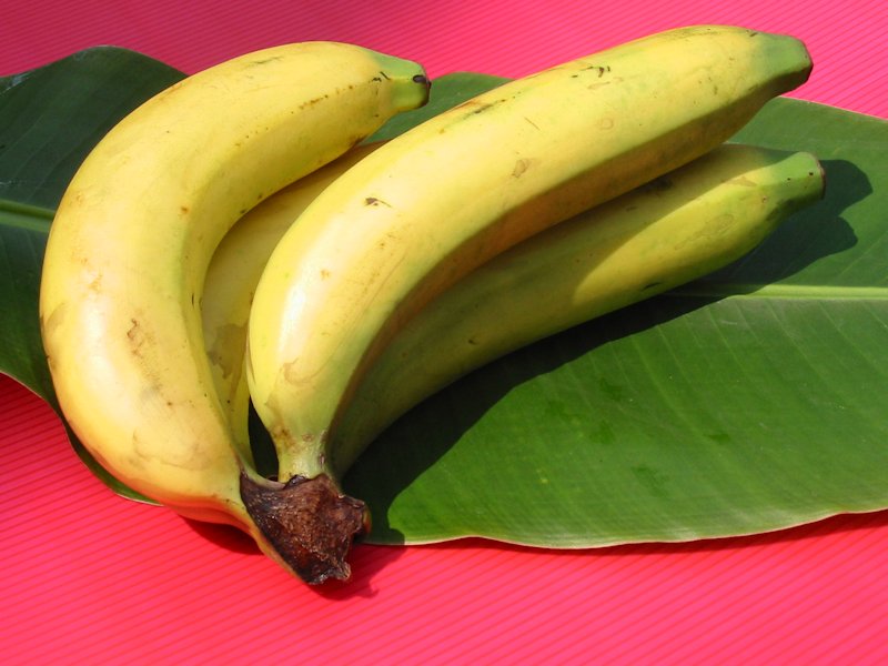
Photo by olika
I’ve used this photo in a previous Spotlight and in the lesson, but it’s a great photo for painting yellow. Photo by Ivyleaf
The rest of the photos are by me:
As always, feel free to crop, revise and modify the photos as much as you want for your paintings.
Feel free to ask questions and add your observations and thoughts about the color yellow!
Have fun!
June 1, 2014 at 7:06 am #1206107Great lesson Don. I can’t wait to start!
Jay
Happy to say "hello". C and C always welcome.
JAY:wave:
June 1, 2014 at 8:24 pm #1206148Spectacular! Many thanks for this thoughtful presentation, Don.
Best, Evelyn
June 1, 2014 at 10:28 pm #1206095Yellow is my favorite color! Well, actually, orange is. No, wait, wait…red, definitely red.
 Thanks for the presentation and great photos Don, I will make time to paint in my favorite color!SandraJune 2, 2014 at 4:39 am #1206005
Thanks for the presentation and photos, Don! This will be my first venture into the Spotlight. I’ve chosen the sunflower pic and will start on it today.
[FONT=Book Antiqua]Blayne C & C always welcome
"Art and I have an agreement... I won't ask where we are going and art won't ask, "Why me?" (Bob Brendle)June 2, 2014 at 1:40 pm #1206149Thanks, Don. Another great, informative presentation. Some year, I’ll do one of these, but just reading the information you’ve put together is wonderful.
Peg
and we all shine onJune 2, 2014 at 3:56 pm #1206094Good one Don! I tend to neglect yellow, especially in landscape. And painting yellow in shadow convincingly is always a challenge! Unfortunately I am so busy this month I may not have time….but I’ll see what I can do and will digest the lesson anyway!
My website http://ruthmannpastelart.com/
Pastel Guild of Europe http://www.pastelguild.org/
June 3, 2014 at 3:03 pm #1206108 This was EVER SO HARD! 8 x 10 on MT. pale orange. Sometimes I feel like I can’t see it until it’s been photographed and online. Next to the crop, it is pale, pale pale. But I’ll put it up and crits. I need help so Feel FREE .:eek: (Now I can see why people use white sanded paper to ‘glow’.)
Happy to say "hello". C and C always welcome.
JAY:wave:
June 3, 2014 at 5:20 pm #1206109I forgot to say that this is bigger 8 x 10 and will be cropped to that size. Pastels were ludwig, unison, mount vision, some Nupastels too. Thanks for looking.
Happy to say "hello". C and C always welcome.
JAY:wave:
June 3, 2014 at 6:20 pm #1206098thank you Don for this wonderful lesson…..
Jay I love your painting…..its lovely ….the background colours are beautiful….the flowers gorgeous…..
Prashanti
June 3, 2014 at 7:15 pm #1206110Thank you, Prashanti. I felt like I struggled with this today. Spent yesterday studying the structure of sunflowers. Will you be doing one?
Happy to say "hello". C and C always welcome.
JAY:wave:
June 3, 2014 at 7:41 pm #1206064Jay, thanks for starting us off this month with a lovely sunflower painting! Very nicely done!
Don
June 3, 2014 at 9:54 pm #1206006Great values and colors in those yellows, and masterful use of hard and soft lines. Beautiful!
[FONT=Book Antiqua]Blayne C & C always welcome
"Art and I have an agreement... I won't ask where we are going and art won't ask, "Why me?" (Bob Brendle)June 4, 2014 at 5:38 am #1206111Thank you so much, Blayne. You were generous to me..appreciate it!
Jay
Happy to say "hello". C and C always welcome.
JAY:wave:
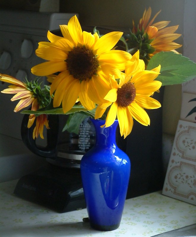
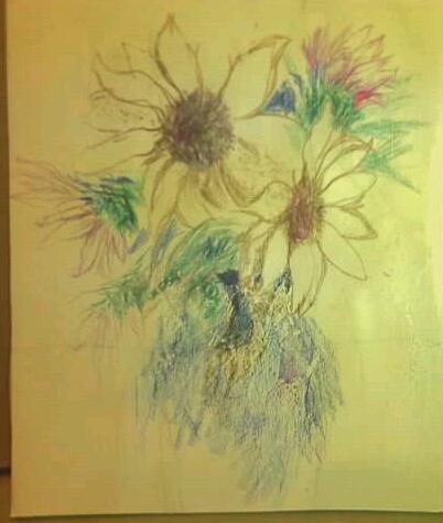
June 4, 2014 at 1:39 pm #1206007OK, after THREE days…here is my effort. This first image is my detailed (for me) drawing in colored pencil on 5″ x 6″ foamcore that had one coat of Golden Pastel Ground. I used colored pencil rather than pastel because my next step was to brush on a coat of clear gloss medium with pumice. This seals the sketch as well as provides more tooth.
Here is the rest of the story (photo taken outside):
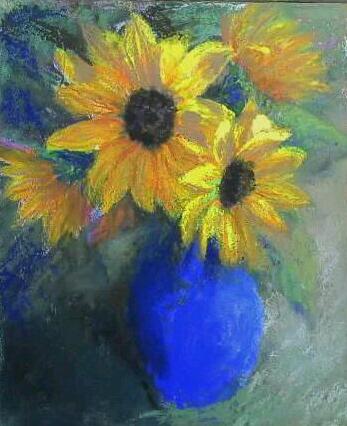
Photo taken inside:

Color corrections: The photo taken inside is amazingly accurate, considering it was taken with a 4-year-old cell phone. It shows the accurate size and colors of the vase and its highlight, and shows the flowers well.
I enjoyed this exercise — yellows are tough, especially on a small scale. I now see many mistakes here, especially the too-light green value on that flower I added just behind the vase.
I used Nu-Pastel, Holbeins, Sennelier, Terry Ludwig, Diane Townsend Terrages, Carb-Othello–just throw in the kitchen sink and a couple of cats.:lol: I didn’t run out of tooth, just patience. C & C, always welcome.
[FONT=Book Antiqua]Blayne C & C always welcome
"Art and I have an agreement... I won't ask where we are going and art won't ask, "Why me?" (Bob Brendle) -
AuthorPosts
- The topic ‘The Spotlight – June 2014 – The Color Yellow’ is closed to new replies.
Register For This Site
A password will be e-mailed to you.
Search