Home › Forums › Explore Media › Casein, Gouache, and Egg Tempera › Sunflowers on a White Cloth – casein
- This topic has 10 replies, 7 voices, and was last updated 6 years, 1 month ago by
 talisman.
-
AuthorPosts
-
January 25, 2018 at 9:53 pm #450158
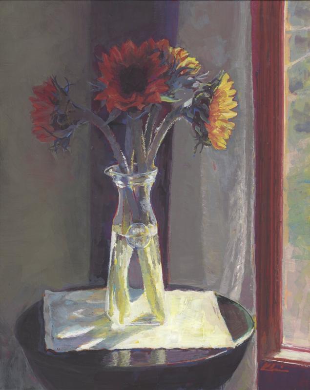
Sunflowers on a White Cloth; casein tempera on Claybord panel; 10″ x 8″
Painted from a photo I took last fall – I needed to bask in a little warmth here in chilly Minnesota

C & C Welcome!
– Mary
January 26, 2018 at 6:04 am #552329And it’s very welcome for all of us who have had an extra cold winter! Just lovely!
January 26, 2018 at 11:10 am #552332Very nice. I really like how finished this painting appears: the way that the shaded flower fades into the background while the sunlit flower jumps out. This is dazzling. Gary
"Painting is a verb"
January 26, 2018 at 10:35 pm #552333Thank you, AbA and Gary – much appreciated!
– Mary
January 27, 2018 at 1:16 am #552330Wow. I really like this one. The lights really pop out, which is one of the strengths of casein. I think you have gotten better at handling the darks too (as a side note, the darks have often been my problem in casein; most of the casein colors are brighter than other types of paint, so I sometimes have to rework the darks to get them dark enough. Now I think it is better to lay in the darks early on).
January 27, 2018 at 10:36 am #552328I really get that feeling of the warm sun.
The flowers and vase look great.January 27, 2018 at 10:46 am #552334Thank you, Trond and Perry!
Darks are indeed a challenge in casein – as is the issue on whether or not to use Ivory Black – and how much. With this piece I initially laid out the entire painting in two values: Rose Red and Naples Yellow. (I’ll add too that I paint on toned panels – 6 coats of Venetian Red casein allowed to dry at least 6 weeks.) After those two values/colors, I continued to refine the values, color and edges. Below is an intermediary stage for you to see:
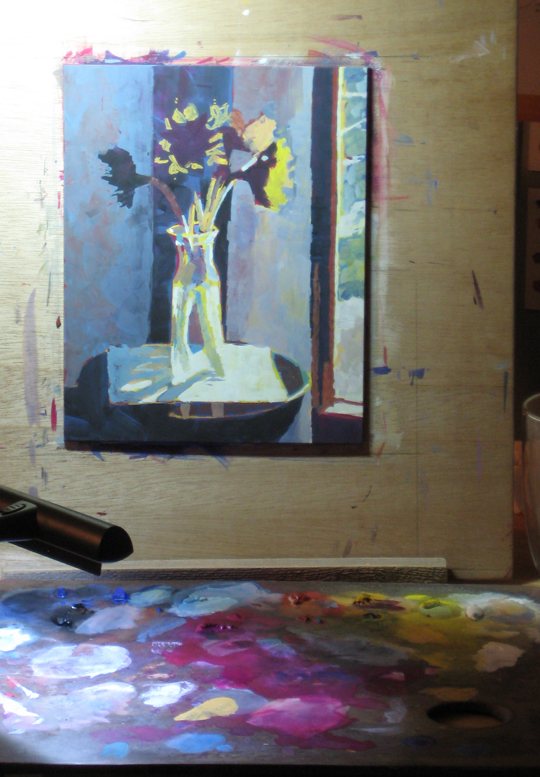
– Mary
January 27, 2018 at 9:57 pm #552331Thanks for the info Mary! I also like painting on casein grounds that have dried for a good while. It is much better than acrylic grounds, but heavy paper also works for me if I don’t have the patience to make a casein ground
February 15, 2018 at 7:31 am #552336March 10, 2018 at 6:47 pm #552337Beautiful Mary! I’m so impressed with your sense of light. As a rank beginner, I struggle with making that light source a prominent feature of my compositions. Being a professional photographer all my life I’m cursed with the need to make everything look perfect so getting the paint to do my bidding is a lesson in perseverance and determination ;-). I wanted to ask you….why 6 coats of Venetian Red as a ground? Why not one coat, or for that matter…why at all?
Steve in Vermont
March 10, 2018 at 7:24 pm #552335Thank you, Steve!
Whether or not to tone your substrate is a very personal choice. My decision stems from the old palette I like to use. It’s mahogany and used to be my oil painting palette. It’s been impregnated over the years with linseed oil – so it is actually quite water resistant. It’s an unlikely choice for a casein palette but – again – a very personal choice – I just really like it and am used to it. The Venetian Red, which is one of my colors anyway, is close in value and color to my mahogany palette. This makes it a little easier to gauge color when mixing.
The six coats is rather arbitrary, I admit. But it seems to be a good amount to fully cover the Claybord panel with no streaking. Also, it gives me a good layer of casein over which to paint. That way, if an area of my painting doesn’t receive a lot of paint, there is still a good layer underneath to support it. When my paintings are finished and have cured for 6 weeks, I like to buff them with a small piece of wool. (This brings a lovely satin-y finish to the surface and takes the place of varnishing.) Knowing there is a solid layer of casein to buff gives me confidence – although I’ve never had any rub-off up to this point.
The few times I’ve painted on Claybord straight from the packaging I’ve been frustrated. The surface feels too slick for me and I felt I had less control. This could be explained by my move from watercolor board to Claybord – the former is very absorbent and I may have gotten used to that. I’m wondering, if I tried untoned Claybord now, how I would rate it.
One final reason: I plan for and utilize the slight lifting I can achieve with the Venetian Red. Whenever I need or want, I can bring up that deep warm color as it suits me. This also helps to unify a painting as it can become the mother color – or a component of the mother color. One could use any color to do this with – including black. Like I said at the top, it’s a personal choice.
Hope this is helpful,
Mary -
AuthorPosts
- You must be logged in to reply to this topic.
Register For This Site
A password will be e-mailed to you.
Search