Home › Forums › The Learning Center › Color Theory and Mixing › Green and Purple makes… cyan?!
- This topic has 40 replies, 1 voice, and was last updated 1 year, 2 months ago by
 Cadmium Maroon.
-
AuthorPosts
-
October 31, 2014 at 9:56 pm #992378
Hello, guys! How are you doing?
I was browsing some blogs and reading about coloring mixing. Nothing seemed too unusual about it.
Then, I visited ArtRelated (http://artrelatedblog.wordpress.com/2012/06/21/color-theory-thursday-secondary-palette/), and the author recommended Phthalo Green Blue Shade (PG 7) + Dioxazine Purple (PV 23) to get… blue?!
Whoa. I was really surprised. If mixing magenta (PR 122, PV 19-gamma, PR177, etc) with green gives you a near-black, then mixing it with purple should also give you a complementary color. Right?
Right?!

Well, as you can see, mixing PG7 + PV23 does give you a blue that leans towards green, and mixes green equally as well as purples. In other words… cyan!
I repeated the mixing at home. My PG7 is slightly different in hue, being a bit yellower, and PV23 being much bluer. I did get colors that varied from a deep teal (similar to PB15 + PG7), to cyan, Prussian Blue Hue, and, finally Indigo Hue.
Of course, this cyan has a much lower chroma compared to any Phthalo Blue, but considering the clean, deep blue ranges and the mixes with greens and purples, it casts serious questions on whether cyan is really primary. Considering these results, you could have new primary set with MYGV pigments (Magenta, Yellow, Green and Violet), and an old new question arises: can we have a subtractive palette that works with RGB, like light devices do?
All I can say is that this gives Phthalo Green Blue Shade (PG 7) a whole new use!
Can you do some tests to see if you get similar results? Your experiments and/or thoughts on the matter would be really appreciated!
November 1, 2014 at 9:51 am #1213588Mythrill, if you find this result surprising you probably need to read up on how subtractive mixing works. See Fig. 5.1.1 here:
http://www.huevaluechroma.com/051.phpPG 7 reflects lots of the blue and green parts of the spectrum, and PV 23 reflects lots of the blue and red parts: see Figs 4.5.2 and 4.5.3 on this page:
http://www.huevaluechroma.com/045.phpSo what part of the spectrum do they have in common?
Colour Online (hundreds of links on colour): https://sites.google.com/site/djcbriggs/colour-online
The Dimensions of Colour: www.huevaluechroma.com
Colour Society of Australia: www.coloursociety.org.auNovember 1, 2014 at 10:56 am #1213563[B]Mythrill[/B], if you find this result surprising you probably need to read up on how subtractive mixing works. See Fig. 5.1.1 here:
[URL]http://www.huevaluechroma.com/051.php[/URL]PG 7 reflects lots of the blue and green parts of the spectrum, and PV 23 reflects lots of the blue and red parts: see Figs 4.5.2 and 4.5.3 on this page:
[URL]http://www.huevaluechroma.com/045.php[/URL]So what part of the spectrum do they have in common?
Hi, David!
Yes, I have to admit I am really surprised to find that out. Theoretically, green and purple are very far on the color wheel – in theory, you should get a near-black complement, not a cyan hue, which should be a primary!
I agree with you that this is happening because both Dioxazine Purple (PV 23, blue shade) and Phthalo Green Blue Shade (PV 23) have a lot of blue in common, but I believe what makes this all possible is the ridiculously high chroma of PG7 and PV23.
By the way, your site is particularly instructive. Sorry if I’m repeating you, but is it correct to say that obtaining a cyan hue is possible because PG7 reflects a lot more green and blue than usual, and PV23 reflects a lot more blue and red than usual?
November 1, 2014 at 11:29 am #1213589Their high chroma helps of course, but it’s also the fact that by reflecting lots of blue and green, PG 7 is quite close in hue to an ideal blue-green (“cyan”) subtractive primary, and by reflecting lots of red and blue, PV 23 is not too far in hue from an ideal blue-red (“magenta”) subtractive primary. It’s characteristic of paints close to the ideal subtractive primary hues that they make high-chroma mixtures with paints of quite distant hues, as far as the other two subtractive primaries, because they have one of the additive primaries (blue in this case) in common with each of these.
Colour Online (hundreds of links on colour): https://sites.google.com/site/djcbriggs/colour-online
The Dimensions of Colour: www.huevaluechroma.com
Colour Society of Australia: www.coloursociety.org.auNovember 1, 2014 at 3:02 pm #1213562Mythrill,
I remember about 13 years ago on this forum we first discussed mixing PR122+ PG7. In masstone it’s pretty much black, but try pulling it very thin, or diluting, or better yet: mixed with white. I found it surprising.The explanation (as David explained) is that the wavelengths that are most common to both the starting colors will be dominant in the final result. In this case, PR122 and PG7 both reflect quite a bit of the blue region, so you can reasonably expect the final mix to be somewhat blueish.
PG7 + PV23 also have quite a bit of blue reflectance in common (I will guess PV23 reflects at least as much blue as PR122 does), so a 50/50 mix could be expected to give a deep, blackish-blue. And mixing the blackish-blue with PG7 can be expected to give a turquoise color. If it were brighter and more chromatic I would then call it cyan
 . But yep…a lot of color mixes are surprising.
I like your PY110 + PV23 mixes. I love the various rich earthy mixes when you darken yellows or oranges with Dioxazine Purple. In fact, sometimes adding PV23 will be perfect for darkening a yellow to shadow. It’s surprising so few people seem to use this mix.
November 1, 2014 at 5:12 pm #1213564Mythrill,
I remember about 13 years ago on this forum we first discussed mixing PR122+ PG7. In masstone it’s pretty much black, but try pulling it very thin, or diluting, or better yet: mixed with white. I found it surprising.The explanation (as David explained) is that the wavelengths that are most common to both the starting colors will be dominant in the final result. In this case, PR122 and PG7 both reflect quite a bit of the blue region, so you can reasonably expect the final mix to be somewhat blueish.
PG7 + PV23 also have quite a bit of blue reflectance in common (I will guess PV23 reflects at least as much blue as PR122 does), so a 50/50 mix could be expected to give a deep, blackish-blue. And mixing the blackish-blue with PG7 can be expected to give a turquoise color. If it were brighter and more chromatic I would then call it cyan
. But yep…a lot of color mixes are surprising.I like your PY110 + PV23 mixes. I love the various rich earthy mixes when you darken yellows or oranges with Dioxazine Purple. In fact, sometimes adding PV23 will be perfect for darkening a yellow to shadow. It’s surprising so few people seem to use this mix.
Hi, Patrick!
Just to clarify, the mixes I pasted are not mine, but from the blog’s. I might paste mine here later on.
Regarding the mixes I got myself, I would say you can get a mix as chromatic as a prussian blue hue; however, if you still think it’s not chromatic enough, add some ultramarine blue to the mix – a blue-violet – and we will have a 3-pigment hue will lean even more towards cyan.
Of course, the mix will always be dark in masstone, but then, so are the phthalos and dioxazine purple, right?
November 1, 2014 at 9:36 pm #1213586I made those mixes, it’s my blog~

It’s been a while since I’ve done any of those mixes, but PY110+PV23 is a nice mix because it’s semi transparent and a good balance between intense and earthy. I just tried it again and it was pretty good, but I also tried using PY83 instead of PY110 next to it and that one was really nice. PY83 is more transparent and adds glowing undertones to everything I’ve mixed with it.
November 2, 2014 at 2:01 am #1213580it casts serious questions on whether cyan is really primary.
It simply shows that primary colors can be mixed, contrary to myth. (Exception below.)
an old new question arises: can we have a subtractive palette that works with RGB, like light devices do?
You need to have at least a yellow. Any yellow you can mix from red and green will be too dark and dull to look much like a yellow. Might have a tough time with violets too.
My website: http://www.rusticportraits.com
My artwork blog: http://llawrencebispo.wordpress.com
My art materials blog: http://sunsikell.wordpress.comNovember 2, 2014 at 9:25 am #1213565First of all, thanks for posting the photos on your blog, yellow_oxide. It’s certainly insightful, and you helped point out something very important!
It simply shows that primary colors can be mixed, contrary to myth.
But the whole point of the theory behind primary colors is that they can’t be mixed from any other colors. This still holds true to magenta and lemon yellows: you can’t mix magenta without any other magenta, and you can’t mix a lemon yellow without anything else that doesn’t have a lemon yellow.
(Exception below.)You need to have at least a yellow. Any yellow you can mix from red and green will be too dark and dull to look much like a yellow. Might have a tough time with violets too.
That’s true. As David mentioned, two colors must have a lot of reflectance in common with the color you want to mix. In order to mix a primary yellow (lemon) with what we consider as secondaries, we would need red and green pigments that have an extremely high chroma (i.e, that would look very garish in masstone) and that reflect a lot of yellow in common.
Considering Green Gold (PY129) can create earthy yellows with something like Quinacridone Magenta, it’s probably close to an ideal yellow-green to mix with an ideal red; however, not even Pyrrole Red Light (PR 255), one of the brightest red pigments we have today, has a lot of chroma nor does it reflect a lot of yellow to with PY129 to create a lemon yellow. If we consider how vibrant PR255 is, that’s saying a lot!
November 2, 2014 at 10:59 am #1213582Phthalo green and Diox are close neighbors in the color wheel. That means they are well-mixing colors with low saturation loss.
Red+Green =Yellow only when you are mixing lights. Ideal red absorbs Green and Blue and ideal Green absorbs Red and Blue. A reflected Yellow color males Brown result. Why? Because Yellow color must reflect widest part of spectrum, not a “Zonal” yellow only. To be Bright, yellow color must reflect red, orange, yellow and green color and restrict only blue part of spectrum.
You can check this:
https://en.wikipedia.org/wiki/Optical_filterNovember 2, 2014 at 11:28 am #1213587But the whole point of the theory behind primary colors is that they [B][I]can’t[/I][/B] be mixed from any other colors.
Primary colors represent an ideal, or a concept. People find materials whose properties come close to this ideal, but the real physical realities either fall short or are more complicated.
There’s a lot of paints that can’t be mixed. Ultramarine blue is primary. No mix I know of can reproduce it exactly. Phthalo green is more intense than any mix of yellow and blue at the same hue angle. White definitely can’t be mixed, but, oddly, while the rest of the world calls white a color some artists don’t, so they claim a 3 color palette that has 4 paints on it.
For some reason artists for a long time have fixated on the idea that there’s 3 primaries (although artists haven’t always said 3, Leonardo said 6 because he included black, white, and green). If the goal is to have a set of 3 paints that can mix the largest possible range of colors (called a gamut) without getting muddy, then there’s three “mixing primaries” that are best selected as cyan, magenta, and yellow, preferably represented by transparent paints on a white surface. These are mixing primaries only because they do the best job at matching the ideal of a set of 3 paints that can mix anything. Even so, no set of 3 can mix absolutely anything, as there will always be colors that fall outside their gamut. Additionally, as this mixing test shows, those particular three aren’t the only colors that can mix a large range of other colors that includes colors from every category.
November 2, 2014 at 11:36 am #1213566Phthalo green and Diox are close neighbors in the color wheel. That means they are well-mixing colors with low saturation loss.
Red+Green =Yellow only when you are mixing lights. Ideal red absorbs Green and Blue and ideal Green absorbs Red and Blue. A reflected Yellow color males Brown result. Why? Because Yellow color must reflect widest part of spectrum, not a “Zonal” yellow only. To be Bright, yellow color must reflect red, orange, yellow and green color and restrict only blue part of spectrum.
Giga, could you please point out where Phthalo Green Blue Shade (PG 7) is on that theoretical color wheel? I assume most pigments would have a hue around 5G and 10G, which makes them quite distant from Dioxazine Purple (PV 23, blue shade): around 5-6 steps if we count clockwise!
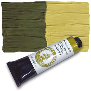
By the way, I have my Green Gold tube (PY 129) on my hand, and Daniel Smith lists it as “Azomethine Yellow 5G”; however, when I look at this color chart, I see it best placed at 5GY – 5G would be too bluish!
I also placed a tint of PY 129 side-by-side with Lemon Yellow (PY 3). Although clearly green in masstone, when mixed with gloss gel and calcium sulphate it’s almost identical to PY3, with the tint leaning only a little closer to a middle yellow and having a slightly lower chroma!
Mixed with just a bit of PR255, gloss gel and a sparing amount of titanium white, it can also trick you into thinking it’s a primary middle yellow and a deep, orange yellow – especially when this mix is glazed over a tint of PY129.
Just for curiosity’s sake, here’s how Daniel Smith’s Green Gold (sold as “Rich Green Gold”; their “Green Gold” is a convenience color) looks in acrylics. Green golds (PY 129) from other brands may be slightly greener or yellower.
 November 2, 2014 at 11:44 am #1213567
Primary colors represent an ideal, or a concept. People find materials whose properties come close to this ideal, but the real physical realities either fall short or are more complicated.
There’s a lot of paints that can’t be mixed. Ultramarine blue is primary. No mix I know of can reproduce it exactly. Phthalo green is more intense than any mix of yellow and blue at the same hue angle. White definitely can’t be mixed, but, oddly, while the rest of the world calls white a color some artists don’t, so they claim a 3 color palette that has 4 paints on it.
For some reason artists for a long time have fixated on the idea that there’s 3 primaries (although artists haven’t always said 3, Leonardo said 6 because he included black, white, and green). If the goal is to have a set of 3 paints that can mix the largest possible range of colors (called a gamut) without getting muddy, then there’s three “mixing primaries” that are best selected as cyan, magenta, and yellow, preferably represented by transparent paints on a white surface. These are mixing primaries only because they do the [I]best job[/I] at matching the ideal of a set of 3 paints that can mix anything. Even so, no set of 3 can mix absolutely anything, as there will always be colors that fall outside their gamut. Additionally, as this mixing test shows, those particular three aren’t the only colors that can mix a large range of other colors that includes colors from every category.
Yellow_oxide, you are absolutely right. However, it’s much better to see this myth debunked with a few pictures and experimentation.
I consider earth colors (e.g, “Raw Umber”) primaries in the sense that they can’t be perfectly imitated from higher-chroma colors. Sure, you can match a convincing hue with a synthetic organic yellow + violet, but, in this particular case, the hue will be either too chromatic (e.g, too orange) or lose chroma very quickly if you try to adjust them past an optimal point. This is more noticeable when trying to mix the resulting hue with something else to “soften” the chroma.
November 2, 2014 at 12:28 pm #1213591David Briggs goes into great detail about this on his website Dimensions of Color[/URL]. In particular, he compares the different mixing paths of various hues, and how “primary mixing colors” have different mixing paths than other colors, arcing outwards around the color wheel, instead of arcing inwards towards the center.
Is that what makes them a primary? Does it matter what a primary is? I don’t know. What I do know is that Yellow-Magenta-Cyan act differently from other colors when they interact with each other, and that is information that can be valuable when actually painting and mixing pigments, which is enough for me. The rest is very interesting, but academic, IMO.
As a watercolorist, btw, I’ve often mixed Yellow Ochre with Dioxazine Purple– a wonderfully varied and versatile mix that gives you warm shadowy yellows that don’t veer towards black. I’ve also mixed Dioxazine Purple with Viridian, and gotten a very nice blue green/ muted cyan-ish color. They’re definitely not opposite each other across the color wheel, the way, say, a Lime Green would be, so the resulting mixture didn’t surprise me much, once I thought about it.
November 2, 2014 at 12:48 pm #1213583Mythrill, you can calculate mixing color position and saturation lost:
Black is at the center position of color wheel. Mixing Color position near 5B has approximately ~30% saturation lost. Phthalo and Diox are both very chromatic colors. Therefore, reducing 30-40% of their original saturation in mixture is still equal to a good blue color. Somewhat close to Prussian Blue or a bit less chromatic. -
AuthorPosts
- You must be logged in to reply to this topic.
Register For This Site
A password will be e-mailed to you.
Search