Home › Forums › Explore Media › Oil Painting › The Technical Forum › Viridian Green ?? Some advice needed Please
- This topic has 23 replies, 8 voices, and was last updated 8 years, 7 months ago by
tamiea.
-
AuthorPosts
-
September 8, 2015 at 9:34 am #993359
1}…Not sure what the point of Viridian Green is ?
I try to use it, when attempting to paint foliage etc.. but it never seems to give me the sort of colors that I want.
2}…Has anyone any suggestions as to what the best way to use it is, or which are the best colors to mix it with are please ?
I would appreciate any tips.
Thank You
September 8, 2015 at 1:12 pm #1237802 Anonymous
I use it for foliage, it is my favorite green, here is an example where viridian is the main color:
I will just give you my full palette, I may mix viridian with any combination of these colors:
cad red hue
perm alizarin
hansa yellow
yellow ochre
ultramarine blue
viridian
burnt sienna
burnt umber
WhiteSeptember 8, 2015 at 1:23 pm #1237808I like the painting very much.
You obviously mix quite a few colors with it.September 8, 2015 at 4:38 pm #1237801Glad Sid can find a use for Viridian. I have bought Viridian green in the past and almost never use it. Where I live, almost all greens in grasses and foliage are warmer greens (leaning towards yellow on the color wheel). Viridian is cool and leans towards blue. If I were to use it, I would probably mix it with yellows to warm it or use it for foliage in shadow. This is just my opinion, of course, and Viridian is not on my palette.
Don
September 8, 2015 at 4:43 pm #1237809How should I choose which colors, that I have on my palette ?please
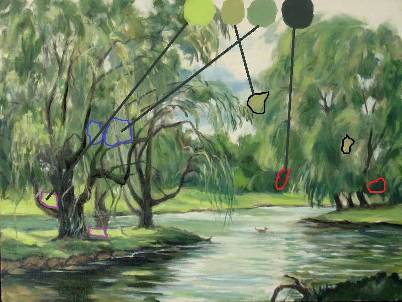
September 8, 2015 at 4:57 pm #1237803Anonymous
Thanks for liking,
here are the basic mixes as best I remember,
The first sample is the lightest sample from the ground, it is viridian and hansa or cad yellow hue.
The second sample is from the light foliage in the willow, it is a mix of viridian and yellow ochre.
The third sample is from some light foliage in the other willow, it is a mix of viridian and white.
The fourth sample is from the dark foliage in the willow, it is a mix of viridian and burnt sienna.
But there are variations here and there with some burnt umber, cad red hue, or ultramarine blue added too.
The dard tree trunks are ultramarine blue and burnt umber.
September 8, 2015 at 5:05 pm #1237804Anonymous
You don’t have to have any green on your palette. Some paint all of their greens with mixes made from ultramarine blue and yellows.
That is my basic palette for many years now, it has two reds, two yellows, two blues, and two browns, plus white.
I know viridian is green but it is a blue green, and ultra blue is a violet blue.
I can mix a million colors with this palette, but colors don’t matter too much, they are easy to mix with many different paints. It is the values and the drawing with the brush that matters, colors can be all over the place.September 8, 2015 at 5:12 pm #1237810Thank you for the massive effort you made. to help me with the palette etc..I’m very grateful to you.
I am trying to develop the habit of using just magenta,yellow,cyan, sap green, zinc/titanium white, burnt umber is used as well as Prussian blue,, love Prussian blue,basically I try to get bright colors down first..
I’m not sure how to make something go into the distance though..I tried blending the sky into the foreground,,something like that..September 8, 2015 at 5:53 pm #1237818Viridian straight out of the tube is a color rarely found in nature.
I use pthalo green blue shade in all of my landscape paintings, which is very close to viridian in hue but many times more powerful in both color intensity and tinting strength. I mix a much small amount of phthalo green with a larger amount of yellow ochre to mix a yellowish green (one that has very good opacity), and then use that mixture to mix other greens in my painting. Phthalo green should never ever be applied directly to your canvas, not if you are trying to paint realism.
September 8, 2015 at 6:21 pm #1237811Thank you Michael for messaging me.
I think I can get all the greens I need from yellow, ultramarine,cyan,yellow,Prussian blue etc,sap green..not sure I need viridian..September 8, 2015 at 6:44 pm #1237807What I love about painting is that there is no single right answer. I do not care for viridian and do not normally use it. Occasionally, like Michael, I use phthalo green. On the other hand, I love Stapelton Kearns works and blog.
http://stapletonkearns.blogspot.com/search?q=Viridian+Green
He uses Viridian a lot and dazzles me with it. So does Matt Smith, another marvelous plein air painter. So, I occasionally pull out the Viridian and work it into a couple pictures. I may get smart enough about its use one day to make it a regular part of my palette.
"Painting is a verb"
September 8, 2015 at 6:56 pm #1237812I like those paintings very much..at
http://mcchelsea.smugmug.com/Art/Sampling/31452689_MdFmBB#!i=4167761962&k=b4FbNjzLoads of light, and bright colours in them..
September 8, 2015 at 9:01 pm #1237819Thank you Michael for messaging me.
I think I can get all the greens I need from yellow, ultramarine,cyan,yellow,Prussian blue etc,sap green..not sure I need viridian..There are many different painters using many different types of color palettes. There are many ways to mix greens. No way is wrong if it gets you the color you want. You definitely don’t need any more colors.
The “Sap Green” you are using is probably a mix of phthalo green and transparent yellow, so you’ve actually been using phthalo green without realizing it.
September 8, 2015 at 9:11 pm #1237820What I love about painting is that there is no single right answer. I do not care for viridian and do not normally use it. Occasionally, like Michael, I use phthalo green. On the other hand, I love Stapelton Kearns works and blog.
[URL]http://stapletonkearns.blogspot.com/search?q=Viridian+Green[/URL]
He uses Viridian a lot and dazzles me with it. So does Matt Smith, another marvelous plein air painter. So, I occasionally pull out the Viridian and work it into a couple pictures. I may get smart enough about its use one day to make it a regular part of my palette.
I see that Kearns HATES phthalo green. He can’t use the powerful stuff. He’s not a real man like me

When I first starting doing landscapes I had some horrible experiences with phthalo green and dropped that color, but now I use it as my go-to green, knowing that it’s a color that has to be used very carefully and dulled down by mixing it with yellow ocher or a dark gray. (Yay for Portland Grey Deep!)
September 8, 2015 at 9:24 pm #1237805Anonymous
I think I can get all the greens I need from yellow, ultramarine,cyan,yellow,Prussian blue etc,sap green..not sure I need viridian..
yes you have the makings for a plenty of greens already. I also like to substitute Winsor Newton artists Permanent Green in place of viridian. It is a mix of yellow, phthalo green, and white.
-
AuthorPosts
- You must be logged in to reply to this topic.
Register For This Site
A password will be e-mailed to you.
Search