Home › Forums › Explore Media › Drawing and Sketching › The Classroom › Basics 101: Class 10 – Still Life
- This topic has 435 replies, 1 voice, and was last updated 3 years, 9 months ago by
 I am new to drawing comunity. Hope you welcome me..
-
AuthorPosts
-
January 16, 2005 at 11:54 pm #991066
Basics 101: Class 10
Still Life
I think that many of us think of Sill Life as objects nicely arranged on a stand with maybe a lacey doily or sitting on some nice reflective and highly varnished grain of wood.—flowers neatly arranged, organized, categorized and lined up like an identification session in a police line up. Still life is still, we think—and don’t you forget it. Still life is always indoors and is always an arrangement.
I think not. Look at Albrect Durer’s “Great Piece of Turf” for example which was painted in 1503—Turner and his “four fish”(around 1822) and lastly Andrew Wyeth’s bucket post which was painted in 1953. ALL are examples of still life. Objects that present no movement—are still—not moving—yet by their very arrangement represent an element of life itself—hence, Still Life.
Still Life can be your traditional arrangements of course but you are NOT limited to painting still life indoors—ANY non living object that you can contain in a composition can be a still life, whether it be indoors or out side can be considered to be a still life.
Still Life can be said to be a collection of objects combined into an ordered composition that represents a slice of life. Can a still life convey a meaning of importance—some tragic memory or represent a political or artistic statement? Of course they can—look a the work of such noted artists such as WC member Arlene Steinberg. Her work is clean and pristine—well executed technically and on the outside looking in you get a sense of the still life as a pretty picture—but look deeper at some of her work and you will see an in depth mode of thinking—a poignancy of the soul and a sensitivity to these tragic times that lately seem to engulf our lives.
For this class I will be doing a pencil version of the De Reyna demonstration—though not taking it to its final moment—that is for you to do. I have also prepared a demonstration of a quick color pencil sketch of a still life picked from our WC image archive. I am also going to supply you with other examples of still life in which you can practice your newfound skills.
Do the De Reyna exercise with pencil but the demo or any other example that you choose may be in color or may be of any media of your choose. At this point, I want you to go ahead and have some fun—experiment and explore your possibilities. If you have the courage, do a still life in a medium that you have never used before.
Materials:
Paper: Your Choice—I am using Stonehenge and Arches
Pencils: Again, your choice.Demonstration One: The De Reyna Still Life:
Stage 1: I have drawn the line drawing in the De Reyna book. For the purposes of this demonstration, I am leaving all the lines intact. When you have your shapes complete, normally you would erase the lines but my point here is to consider everything in the composition that you CANNOT see. All of these objects overlap with each other BUT they will always be independent three-dimensional objects. ALWAYS DRAW EACH OBJECT SEPARATELY.
Stage two: I have started to add volume to the objects. The paper that I have chosen as my surface is Arches 140 pound watercolor paper. I like drawing on watercolor paper because it has a marvelous texture. It does have a tendency to wear down the graphite quickly and so you have to sharpen more unless you are using a mechanical pencil.
Stage three: I now have added shading and have started to work on the cloth. Colored in the table and continued work on the texture. You could take this further by adding wood grain or by texturing the background. It is entirely up to you. The point is that once you have identified and drawn the shapes, you now have total control to just let yourself go and be as creative as you think you can be.
Demonstration 2: CP of WC Library Reference
Stage 1: In this second still life, I have again created a basic line drawing of the fruits and the vessels. In this case, the drawing consists of spheres and ellipses. Very elemental objects but when combined make a lovely still life. I started by using an indigo blue pencil to create the initial sketch.
Stage 2: Next I continue with the indigo pencil to created a toned drawing. I ease off the grapes with the indigo pencil a bit because the blue will over power the yellow in the picture.
Stage 3: finally, I add the colors—tuscan red and scarlet lake for the plums and yellow carnary, green and olive green for the grapes.
The paper that I have used here is Stonehenge while I have use Prismacolor brand pencils.
Exercise One: Do the first demonstration—ONLY MAKE IT YOUR OWN. Do the breakdown of the shapes and let us see those—then move on to finish your still life.
[Edit: reference is here: http://s3.amazonaws.com/wetcanvas-hdc/Community/images/15-Feb-2010/142886-pot-reference.jpg
Exercise Two: Do the second Demonstration—ONLY CHOOSE YOUR OWN MEDUM. Be as creative as you would like.
[Edit: reference is here: https://www.wetcanvas.com/RefLib/showphoto.php?photo=42686%5D
Exercise Three: Choose one of the extra photo that I have included OR consider doing one of your own choosing. If you do one of your own—explain how you came about choosing your objects, how you decided upon setting up your composition and your choice of paper and medium.
ABOVE ALL
HAPPY DRAWING!!!
catmandolin.deviantart.com
January 16, 2005 at 11:56 pm #1190281Here is the second demonstation:
catmandolin.deviantart.com
January 16, 2005 at 11:57 pm #1190282here is the finished piece:
catmandolin.deviantart.com
January 16, 2005 at 11:58 pm #1190283Finally, here are some practice samples:
Note from the Editor: This thread continues with the recent posts. The older posts can be found in this closed thread:
https://www.wetcanvas.com/forums/showthread.php?t=243677
catmandolin.deviantart.com
October 13, 2010 at 10:50 am #1190323Anonymous
I first would like to ask you – which size would you recommend? The same as the original, or bigger (in my case that would be a full A4)?
Hi,
The recommended format for most of the classes is A4 (for charcoal bigger is better). With a half-decent printer driver you can print out the scanned reference in about A4 format and refer for clear details to the original.
 October 13, 2010 at 2:11 pm #1190504
Great, A4 it will be then.

Hope it won’t take too long before I have something to post here…
Blogs: Fantasytree and
Pennans Vandring (In Swedish)October 16, 2010 at 11:36 am #1190529Here is my completed drawing of the first assignment.
---- Renzo Wouters ----
October 16, 2010 at 3:02 pm #1190324Anonymous
Nice job Renzo, very well done :clap::clap:.
October 19, 2010 at 10:51 am #1190530Hello again,
My first try in another medium: watercolor pencils. What do you think?
---- Renzo Wouters ----
October 19, 2010 at 3:48 pm #1190325Anonymous
Good job, Renzo :clap:. Very good treatment of the highlights.
Color seems to suit you, nice painterly character :clap:.
You did very well in this class :thumbsup:.November 14, 2010 at 4:01 am #1190505Good morning,
here is the first “shape breakdown” stage of the first assignment: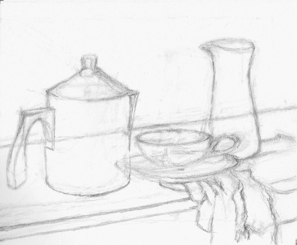
Blogs: Fantasytree and
Pennans Vandring (In Swedish)November 14, 2010 at 7:38 am #1190326Anonymous
Magnus –
Very well done :clap:.
I know your interests for figure and portraiture, where striking the correct proportions is extremely important, otherwise I would not point out this slight horizontal shift: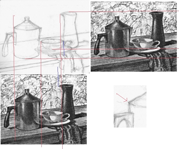
The vertical proportions are all very good :thumbsup:
When finishing, please correct that one pointy end of the top ellipse :). Otherwise, your ellipses are fine.
November 14, 2010 at 8:41 am #1190506Thanks a lot, and thank you for pointing out what could be corrected when continuing and finishing. Really looking forward to working with tone and all those different textures. Hope to be able to have the patience to produce a still life study to feel happy with.
Blogs: Fantasytree and
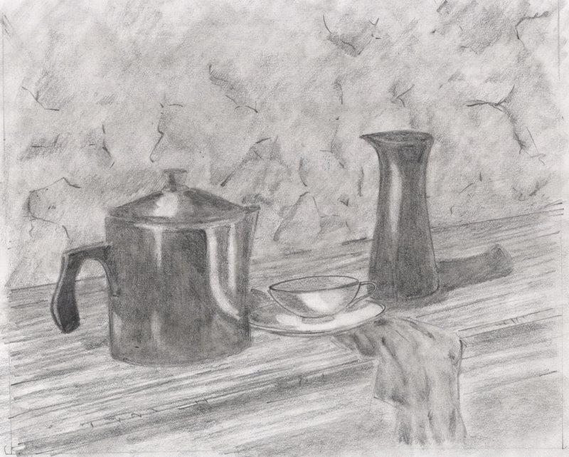
Pennans Vandring (In Swedish)November 22, 2010 at 3:18 pm #1190518I decided to move on to the still life and I went with a small study first. I know it is a bit off but I am starting to get a feel for using darks that I had not before now. Plus the cheap printer paper was starting to give out before I could make too many changes. :wink2:
 MarkNovember 22, 2010 at 5:54 pm #1190327Anonymous
Mark –
Well done :clap:.
I won’t comment on the darks given the poor paper quality :wink2:. I’d like to draw the attention to a little inconsistency in the treatment of outlines. Pot and creamer are fully shaded, but saucer and cup are more in the “outline with shading hints” style. Both styles are legitimate drawing styles, but mixing them means “lack of unity”.
I’m not sure how accurately you intended to copy the forms. But for your information, you did pretty well for the heights, but went a bit too broad: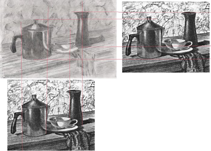
Your ellipses are very good :clap:.
-
AuthorPosts
- You must be logged in to reply to this topic.
Register For This Site
A password will be e-mailed to you.
Search