Home › Forums › Explore Media › Pastels › Soft Pastel Learning Center › December ESP: The Colour of Magic
- This topic has 21 replies, 7 voices, and was last updated 19 years, 3 months ago by
 Rosic.
-
AuthorPosts
-
December 4, 2004 at 11:26 am #448173
Primary and Secondary Colour Families
Think of colours as having family relationships:
Primary: Yellow
Family
yellow-orange
orange
red-orange
Primary: Red
Family
red-violet
purple (violet)
blue-violet
Primary: Blue
Family
blue-green
green
yellow-green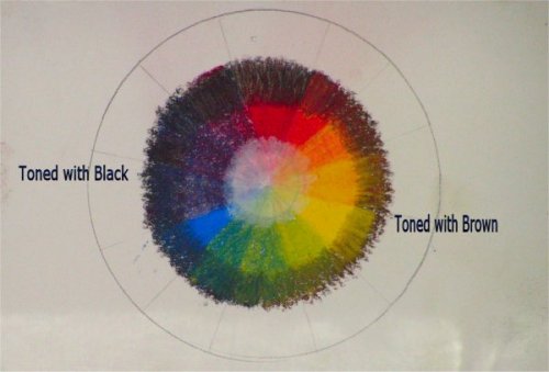
I s’pose I should also say “red-orange”, while listed as a “yellow family”, is also in the red family. Same for “yellow-green” being part of the yellow family, etc. This only makes sense, if you think about it. Colour is a circle of family relationships- some are parents, (primary colours) some siblings, (secondary colours) some cousins (tertiary colours) and some second and third cousins (those weird greyed colours).
Tertiary Colours
Supposedly, tertiary colours are those like “red-orange” and “blue-green”
Technically, teriaries are those colours made by mixing one or more of the
secondaries with another colour, so I consider tertiaries any of the browns-
rust, ochre, vandyke, etc.Complementary Colours
The primary or secondary colour directly opposite any individual colour on the colour wheel. Red’s complement is green, blue’s is orange, yellow’s is purple. Tertiary colours also have complements, but by then, it’s more staying to the proper family of colours than worrying about if it is exactly “right”. For instance, ochre (ochre = yellow + green + red) is *mostly* on the warm red/yellow side, so its complement would be on the blue-green side, or a vandyke brown.Place even a dot of complementary colour near a hue, and that hue will appear more intense.
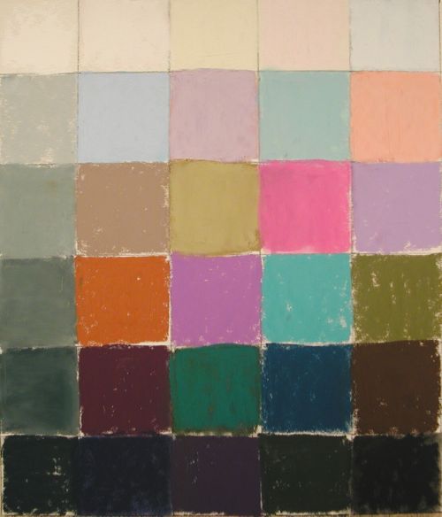
Assignment: Try your hand at making your own colour wheel. You will want your purest primary colours to do this, so choose with care. Draw a circle, and divide it into twelve wedges; then start at the top with red, count four spaces over and lay in yellow, then four spaces over and lay in blue. Now using ONLY your three primary colours, fill in the graduating colour changes around the wheel. For instance, the first wedge to the right of red is a layer of red, a layer of yellow, and then another layer of red. The next is two layers each of red and yellow, and the next two layers of yellow to one of red. If you do this, you’ll start to see the “recipe” of every colour out there.
I also “tinted” and “toned” the inner and outermost areas of my colour wheel to show the difference the addition of flat white and black/brown can make. The reason I chose brown for the yellow side of the wheel is that black just makes all of those colours go to greeny-mud, whereas a dark brown allows their “family” colour to come through. (Extra points to anyone who can explain why)
Greyed Colours
Add any colour’s complement, and it becomes duller- or “greyed”. Red + green = dull red or “greyed red”Tinted Colours
Any colour + any amount of white = a tint. “Pink” is a “tint” of red. Peach is a tint of orange. Spring green is a tint of yellow-green.Toned Colours
Any colour + any amount of black = a tone. Dark blue is a tone of blue. Maroon is a tone of red-purple.Tone/Temperature
General rules: Warms come forward, cools recede. Warms on the yellow-red side, cools on the blue-green side. However… A green that has been brightened with yellow, and greyed with red, (olive, in other words) will appear warm when placed near a blue with no red in it. A blue-purple will appear cool, a red-purple will nearly always appear warm. Why? Because there are two parts of blue in the one, and two parts of red in the other. Use tone/temperature when colour is not enough, or when the area is dull gray- it gives the work some life.Split-Primaries, or How to NOT Make Mud
The warm and cool shade of each primary colour are called “split-primaries”. While we think of “yellow” as warm, when seen side-by-side, Hansa Golden appears warmer than Hansa Primrose, which has a distinctive green cast. If one wished to “make” a green by layering blue and yellow, and used Pthalo Blue (a “warm” blue) and Hansa Golden, the green would be rich and warm. If they used Pthalo blue and Hansa Primrose, the green would be slightly less intense and somewhat greyed. Why? Because Pthalo Blue is “warm” (which means, whether it contains a “red” or not, it leans red easily) and Hansa Primrose is “cool” (meaning it has no blue in it, but leans green easily) and red is green’s complement. So the “cool” in the yellow greys the “warm” in the blue. Pay attention to this, because it will help you make your colours “glow”.Assignment: Find a warm and a cool of each of your primary colours. Lay them side by side and compare. Try layering a cool yellow with a cool blue, see what you get- a nice “true” green, eh? Now try layering a cool red with a warm yellow- what happens? The resulting orange is not “true”, is it? Extra points to anyone who can explain why.
December 4, 2004 at 11:42 am #492138VALUES
Value is the relative lightness/darkness of a tint or tone of a colour. Pink is a light value of red, maroon is a dark value of red. This sounds soooo simple- but it is on this that the integrity of the work relies. Your values MUST be correct.“A thing is only what it is in relation to what it is not.” ~ Preston King
Schmincke, I think it is, makes a wonderfully warm, barely yellowed light that I call “Sunshine white”; Unison makes an Ultramarine light that is the same colour as that lightest band of sky near the horizon at dusk. Both of these would be considered to have a “light value”, but how light that value is depends entirely on its relationship to the values surrounding it. If I have a wonderfully rich and dark purple eggplant, and I zing a highlight into it with that Ultramarine light, the highlight will appear almost white. However, if I have a white rose made up of various almost-whites, and I try to zing a highlight in there with that Sunshine white, it will barely hum. Why? Because there is not enough contrast between the colour values already there, and the Sunshine white.
Values can only be established in relationship to other values. We can see a maroon-red is “dark”, but is it darker than Hunter green? We MUST learn to see whether or not it is, and that takes practice. This is why so many pastelists develop wrinkles around the eyes so early- we TELL people it’s from painting en plein aire, or at least gathering reference materials out in the sunshine, but it’s not- it’s from squinting like crazy trying to see which colour is darker or lighter than another. (Tip: L’Oreal makes a really good “anti-crease cream” for the face and neck- works- trust me).
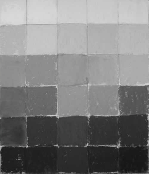
Assignment: To learn about values in pastel, one of the best things to do is get a piece of paper and make a column down the center. Divide the column into 7 spaces horizontally- like a closed ladder. Now, using white, a pure blue and black, start at the top and lay in the white; in the next step, lay in white and a little blue and white again; next, blue then white then blue; next, blue; next, blue then black then blue again; next black, then blue, then black, then blue again; and finally black. Now STAND BACK- at least 5 feet- and LOOK at the value scale. Close-to, it’ll look messy- that’s a given- but if you stand away and look at it as you would any other “thing” you gaze at, you can see the gradual change from white, through blue, to black. (There is no need to peer at your work from 6″ away- it’s like using a magnifying mirror to look at your face, and then bemoaning the fact you have pores in your skin. Of course you do- and they’re not-so-attractive magnified 10x. But from a more natural viewpoint, your skin looks just fine).
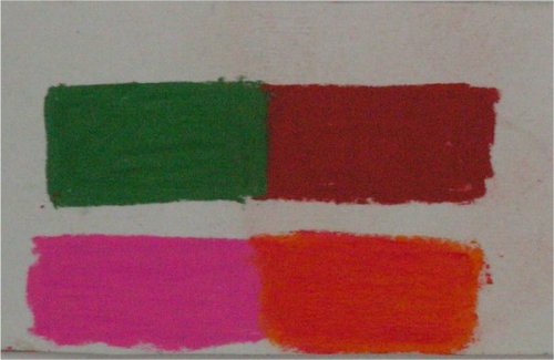
So now you see how values work within one colour, how do you check to see if two different colours have the same, or a different, value? Kitty Wallis pairs them- and it’s a very good exercise. Assignment: Take two different colours which you think have the same value- say an orange and a green. Make a nice orange rectangle about an inch by two inches- colour it in solidly. Now make another rectangle- right up against that orange- with the green- there should be no paper showing between the two colours. Now SQUINT at them. Really squint your eyes- don’t just look. If they are the same value, when you squint, you should not be able to really tell one from the other. If they are different values, you’ll see them both- no matter how hard you squint. Try this with a few colour and value combinations until you are “guessing” the values are the same easily.
Jackie Simmonds has a very good exercise for learning to see value in colour: Tear a strip from a colourful picture- say one inch by five inches, and “match” the colours you see. Take them both into grayscale (if you cannot scan or take a digi pic to convert to grayscale, then look at them through a piece of red cellophane- nearly the same thing). Do they match? Then your values are correct. Now, turn the original strip into grayscale, and assign different colours to the values present- for instance: the darkest areas will be this dark purple, the next darkest, this rust, the midtones a blue, the mid-lights a lavender, and the lights a cream. Colour it again- then take it into grayscale and see if you managed to match the values up right to a colour.
Now it’s time to do this yourself using a simple shape like an apple. Try to get one which is pretty much all one colour, eh? Make it easy on yourself right now. Assignment: Draw the apple outline on your page, and pick out three colours- all different- say, a dark green (really dark) a mid-blue and a light-pink. Now paint the apple using those colours. Squint at it and see where the dark goes, where the mid-tone goes, and where the light tone goes. Now stand back again, and take a look- while the colour is “not right”, it should look like a recognizable “pop-art” apple, with good 3-D form- right? If so, congratulations- you’ve got this value stuff going on. If not, look again- compare them by squinting at both, and see where it is your values are off.
This is the basics of colour- believe me, there is much, much more. But it’s kinda like calculus: You have to have basic arithmetic to be able to learn calculus, and once you understand it, it makes perfect sense. And when colour makes perfect sense, you paint naturally, and with confidence, and that shows.
December 4, 2004 at 12:47 pm #492145Julie, this looks great! A primer on primaries, etc… (Sorry, couldn’t pass up the alliterative qualities of that phrase.
 )
) Handell taught us to find colors that are the same or very similar in value by laying them side by side and squinting, as you suggest, and to this day I use this technique for finding values. It was interesting, though, that if you laid them top to bottom the associations seemed to change. For instance, laying a cool on top and a warm on the bottom seemed to harmonize differently than when you put a warm on top and cool at the bottom. Side by side seems not to have tohose associations. We theorized that it had something to do with the landscape… If I get a chance I’ll take some photos to show you what I mean.
Meanwhile, the exercises here look great. Hope everyone tries them out!
Thanks, Julie…
Deborah
Deborah
"All glory to Him, who alone is God our Savior, through Jesus Christ our Lord."
Landscape Painting in Pastels (free online book)
Gouache BlogDecember 4, 2004 at 1:23 pm #492139I remember you saying that elsewhere, Deborah, and I found it very interesting. You might be right about it being a “landscape” thing, because our eyes are wired directly into parts of our brain which function in a near-instinctual way (only the sense of smell has more “primitive” wiring). This means we’d be able to see and discern foodstuffs and enemies within the environment when light was sparse- say at dusk or dawn- and so value relationships are minimal.
Neat the way concepts one wouldn’t think have anything to do with one and other are so often interrelated.
December 4, 2004 at 5:36 pm #492146Here’s another experiemnt you could do to learn about color and value a bit more.
I’ll add my color primer, a lot like what Julie has here already:
Color (hue, chroma): the visual sensation caused by the perceived wavelength of light. While objects possess color, our perception of it is altered by background, illumination, reflected light from other objects, and so on.
Primary colors: colors from which all other colors are made: red, blue, and yellow
Secondary colors: colors that are created from equal amounts of a pair of primary colors: green, orange, violet
Tertiary colors: colors made from equal amounts of a pair of primary and secondary colors: red-violet, blue-violet, blue-green, yellow-green, yellow-orange, red-orange
Analogous colors: three consecutive colors on the color wheel
Complementary colors: the colors opposite on the color wheel– red & green, blue & orange, yellow & violet. For every color there is a directly opposite complementary color that when mixed together create a neutral gray-black.
Tint: a color plus white.
Shade: a color plus black.
Value To Color Experiment
Select a photograph to paint and on a clean white piece of paper make a chart of the values and colors you’ll use. You’ll need a value finder, which is a handy gadget with a gray scale along one side that has a hold punched in the center of each value, which you can place over the top of a color, squinting to see if the color disappears. The idea is to make a column along the far left hand side containing each of the grayscale values in the photo, to which you will match colors in the row next to it.
Begin by marking off a grid of about 2” squares on your paper, 5 across and 5 down. I suggest using a 9×12” piece of white Wallis paper because I would have you paint on Wallis, but any kind of paper will do. Use your value finder to determine the darkest value in your photograph. Make a square matching that value in the bottom left square of your grid. Go on to find the other values in your painting, up to five maximum values. (Hint: turn your drawing board so that you paint your column of values as a row at the bottom of the page, to accommodate the smear factor and the way dust drops down the page. Then turn your board so that the scale is on the left side, descending from light to dark to make the color squares.)
Check the values in your photograph carefully and make sure they are found in the photo. Don’t use too black a dark if that value doesn’t exist there, or too white a light if it’s not that light. Next to the value square on the left side, place the color that matches the value you see in the photograph. For instance, if a dark green tree is your darkest dark (value and color), fill in the square beside your darkest value with that green. Match the values to the colors you see. Do this for all the values in your painting. You should then have a column of grayscale values next to a column of corresponding realistic, natural colors. Continue each row, finding colors of the same value, but different from those in nature. For instance, next to your dark green you might put a very dark purple, maroon, blue, and brown. Each row should end up showing five different colors of the same or very similar values. Each column should descend from light to dark values.
Now you have a chart that you can use for a painting of that photograph. I suggest you make a painting using all of the colors in the chart, layering or using broken color, to assist you in understanding how to find and use colors of the same or similar values.
Check your color chart by looking at it in black and white to see if the values are correct. (I blew it in a few places!) This really helps you begin to see where you need to become straonger, seeing the values more exactly and not making assumptions.
Hope this helps! Deborah
Deborah
"All glory to Him, who alone is God our Savior, through Jesus Christ our Lord."
Landscape Painting in Pastels (free online book)
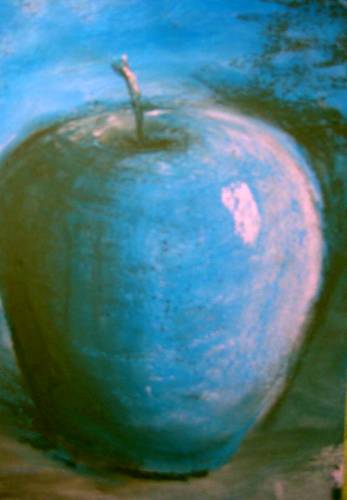
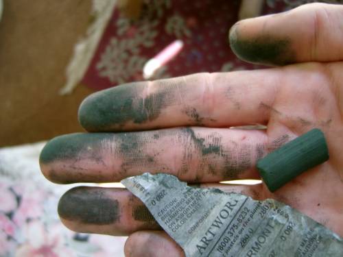
Gouache BlogDecember 5, 2004 at 10:42 am #492150Assignment: Draw the apple outline on your page, and pick out three colours- all different- say, a dark green (really dark) a mid-blue and a light-pink. Now paint the apple using those colours.
Apple with my coffee!! ( Note…this is on black art spectrum, cause that is what was in hands reach, but none of the black is peaking through INL)
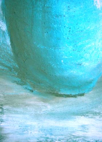
 December 5, 2004 at 11:51 am #492140
Ta-da!! See? But I can also spot where you snuck an even darker dark down on the left side bottom- good eye- it needed it.
I remember you saying how you resisted making and studying the colour wheel, Preston, thinking “Everything I Need to Learn About the Colour Wheel I Learned in Kindergarten From Crayola”, but that, when you had to go through the motions for your degree, it turned out you not only solidified a great deal of knowledge, but learned even more. Perhaps that’s why so many folks resist it- they think it is too simple; when it is only simple once you have actually DONE it.
The split primaries, especially, are a huge step forward in understanding how to use physical colour in a visual world. It’s far easier to make mud than to figure out a way to make colour sing out within the context of a hodge-podge of values; understanding split primaries at least helps one make “controlled” mud.
Preaching to the choir, though, eh? Your colour-work is so clean and vibrant anymore.
December 5, 2004 at 11:57 am #492151But I can also spot where you snuck an even darker dark down on the left side bottom- good eye- it needed it.
Sorry,,,but that is the pure dark green…image repro issue…no other colors used but those you see on the left ..the flash bleached them out…
December 5, 2004 at 12:00 pm #492141“Wahl Ah’ll be” Must be rainin’ in Georgia? tsk tsk.
December 6, 2004 at 1:30 am #492147Looks like rain here too. Since so far its just us chickens here I have to tell ya that I suspected dark addtions there too…in the photo it looks like you used gray, blue and lavender-pink pastels. The darkest dark is the paper. Hmmm…okay, I trust you, Preston! I know you didn’t use the paper but now I needa see a better photo of those colors. Dark green you say? Ooooookay…. The color sings but the solid foundation is the form. As always. You just get better, Preston. That’s all.
Deborah
Deborah
"All glory to Him, who alone is God our Savior, through Jesus Christ our Lord."
Landscape Painting in Pastels (free online book)
Gouache BlogDecember 6, 2004 at 12:43 pm #492152Yep…..it’s green!!!!!
 December 6, 2004 at 12:47 pm #492142
Okay, so you don’t have to go to confession this week- lucky you.
Between flash, jpgs/digi and the WC scripts, pics are problematic. But I believe you, Preston, she said virtuously….
December 6, 2004 at 1:27 pm #492153Julie…..Your are right that it is easy to get mud if you don’t have a base knowledge of what one color is going to do to another……but the good thing is…you can get “mud” to work for you if you understand what one color does to another……in the pic below…you will see that the red of the pink neutralized the green to give me a brownish tint in the foreground toward the base of the apple. One can do quite a bit with a limited palette if you understand the basics outlined in this months ESP. In this immediate gratification world, I often try to avoid the work of painting (i.e., studying, exercises, etc.)and go straight to creating a masterpiece painting. Unfortunately, you can’t get a really good prime rib dinner by going to McDonald’s drive-thru
 December 6, 2004 at 1:46 pm #492148
A quote about mud and shadows from my friend Judy Carducci:
“I’m not afraid of mud, remembering Delacroix’s comment, ‘Give me mud, and if you let me put whatever I want to next to it I’ll make it into the flesh of Venus.’ I tell my students not to worry about the color of the shadow. It can be mud. The value and what you put next to it is what matters. Don’t decorate the shadow. It’s not heavy and complicated. I know it takes a little work because the edges of the shadows show the contours and lead the eye down the face to the body. Just remember to concentrate the color where you want to draw the eye.”
DeborahDeborah
"All glory to Him, who alone is God our Savior, through Jesus Christ our Lord."
Landscape Painting in Pastels (free online book)
Gouache BlogDecember 6, 2004 at 2:14 pm #492143I call it “making controlled mud”. I think it is important to understand how colours work so you can control the “mud” that’s going to happen if you use anything other than flat passages of one colour. People’d think it can’t be done, but you CAN layer an orange over a blue and NOT MAKE MUD, but instead a rich, complex passage of colour. I know, I’ve done it often enough- orange and blue are my favorite complements to use.
We keep buying and buying more and more pastels, different sets, different colours, searching for the “perfect” blue, red, pink, green, yellow- whatever- hoping that when we find it, it’ll be the one stick that makes the difference- NOW our paintings will start to sing. What a waste- of both money and the opportunity to learn! MAKE the colour you think you lack by layering the ones you have- the results are so much richer than if you grab that $4.00 stick of handrolled-between-a-possible-virgen’s-thighs and lay in a wide swathe of it.
Learn the split primary palette, how to recognize the “ingredients” of a hue, and how to find it’s complement, and I promise you your work will start to sing. Yep, we KNOW this month’s ESP is too seemingly “basic”, and that it’s easy to think “Everything I needed to learn about colour I learned from Crayola in Kindergarten” but if that were true, each painting we did would be *perfect* in colour and value. This is the bottom line of painting- the building blocks. And you wanna know what the most basic building blocks are made of? Mud.
-
AuthorPosts
- You must be logged in to reply to this topic.
Register For This Site
A password will be e-mailed to you.
Search