Home › Forums › Explore Media › Pen and Ink › St. Joseph’s in Mason City, Iowa
- This topic has 12 replies, 9 voices, and was last updated 5 years, 7 months ago by
 Yorky Administrator Ormskirk.
-
AuthorPosts
-
September 4, 2018 at 12:28 pm #461465

This is a drawing of St. Joseph’s in Mason City, IA. It is 20 inches x 14 inches. It is drawn on hot press paper. The photo isn’t so hot, but then that’s pretty much par for me. It is a little wonky in perspective and that the two steeples aren’t the same in real life, it really seems wonky. Comments are welcome.
September 4, 2018 at 3:26 pm #687928Looks excellent to me. You seem to have the same problem I do, Being our own worse critic. I really like the trees in the top corners
September 4, 2018 at 3:47 pm #687919 Wonderful! I’ve taken the liberty of screen grabbing this, cropping this the way you intended and removing the “colour”. I find that once an image is too big to scan into my computer, the photograph usually takes on a yellowish tinge. I’m sure your paper was pure white, and that white adds crispness to what is a superb image. I love that you have your verticals verticlal! well done.
John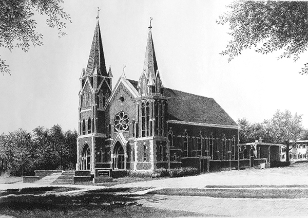
http://www.watercoloursforfun.comSeptember 4, 2018 at 5:43 pm #687924Well done. Very nicely rendered.:thumbsup:
Mark.
-Don't sweat the small stuff...September 5, 2018 at 10:47 am #687920Thank you, jtomasella! I think I do, from time to time.
Thank you, John! I sometimes try to get the crop and white balance taken care of before I post. I’ve been pretty crammed for time recently and been skipping steps. I like the strong verticals of some churches. Especially when contrasted(enhanced?) to what is around them. My cross-hatch is kind of sloppy and weakens the sharpness of the verticals (and horizontals). I think I need to keep this in mind when I choose my subjects. I would have liked to see more of a contrast between building and trees. I think a little cleaner edge in areas would have enhanced that contrast and made the church pop out more. I’m mostly happy with it. It just gave me more ideas for next time.Thank you for your comments!
September 5, 2018 at 4:10 pm #687925September 6, 2018 at 11:46 am #687917I really like the contrast. Very good.
September 6, 2018 at 8:34 pm #687926Really nice work. Is it an old church?
C&C always welcomeSeptember 6, 2018 at 10:59 pm #687927Really good job.
Subrata
Life was beautifulSeptember 7, 2018 at 10:06 am #687921Thank you very much for the comments. I really appreciate them. I’m not sure how old it is. I’m not from around there. (I live about an hour and a half south) I went there once to drop some work off at a gallery and some one told me I should walk around Mason City and look at the architecture. It is a fascinating community. Frank Loyd Wright designed two buildings that are located there as well as a couple other fairly well know architects, I believe. The reference photo I used to draw this from was from 2010,
September 7, 2018 at 10:09 am #687922The George Stockman House – 1908 and the City National Bank and Hotel – 1909 (Park Inn, I think it may be called now).
September 9, 2018 at 11:01 am #687918It’s a very good drawing and any (very minor) flaws in the perspective are not really noticeable …….. we are our own strictest critics!:)
Cheers, Maureen

Forum projects: Plant Parade projects in the Florals/Botanicals forum , WDE in the All Media Art Events , Different Strokes in Acrylics forum .September 9, 2018 at 10:11 pm #687923Thank you, Maureen! Yes, I believe you are right. It helps when others can find the beauty that we ourselves sometimes over look. I did really enjoy drawing it. Thank you very much.
-
AuthorPosts
- You must be logged in to reply to this topic.
Register For This Site
A password will be e-mailed to you.
Search