Home › Forums › Explore Media › Pastels › Soft Pastel Learning Center › November ESP: Shadows
- This topic has 20 replies, 10 voices, and was last updated 19 years, 5 months ago by .
-
AuthorPosts
-
November 7, 2004 at 3:09 pm #448162TheShadows Know HAhaHAhaHA!
Shadows are the drama queens of pastels. Oh, we can give highlights their due as the Divas, but it is the shadows which allow those highlights to sing out, and the shadows which give the Divas a place to shine from, as it were. So often overlooked, shadows will then give us problems, tell us- and the whole painting- their woes, because we aren’t paying enough attention to them.
Shadows aren’t just oddly-shaped passages of black or gray, nor are they simply a deeper value of local colour, shadows are just as important a figure in a still life composition as your center of interest. And it is shadows, moreso than highlights, which define form and volume: An artist can lay a highlight juuuust right, but if the shadow isn’t there to support it, that highlight makes but an “eeep!’ of interest.
In still life, form and volume are important, because still life is dependent upon the objects portrayed more than the vista and depth of a landscape. Using a simple egg, for example, let’s look at the role shadow plays in th4e still life genre.


There is obviously a lit side, a shadowed side, and a cast shadow which all give us the appearance of an egg form with volume, or 3-Dness. In grayscale, it is easy to see this is simply a function of value, but when we are working with colour, hue and tone take on roles which are equally important. Reams has been written on the properties of light and colour (and if you think you know it all, go hang out in the Color Theory Forum for a few hours- they’ll make your brain ache), but the best “rule of thumb” is that shadows are usually cool, because light is usually warm. (Note the word “usually”- it is not always so, especially when working with water, reflected light, or under certain indoor-lighting conditions). Now theories are all well and good, but you cannot make art by committee; when push comes to shove, it’s what you, the artist, sees.
In pastel, the critique most often heard is “push your darks!”, and with the papers we have available to us today, (yep, I’m thinking Wallis here) there is no reason not to start just a smidge darker than you think necessary- it is far easier to lighten a dark than to darken a light. So, let’s see what we can do for this egg.

You can see in grayscale sketch both the strength of the light source and the direction- these are important, they give your piece “believability”. Naturally, things closest to the light source will be lightest- even the background- and the direction must be consistent throughout the piece or viewers end up visually confused (unless you’re really, really good at pulling off multi-light source work). Note the areas of reflected colour- we’ll need to give those areas special attention.

First, get the background in. It’s all well and good to plan it, but until you can SEE it on your ground, you will have trouble judging your other tones and colours. Note the consistent light source already.

Now, it’s easy enough to “colour in” highlights- most of us do that quite naturally, going gradually lighter and lighter, but with shadows, that seems to stump us. It shouldn’t- it’s the same thing, just in darker colours. I’ll start with a medium dark blue, and then glaze over it in a darker red. Using a bit darker value of the local colour layered and glazed with blue gives me a nicely transparent shadow area. Again, and again, until I have the shadowed side defined. See how it works? Where I have a reflected light, I glaze over local colour on the very top, where I have a darker shadow- up close to the egg- I glaze the dark blue on top. We can see in the reference the shadow is crisp-edged near the egg, and then softer-edged farther away, so let’s scumble a bit of local colour over that edge to soften it. Ta-da! It works, too!

The side of the egg is worked the same way: Blues and local colour, glazed in layers, and I pay careful attention to that very dark neutral part of the shadow- there’s blues, greens and lavenders in there. The reflected light gives that side of the egg a bit of a glow, and to me, glow = yellow, so I’ll try a medium orange glaze and more local colour. Clean up the edges a bit, make sure I’m dark enough and fading that side shadow enough to indicate form, add a nice white highlight and Ta-da!!

We’ve painted an egg!!
Shadows also often have a penumbra– a ring of lighter or different hue- around them. This is especially noticeable on skin- there’s usually a thin line of red marking the shift from shadow to lit. It is also seen in still life with strong directional light, and high chroma, or bright colour. Often, this penumbra is overlooked, or absorbed into the guideline of shadows becoming more transparent the farther from the object casting them, but in many cases, making sure you include that penumbra contributes to the overall effect of the piece.

The shift of plane in a still life will also influence shadows. Where a shadow reaches a wall or other object, and crawls over it, there will be a definate shift in direction; in curved objects, especially, it is helpful to exaggerate this just a bit so the different objects’ form and volume, and the depth of the plane, are given their due. We’re talking milimetres here sometimes, such a small increment, it is hardly noticeable unless you are looking for it. Look at the information given just because of this plane break.


And here, the “roundness” of the clear glass is more apparent because of the subtle plane break and curve in the shadow behind it
Very often, you will hear about “reflected colour” in shadows. Be careful with this idea: If you don’t see it, don’t try to put it in wily-nily. Reflected colour seems to have a distance/comfort zone: If an object is casting a shadow very close to itself (as in, say, less than an inch from a wall) there is very little reflected colour there- odd, but true. This seems to be because the shadow is very dark, there’s not so much room for the light to bounce around picking up colour and casting it elsewhere. It’s also a function of the strength of the light- weak light gives far less reflective colour than strong light. Better to concentrate on making the shadow transparent by glazing your “shadow” colour with your local colour. If you do see reflected colour, it is usually in or near the penumbra area surrounding the shadow, or defining a plane break. Conversely, if an object is casting a very long shadow, the reflected colours seem to be so mixed up, they just become grayed; so keep an eagle eye out for just where any reflected colour is placed. Also, the reflective nature and colour of the object’s surface must be taken into account- a metal or smooth/polished surface will undoubtedly reflect more colour than cloth or a rough, highly textured surface- that’s a physical characteristic of different textures. Light objects tend to pick up reflected colour more easily than dark. Of course, the more complex the set-up, the more planes light has to bounce itself off of, casting reflected colours, shadows and highlights- as always, look, and look, and look again, so you are aware of what colour is where.
Deborah should be along here pretty quick to show you how shadows work in a landscape- and then we’re going to come up with some lessons for y’all- I think. We’ll see.
November 7, 2004 at 5:33 pm #492079Julie, what a great explaination of shadows! This is something that I really need to work on, so appreciate you taking the time to do it. The simplified shape of the egg helps to give clarity to your discussion. Thanks, so much. I will look forward to the rest of the thread.
Kathy
 November 7, 2004 at 5:42 pm #492085
[FONT=Century Gothic]Thanx Julie…Very well explained.[/FONT]
 [FONT="Comic Sans MS"]
GLASS DEMO
"Love art... Of all lies, it is the least untrue." - Gustave Flaubert, letter (1846)November 7, 2004 at 5:47 pm #492086Whoa–Julie, thanks! You have done a terrific job describing your part of this!! Great descriptions and illustrations…
Here’s my part, on obvserving shadows in the landscape.
_________________________In landscape painting the source of light is clearly the sun, warm and yellow, casting shadows across the land or other planes of the earth. Because we have only one sun, shadows are cast in only one direction. However, sunlight may be direct or reflected, which can account for the mystery of shadows. Reflected light can add delightful complications, causing variations in angles and colors. Look for the mingling of sharp, crisp shadows created by closer objects and the fat, rounded shadows from those farther away.
To paint the fine distinctions that can be found in shadows you must first select their proper values. Look for the variety of shadows from the deepest crevice to the most insubstantial whisper of shade from a distant cloud. Gaze into the light area and analyze a shadow’s value using your peripheral vision to perceive correctly the proper tone of even the most delicate shadow. When you stare into shade your pupils dilate and your eyes adjust to the dimness so that over time you can almost see in the dark. Make use of your peripheral vision even when using a photograph, to aid you in seeing the values more accurately, but be aware that the photograph is at best inaccurate. If you rely on photographs to decide the value of the shadow you can easily be led astray. The camera is a far less sensitive instrument than the human eye and averages the available light, resulting in overly dark shadows. Take time to look at shadows, recording their values in your mind’s eye, rather than copying a photo. That way, when you use a photograph you will remain independent of it and remember the relative transparency of shadows.

Here’s an underdrawing that will show you some things to look for in the values. It’s on Wallis, a piece that has been wiped clean of another image causing the stains you see. I did the drawing in extra soft thin vine charcoal and a pale gray pastel pencil.When painted correctly, a shadow does not look like something that has been laid over an object but is an integral part of it. If the shadow looks like a sock draped over the wall it needs to be more transparent. Only in the deepest darkness are shadows so thoroughly black as to become opaque, and those are usually found outside night. The value of a shadow becomes progressively lighter as it travels away from the thing that is casting it. This means that shadows are darker where they originate and lighter where they end, due to the addition of light reflected from the sky or ambient light in a room.
As a broad generalization, the shadow side of an object is somewhat darker than the shadow it casts, due to this addition of light in the horizontal plane. However, this can be affected by the local color of the object, so that a white wall will not be as dark as the shadow it casts on green grass. Shadows are subject to the laws of aerial perspective, and so become lighter in value and cooler in color with distance. The shadow of a cloud cast at your feet is darker than the shadow of the cloud on the distant mountains.
To keep your shadows colorful but believable try this recipe: 1) imagine the local color of the object upon which the shadow is cast, 2) slightly darkened by the shadow and 3) somewhat blued by the sky. This recipe will work for you as you begin to paint shadows, but as with any recipe, you should flavor it so that it becomes your own. Any good cook knows that the recipe is a great starting point but it needs the personal zest or subtle variations of the chef to make it special. Do not slavishly adhere to it; add a few dashes of colors of the correct value to spice up your shadows a bit.
Oftentimes what color to use to begin can be a difficult decision. What color is that wall or the sidewalk in shade? It might help you to settle on the color of the object in sunlight before trying to determine the color of the shadow. If the wall is pink, darken it slightly, add a little blue and you get lavender. If the wall is yellow, darken it and add blue: green. White? Darker and bluer: light blue. You get the idea. Remember, however, that a yellow wall does not become a green wall just because it is in shadow. You must always be sure to add a bit of the local color, in this case yellow, into the shadow area selecting the proper value.
If you are still having trouble choosing a starting point, try standing back from the subject and simply naming one color. Walk away from the shade or a few steps off from your photograph. Name a color on the color wheel. Purple? Green? Remember that gray is not on the color wheel, nor is brown. With distance you won’t see as many of the nuances of color and will be better able to name one simple color to use. Once you name it, run to your easel and find that color and begin there. Start with a color, then flavor it to make nuances of gray or brown, if necessary, or retain the freshness of whatever color you choose, as long as it is the correct value.

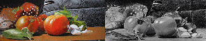
Notice the layering of colors on this pathway, rooted in the color of the dirt in sunlight–but colorful!Some people see the color of a shadow as complementary to the color of the plane on which it is cast, an idea made popular by the Impressionists. Of course, if you stare for a long time at any color you will begin to see its complement as an afterimage. This can work beautifully, but need not be a hard and fast rule. Be adventurous and try different combinations of colors to see how they work.
Closely examine the edges of shadows. Sometimes you will see a slightly warm quality there, due to the afterimage, which leaves a halo of complementary color along the edge. This might suggest some great color ideas to you as an artist and result in exciting shadow colors. At their simplest shadows on the ground could be described as basically cool in color because the cool blue of the sky is injected into them. Shadows on any vertical plane, such as the wall, are often somewhat warmer in color because light reflecting from the ground may bounce into them. The idea of a recipe, therefore, is only a suggestion to help you begin. In fact, shadows are complex and varied, and the colors used are creative decisions that every artist may choose.
Remember that shadows have no independent shapes of their own. They show 1) the shape of the thing that casts them and 2) the shape of the thing upon which they are cast. If a shadow changes direction or shape, either the ground it is crossing is causing it or it comes from the object casting it from above. It changes for a reason.

For instance, notice how the shadow licks up and around the post near its base, then flattens out on the ground plane, and in turn angles up the wall to the post that’s casting the shadow, where it is darkest.Shadows are crisp and detailed at the root and softer at the end. The farther a cast shadow travels the softer and rounder its shape becomes. The reason for this is the round shape of our sun. This may be easier to understand if you think about sunspots, where light peeks between the leaves of a tree and is cast onto the ground. These spots will be rounder in shape the farther the sun travels before it hits the ground. The shapes of the leaves will be more apparent the closer they are to the wall. The sunspots will, conversely, appear rounded if the leaves are far away from the wall. This is because the gap where the sun shines through forms a kind of atmospheric lens that focuses the light in the shape of the sun, which is what accounts for the rounding of shadows with distance. In fact, if you examine shadows and sunspots during an eclipse of the sun, the shapes change to mimic the sun’s shape. The next time there is an eclipse, rather than looking at the sun, pay attention to the shadows cast on the ground. It is remarkable to find crescent shaped spots and shadows there.
________________________________________
Your assignment, should you choose to accept it (oooo, dating myself here. If you recognize this statement you’re older than dirt!), is to show us your shadows.
Paint an egg, using the same egg photo as Julie or another one you find in the RIL or one you shoot yourself. (Let’s not snag her other photos shown here without specifically asking to paint them, okay? Thanks…)
Or paint a landscape that has some shadows in it, from a photo or from life, and show us your results.
We’ll be happy to critique your shadows and see if we can help you learn how to do it, encourage you when you do and move us all on to a better understanding of them.
Also, for a really good discussion on shadows that was in Pastel Talk recently from Jackie Simmonds, see this thread: Seeing into Shadows
Hoping to see your paintings soon! The Shadows Know HAhaHAhaHA!
Deborah
Deborah
"All glory to Him, who alone is God our Savior, through Jesus Christ our Lord."
Landscape Painting in Pastels (free online book)
Gouache BlogNovember 7, 2004 at 6:08 pm #492080Here are a few ranging from right there for you shadows, to difficult to read:


Have fun- that’s what this is about.
November 7, 2004 at 6:53 pm #492087Here are a few landscape possibilities for you, too.


Have fun!
Deborah
Deborah
"All glory to Him, who alone is God our Savior, through Jesus Christ our Lord."
Landscape Painting in Pastels (free online book)
Gouache BlogNovember 7, 2004 at 9:10 pm #492084Whew, I think I need to print this out! What a wonderful classroom! I almost didn’t see this guys, so I “stickied” it for you.
This is going to take some time to digest – but will be back later.
November 7, 2004 at 10:01 pm #492088Oh, thanks, Kat! I forgot to let you know this was coming up! (Can I use frantically busy as an excuse?)
It is a lot of information, isn’t it?
 Remember, if you print it out you have to paint something.
 Deborah
Deborah
"All glory to Him, who alone is God our Savior, through Jesus Christ our Lord."
Landscape Painting in Pastels (free online book)
Gouache BlogNovember 8, 2004 at 1:04 pm #492098I think i need to print this out as well. I’ve often had a problem with shadows..great post
Sam"I tell you, the more I think, the more I feel that there is nothing more truly artistic than to love people" - Vincent Van Gogh"
November 9, 2004 at 3:05 am #492090Julie, Dee..you two make a great team. Ya’ll have given a healthy dose of info with excellent visuals
(penumbra…never heard that term before, but will start to incorporate it in my dialogue. Webster uses the moon in an eclipse as an example for the non painting public)
November 9, 2004 at 6:02 am #492096Here is some great advice!! Thanks!
Julie, can I have a bigger version (A4 size) of the 3rd picture (the one with the 2 cups)? I want to print it out and then paint from it. Thanks in advance!
November 9, 2004 at 11:39 am #492081Very glad Y’all are finding the information helpful and hope it makes so much sense you just start incorporating it naturally into your work. Deborah’s “recipe” for shadows works very well in nearly any lighting situation- all you have to do is LOOK- squint, glance, skim- and you’ll start seeing a shadow is a very complex part of our visual world.
Cheena, I cannot upload anything bigger than that here, so send me a pm with your email addy and I’ll see what I can do. But I gotta tell you, it’s better to use the smaller pic- if you use the large version and trace it, firstly it’s not plumb, and secondly, you’ll be painting the photo, not the painting. Using the smaller one forces you to look, to see, and to use your brain in that slightly different way to achieve true artistry.
November 9, 2004 at 3:49 pm #492091Cheena..that still life caught my eye too. Go for it!!!! I know you will do a great job! (btw…has your friend visiting from the USA brought you your new pastels yet????) You gotta show us when they arrive!
November 10, 2004 at 12:19 am #492097Cheena..that still life caught my eye too. Go for it!!!! I know you will do a great job! (btw…has your friend visiting from the USA brought you your new pastels yet????) You gotta show us when they arrive!
Yes, Preston! My colors have arrived!!!!!!! I haven’t done much pastelling recently but I really want to do this one.
Julie, I don’t mean to trace the picture (I never do that

But a bigger print is always better…It just makes me happier November 17, 2004 at 7:20 pm #492093I’ve started doing no 1…printed it out, drew the outlines of the cups and things…started to fill in the background by matching the colour of the photo….went to do the table….knew that I could only see black, therefor had to lighten it to see what was there…and it’s a whole new background I need because mine’s a mid brown…yours is pale! What should I do?
[FONT="Tahoma"]Regards, Deirdre (Always pleased to get C&Cs!) Don't forget - comment on other threads in the forum as well as posting your own work - also, we encourage you to post WIPs, they help others to learn as well as you.
 Moderator[/COLOR] [
 -
AuthorPosts

- You must be logged in to reply to this topic.
Register For This Site
A password will be e-mailed to you.
Search