Home › Forums › Explore Media › Printmaking › Borders on lino reduction prints
- This topic has 15 replies, 9 voices, and was last updated 7 years, 8 months ago by
 Blayne.
-
AuthorPosts
-
March 12, 2015 at 1:56 pm #992793
Hi everyone,
I’m currently working on my 2nd ever lino reduction print and even with registration pegs, I’m a little off on some of the prints. I still have 3 colors to print so I have time to come up with a decision.
I was wondering what peoples opinions are of printing a border that would hide the registration errors along the sides. I’ll admit that I’m not all that into placing borders around prints unless it’s something I’m initially carving and have done it on purpose. Of the reduction prints I’ve looked at, hardly any include borders.
Any opinions on this topic would be greatly appreciated.
Douglas Thomas
https://www.etsy.com/shop/DougJenThomas
http://dougthomas.blogspot.com/
https://twitter.com/dwtanimatorMarch 17, 2015 at 6:27 pm #1221284Doug… i have t otell you that you are braver than I am. While I’ve done a lot of reduction prints, they drive me crazy…. especially on the thrid or fourth color. you’ve got all of that work and effort into colors one, two and three….. then you botch the block while carving color number 4, and you’re screwed. (not that it’s ever happened…. but it COULD happen.)

Anyway- about the borders thing: using a border to hide misregistered registration marks is often considered to be "cheating" by the Holy Printmaking High Priesthood, since it allows you to attain what appears to be perfect registration without having to suffer a sufficient amount AND as soon as you do, it’s no longer a real reduction print, now IS it? ;( of course not! now it’s a two-block print.
SO… If you want to attain a higher state of being, then it’s an absolute no-no and probaly a slippery slope that will lead you to the Printmaker’s Inferno.
BUT if you are like me, and have reached whatever state of being suits you…. then sure, go ahead and use the border. Of course I can neither confirm nor deny IF I’ve ever done that.
"Political Correctness" is just another way to muzzle free expression
March 19, 2015 at 11:14 am #1221287HAHA thanks a lot. I’ve definitely heard that it is a major no-no to do, but I’ve been told by others that it doesn’t matter.
I was originally leaning towards making another block with a border originally, but I went to a local shop that carries local artists and was checking out prints there and noticed mis-registration on almost all pieces. That actually made me feel better about not having perfect registration.
Your input is greatly appreciated though.:thumbsup:
Douglas Thomas
https://www.etsy.com/shop/DougJenThomas
http://dougthomas.blogspot.com/
https://twitter.com/dwtanimatorMarch 20, 2015 at 1:08 pm #1221288This is the final piece and I’ve decided to go borderless with it.
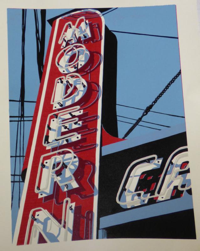
Modern Cafe – 18×24 Reduction Linocut.
(Image is slightly distorted because I took the picture at an angle rather than straight on).This was the piece I just finished. It is of the Modern Cafe which is located in Pittsburgh, PA. It is my first ever 6 color reduction print. The only other reduction print I’ve ever done was a 3 color and much simpler than this piece.
I do like how it turned out, but it has some small registration issues that I wish were non-existent.
Douglas Thomas
https://www.etsy.com/shop/DougJenThomas
http://dougthomas.blogspot.com/
https://twitter.com/dwtanimatorMarch 20, 2015 at 2:37 pm #1221283This has a very nice clean look to it. Without reading about your registration problems, it looks finished and classy. The shadows probably do a lot to camouflage any minor registration issues.
Definitely a print to be proud of.
March 21, 2015 at 10:15 am #1221289Thanks Diane,
Glad to hear that you think it looks nice. I’ll admit that I was shooting for perfection and was initially disappointed when it didn’t occur, but overall I’m really proud of this attempt.
I’m going to attempt another one of a similar subject matter….now all I have to do is locate the subject matter.
Douglas Thomas
https://www.etsy.com/shop/DougJenThomas
http://dougthomas.blogspot.com/
https://twitter.com/dwtanimatorMarch 27, 2015 at 11:23 am #1221285Hi Doug…. that is quite a nice print. I have one question: what was the sequence of your colors and reduction? I don’t see how you could do the red color with a purely redution method unless the ink was absolutely opaque…. but the faint white line between the red and black at the triangular corner, and the lack of any red miregistration where the black was overprinted seem to indicate that’s not how it went together.
If I were to print that, I’d either do a blue / black reduction….. then a second block for the red, and so forth…. or visa versa.
I’m not trying to be critical since the image is great. I just don’t understand how it could go together with just a reduction technique.
"Political Correctness" is just another way to muzzle free expression
March 28, 2015 at 12:09 pm #1221290This is a straight single block reduction. The colors went in this order:
1.) Gray (neon tube color)
2.) Red (pretty self explanatory)
3.) Sky Blue (sky…this actually had to be printed twice because the red was showing through)
4.) Shadow Blue (darker than the sky blue and is the shadow of the neon tubes on the white letters)
5.) Shadow Red (semi transparent darker red that is the shadows on the red parts of the sign.
6.) Black (everything else that remained)I printed red second because I wanted it to really stand out. The sky blue color is simply white and prussian blue. On my first reduction print I did I printed the sky first (similar color to this one) and I’m assuming due to the innate transparency of the red (assuming of course :confused: ) it turned out maroon. Since I did not want that to happen I took a chance at printing the red first. I figured that the white mixed into the prussian blue would be fairly opaque….and it was…it just required a double printing of that color.
Also…the white is simply the color of the paper.
Douglas Thomas
https://www.etsy.com/shop/DougJenThomas
http://dougthomas.blogspot.com/
https://twitter.com/dwtanimatorMarch 28, 2015 at 12:58 pm #1221293Hello Doug,
I use Kento registration for my reduction prints. It works really well and I don’t seem to have problems with registration. The only downside is that your kento registration takes up some of your surface space, you have to factor in a border if you want one and paper sizes have to be somewhat larger so you can trim off the Kento’s. Also you have to be really careful when carving the kento’s so your design isn’t affected. Seems hard at first but I’m happy with the results.
I’m still learning but the kento registration seems to be the best for me over pin registration. My first reduction piece was on wood as a bleed print and my second is on linoleum with a 1″ border. So far my registrations have been pretty accurate with just a minor amount of miss registration which I attribute be getting in a hurry when placing my paper in the kento’s
Hope this helps.
May 7, 2015 at 11:27 pm #1221294No borders!
September 29, 2015 at 2:03 pm #1221295Doug
Very nice picture. I think ‘no border’.
Seven layers of ink.
Have you had problems with repel of ink on the underlying ink layer?
I have that problem at printing of three or more colors.October 1, 2015 at 11:37 pm #1221291I had some minor issues with the ink, but it wasn’t too bad.
My biggest issue came from the red. It didn’t want to lay nicely on top of the other colors. The first 2 I pulled had issues so I stopped and bought a different ink and that seemed to fix that problem.
Douglas Thomas
https://www.etsy.com/shop/DougJenThomas
http://dougthomas.blogspot.com/
https://twitter.com/dwtanimatorOctober 6, 2015 at 1:45 pm #1221286Very nice print! I rarely follow the “rules” with my stuff. I think it looks great borderless.
Would you please share the inks you used?
Thanks,
.
August 9, 2016 at 5:52 am #1221296I think i just saw some of your work the other day on Artsy?
Very nice stuff.August 13, 2016 at 10:50 am #1221292You probably saw Dave Lefners stuff on there. He is one of my inspirations for doing these linocuts.
I pull a lot of inspiration from his style as well as from Ron Donoughe who is a plein air painter from Pittsburgh, PA. I’ve tried very hard to be a good plein air painter and have taken multiple workshops with Mr. Donoughe, but a part of me, somewhere in my head…doesn’t like working with paint brushes. I do like to, but ……I’m not really very good….at all.
When I discovered Dave Lefner I found that same urban plein air look due to the sun and shadows and found a new outlet for my desire to make art that my mind would accept. He’s not the only one who does this same style, but he was definitely a catalyst for some of my prints.
Douglas Thomas
https://www.etsy.com/shop/DougJenThomas
http://dougthomas.blogspot.com/
https://twitter.com/dwtanimator -
AuthorPosts
- You must be logged in to reply to this topic.
Register For This Site
A password will be e-mailed to you.
Search