Home › Forums › Explore Media › Oil Painting › The Technical Forum › MUNSELL´s SCALE SYSTEM
- This topic has 125 replies, 46 voices, and was last updated 15 years, 4 months ago by
 Marigold.
-
AuthorPosts
-
November 1, 2008 at 7:31 pm #989057
This copy of thread has been trimmed down so as to present a clearer viewpoint on Munsell. The original thread contains a lot of dissenting opinions interspersed, which makes it harder going for readers unfamiliar with the core concepts. The original, unedited thread (also well worth reading!) is on the main Oils forum here: https://www.wetcanvas.com/forums/showthread.php?t=527396
Dave (dcorc)Hello there everybody!
Have been reading about this very rational method of painting, based on the Munsell´s scale of colors (rationalpainting.org). I would like to know the opinions of those who already tryed to paint with this system.
I was considering, as a try out, try to use the value scale, and study this system with just values first…
I tryed to talk more about this on this other website, but people over there are way too much enthusiastic about it, so… well, what the hell, i still think WC! is my place after all… i feel more comfortable here, thats all…
Any input would be really great!
Thanks!
ALEXNovember 1, 2008 at 11:15 pm #1148146Pardon any inaccuracies herein, but I beleive Munsell was an artist/color-theorist from Boston who derived a method of codifying colors more systematic than the heretofore, and still popular, Spectrum Method.
His color theories became popular consequently, and in the last century, at the Art Students’ League, a very popular teacher, Frank Reilly, also a renowned illustrator, came along. He taught respectively, both his own method of drawing and painting: the “Reilly Method”. In his painting teachings, students employed a controlled palette, or pre-mixed one, values 1-9. It had rows of grays, reds, and yellows, so ideal for mixing flesh. Obviously, these many piles can only be maintained by adding clove oil to ’em. I know one of Reilly’s erstwhile students who actually had his students instead tubing ’em. Whatever one’s views on his means, Reilly was an incredibly succesful teacher.
This class was immensely popular, so doubtless you may find a number of his students, or students of his students teaching even today. There are a number of books by his past pupils out too. If you really wanna learn more about Frank Reilly, search him out on any Search Engine. Don’t worry, you’ll find stuff, easy.
November 3, 2008 at 6:31 am #1148022Hi Alex, there are many prior threads that mention Munsell that would be worth hunting down.
Munsell’s system uses black to tone down the colour.
I believe your better off add a complimentary to get the tone.
Munsell isn’t a mixing system (I agree that using mixing complements is best, most of the time BTW). At its heart it’s just a way to define colours accurately – at a fixed hue, what’s the chroma and value? – by comparison. This is what makes it fundamentally too cumbersome for most people.
You do find users who think of colour in Munsell terms using neutral greys for neutralising, rather than mixing complements. A few of these will claim that using greys is a better way of working but overall this is a philosophical position, since there are clear exceptions.
Essentially if you can get to the colour you’re aiming for in an efficient way it doesn’t really matter how.
Einion
Do you know if your colour is off in hue, value, chroma... or all three?

Colour Theory & Mixing forum WetCanvas Glossary Search Tips Advanced Search Acrylics forum Acrylics - Information Kiosk
November 3, 2008 at 8:35 am #1148166Hey guys!
Einion:
Essentially if you can get to the colour you’re aiming for in an efficient way it doesn’t really matter how.
That seems to answer it in a rather “time saving” way. Thanks for your input.
I saw some people doing this value exercise where they try to paint this MDF´s wooden balls with the exact munsell value in each ball. They use it as models for painting, and also, use some MDF´s strips, also painted with the exact munsell values to help them SEE the values theorically in a more accurate way. It´s very interesting. I guess this is the method invented by Frank Reilly, as Ribera mentioned… The problem is the PRICE of the Munsell books, and the time you spent tubing these values and making all these stuff… you could very well be painting instead of that… i dont know… anyway, thanks for your input, always very useful and clear!Ribera:
Thanks for all the info on Frank Reilly! Really interesting!November 3, 2008 at 11:41 am #1148077Bill — I was going to stay out of this, but I feel the need to rebutt a few points about the RP forum and practical uses of the Munsell color theory.
Bill, I know you are a very atypical artist, coming from a commercial printing background, and as such have a wealth of first-hand information on colors, dyes, inks and such. I also know your personal painting style, and that is most commonly high chroma paintings featuring glazes, not the opaque method presented in the Munsell-based techniques presented on RP.
As Einion correctly stated, “Munsell” is a system of notation for identifying colors in the medium of paint/pigments. This could be considered the definitive “color space” of pigment and and paints, and the accepted industry standard.
The system has been employed by various artists to create strings of color along the color axises of Hue, Value and Chroma. Usually these strings are limited to the main subjects of the painting at hand, spanning the range of values from dark to light — within that painting or small section of painting.
Painters who specialize in certain subject matter, such as portraits, may wish to mix up large amounts of their most commonly used strings, which center along the fleshtone range. Very, very rarely does a painter attempt to tube a wider range of colors in values strings. As I mentioned earlier, most strings are limited and created at the time of use, and don’t take much time to prepare. I haven’t read any advocacy for “busy work”, only mixing strings as needed (with the exception of a few enthusiasts).
Most painters can immediately benefit by mixing and tubing a value string of neutral greys, for later mixing into colors on the palette. Here again, having the accurate Munsell pre-made color chips is invaluable to create consistent color (even neutral grays) without introducing color shifts, which would taint all future use after going through the trouble and expense of tubing your custom set of paints.
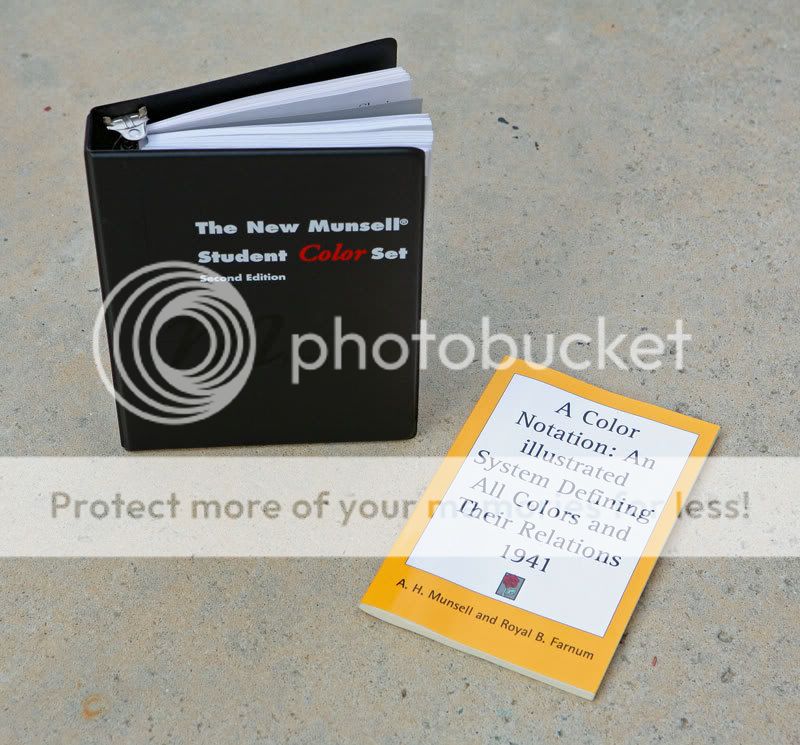
I have the relatively inexpensive Munsell Student Color Book and am about 1/2 way though. I’ve previously read the pamphlet-type book “A Color Notation:. . .”. The Student book provides a limited range of color chips, but enough to have a basic reference. The large Munsell book is pretty expensive, but somone serious about their color should have it, and I plan to eventually get it myself, as I do consider myself pretty serious about color and its presentation. So far, I am more of an explorer myself in the Munsell world, and not coming here to make you all into believers. But misconceptions abound, and I feel the presentation should be balanced to give a clear idea of the overall subject and it potential usefulness in painting.
Here are the two introductory books mentioned above. The Color Notation book is from 1941, but Student book is the Second Edition from 2001 and goes into extensive detail about all color theories and science, including computers and monitors. The Student book has plenty of exercises, including attaching all the color chips to the pages for reference. I think the value can be seen from looking at these pages of various hues, without even breaking into the color theory:
The point is really what works for you and what is most economical of your efforts as an artist. If painting transparently appeals to you, the Munsell system of notation, and techniques of opaque painting, may not appeal to you. But I do think all artists can benefit from the method and doing execises in mixing and value strings of colors.
The two books mentioned above are fairly inexpensive and can often be found on eBay.
I advise all artists to investigate the source materials for themselves and come to their own conclusions regardless of the pros and cons presented here. For those more serious painters, I would suggest applying to join the Rational Painting forum for more information on how the Munsell color notation is being put into practical terms by artists.
November 3, 2008 at 6:59 pm #1148079Bill — the Student Book is an advanced studying course in color and color theory. It not only covers the Munsell notation, but more importantly explores the evolution of color theory, color and art history as it applies to pigments, scientific conclusions, and a great deal more than “color mixing”, as you would know if you had bothered to crack the book open.
The book is full of practical exercises, rather than being restricted to airy theories and opinions. The reader/student can have practical hands-on learning at every chapter. It is not a piece of fiction one can simply skim through, so taking time to comprehend and interegrate the knowledge is not something I am taking lightly. I have been on the periphery of much of this Munsell information for quite some time now, slowly warming to the concepts. I would say the paintings I’ve done over the last two years have been influenced by my studies in Munsell as well as Faber Birren, Josef Albers and M. E. Chevreul.
What is the point of studying art and color theory? I would think improving one’s understanding and gaining practical results would be self-evident.
Having read quite a few books on color theory, as well as art history and technique, and I can easily say this Munsell Student Book is one of the most clear-cut, accurate and least opinionated I have come across.
Regarding tubing your own custom set of neutrals: My point is that it is an easy and worthwhile venture to mix a set of neutral greys in the range of values used in normal painting. But doing so without a reference guide is most likely to result in disaster, producing a bias set of near-neutrals, which can thereafter taint any colors they are mixed into. For that reason, the Munsell neutral chips are a simple and practical cross-check as you do your mixing, before tubing. I don’t think it is too eccentric to make 8 or 9 tubes of neutral grey paint that will always be on hand and remain consistent for any blending needed. Why that seems like a unusual investment of effort, I can’t imagine.
On the same subject of a string of neutral greys: I learned one time saving point already on that in the Student Book — to make the mid and lighter valued greys, it is recommended to add Burnt Sienna (naturally different brands vary, as well as coming from genuine earth color or synthetic pigment). This was perfect in matching the grey chips. Otherwise my mixtures would have been too bluish (Blockx Mars Black). I already knew from reading postings by Graydon Parrish that the dark greys and black needed to have Burnt Umber added, which I did to positive result. A whole thread could easily be developed in this subject alone.
The point of my suggestion to pre-mix a set of neutral value scale is not directed to a specific painting I am doing. The concept is no different than the asset of having a good set of paints — allowing a specific paint to be used when needed. Is that more clear? If I were painting portraits, I’m sure I would have a tubed series of values for two or three hues constantly needed for fleshtones. But I am not a portrait painter and so haven’t invested that time. But if I were, to tube them in advance of continual use would be an important time saving device.
“Plenty? Exercises? Attaching color chips to the pages, for reference? How much more “busy” with “busy work” can it get? ”
The Student Book is not a class or seminar being driven by the blah-blah-blah of some painter/instructor’s opinions and anecdotes. It is composed of theory chapters, with summary, followed by practical exercises at the end of each chapter. I’ll admit, attaching the chips is somewhat a drudgery, but the chips need to be attached, and I would rather do it as an exercise, than pay a higher cost for the book by having it done at a factory. The systematic approach and color chips sorting is not all drudgery, more like doing a crossword puzzle for mental stimulation, which I didn’t mind at all. There seems to be a benefit from such repetitious hands-on work that can’t be gained by reading or hearsay. Or a droning instructror.
I’ve been spending a short period each day for the last week or so reading and working through some the assignments. I’m under no pressure to finish in record time, and I have no one to please with my understanding, other than myself (and a desire to communicate coherently about the subject).
Your comments make it sound as though I don’t paint or incorporate my understandings into my paintings. And I know for a fact you’ve seen my work, so I can only take your comments as belligerently rhetorical. There are certainly paintings to see on my website if anyone cares to look http://www.jimharrisart.net
I think it will be clear to anyone looking for the first time that I am fairly acquainted with color and color theory and put the knowledge to practical use in my own way.The Munsell books are not a be-all-end-all of practical color theory, but they are an important contribution that all artists should be familiar with. And — it is the title of this thread.
November 5, 2008 at 4:52 am #1148045Does the mentioned student book go into the actual mixing and pigments?
Yes and no – by which I mean that there is a great deal of useful information in the student book (see Gunzorro’s more in-depth report, above), including information on approaches to mixing paint. However, the concepts which Graydon Parrish has proposed, and is developing and exploring together with others at RP, are not covered by the Student book. If you want to see whether the ideas are of interest to you, you might like to take a look at my friend Paul Foxton’s blog at http://www.learning-to-see.co.uk which provides a lead-in to some of the concepts.
in what (important) ways does the Munsell color system differ from the NCS (Natural Color System)
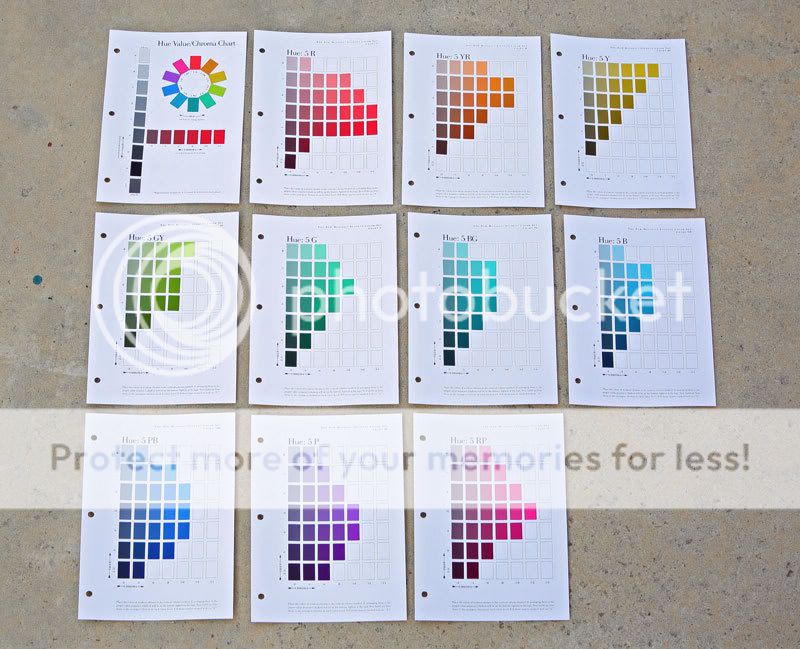
That’s a very good question. The Munsell pages are organised by hue, and on each page, each horizontal row maintains a specific value, and each vertical column maintains a specific chroma (see the pics Gunzorro posted).
There’s a UK site for NCS here:
http://www.ncscolour.co.uk/which is informative about their system, including a glossary of their terminology:
http://www.ncscolour.co.uk/information/glossary.html
I ordered the Munsell-NCS conversion manual, as it seemed to me that was the easiest and most inexpensive way to get a comparison of the two systems. The book consists of two parts – the first is a table listing all the Munsell chips and their exact NCS values, followed by the nearest actual NCS chip in the set and the delta-E between them. The second part is a set of diagrams that map out the munsell chip positions in relation to the NCS pages.
The NCS hues are arranged in the opposite order circumferentially (so the NCS hue numbers go down as the Munsell hue numbers go up ! )

and the relationships between the pages is not straightforward. For example, the pages are broadly, but not completely aligned to a Munsell hue.

Also, while the chip interval-step sizes are broadly comparable, and they do seem to correlate pretty well to the Munsell chromas, the relationship to constant value varies with hue. For example in Y40R the NCS chips series do not maintain constant value (the constant value 5YR Munsell chips here are horizontal in NCS space, but the NCS chips are in series which slope diagonally down in value). However, the G80Y NCS chips do correlate pretty well with Munsell 10Y chips. I think this has to do with the way they have forced the colourspace to have a flat horizontal perimeter associated with highest chroma (a flat horizontal slice through the equator is effectively a prismatic colour-wheel), as compared with Munsells recognition that highest chromas vary in value for different hues)
In short, while it would be possible to work between them, and they could offer help in assessing chroma steps, the varying relationship of the NCS chips to constant-value series, is to my mind, problematic.
I also note that the cheaper index-fan book for the NCS chips, as well as not presenting the geometry of the colourspace well, also are manufactured to a lower colour-accuracy standard than their book-format products (which are similarly, or higher priced, than the Munsell products).
While the NCS system is very well-designed, I think its not so well-suited to this specific purpose.
Part of the idea of using the chip set is that it acts as a calibration set (a sort of GPS, if you like) for colourspace. It provides a scaffolding by which you can actually quantitate (and navigate) where you are in colourspace, and how different colours relate to each other (both in terms of out of the tube pigments, and for example, within subjects, as form is turned), and provides workarounds for problems to do with accurate assessment of value and of simultaneous contrast (a little like the colour-spotting approaches used by photorealists, but taken into painting from life).
It is a tool, and if you are not interested in, or do not need, ways of achieving tight and accurate colour analysis and control, it is probably not something that would interest or be of use to you.
Dave
November 5, 2008 at 5:41 am #1148154Thank you, Dave. This is very helpfull. I already know the NCS system pretty well, and I have had a color chip set for years. It is arranged in the triangles indicated in your illustrations.
I think maybe thisAlso, while the chip interval-step sizes are broadly comparable, and they do seem to correlate pretty well to the Munsell chromas, the relationship to constant value varies with hue. For example in Y40R the NCS chips series do not maintain constant value (the constant value 5YR Munsell chips here are horizontal in NCS space, but the NCS chips are in series which slope diagonally down in value).
is what I need to check into a bit more. I don’t really know the Munsell system very well. At first glance they seemed to be very similar.
November 5, 2008 at 12:02 pm #1148080Dave did a pretty good explanation of the the two systems.
I’m not as familiar with the NCS system, but a couple things mentioned by Dave, jumped out at me as I reviewed NCS:
As indicated, the actual pigment relationships in Munsell start from a bedrock of neutral, then expanded indefinitely along the horizontal axis of chroma. This results in a color sphere that is not so much a sphere as a mis-shapen “potato”, with bulges out near the top values for yellow and abbreviated depth at lower value for blues. The red chroma bulge is more central and extends a greater distance. The NCS system has chosen an arbitraty maximum chroma depth for all pigments, and that is not a real-world or mixing reality. Since the Munsell steps are all exactly equal to HVC, intermixing or finding direct “cousins” among the hues is simple.
The second point I notice is that the use of only four hues in NCS is a bit unrealistic as to the overall range of pigments and their use, weighting the hue wheel and chroma trianges too far toward yellow-green mixes and too little toward purple-blue. Although on the surface this seems a minor point, it has a great effect on finding proper complimentary colors and more complex color mixing. In this regard, the Munsell system is more exact and harmonious with how the paints interact.
I will say the NCS system is an elegant development and its symmetry and logical approach will appeal to a great many people. It seems quite useable, if not a paradigm of color theory.
***********
With regard to color mixing: If I am reading this question correctly, no, Munsell is a system based on pigment arrangement and the exact notation of position within the real-world reflectances. It offers no step-by-step advice on mixing one tubed paint with another do produce a target color. All that is learned by the individual trial and error of mixing and accumulating proper paints that are consistent in their reaction with other pigments.I don’t know if you’ve seen any of my color comparisons between different paint brands, but depending on many factors, the same pigment from different sources or different manufacturing techniques can result in quite diffenent colors or mixing qualities. You are probably familiar with this phenomenon, as it affects all painters to some degree.
There are some suggestions in the Munsell Student Book on a limited 6-color (plus black and white) split primary palette that can produce the bulk of colors represented in the Munsell chip set, but to achieve the complete duplication, upwards of 20 carefully selected tubes of paint are needed. Besides the basic six warm/cool range, the book also suggests a high chroma green and purple to expand the coverage to its greatest extent with limited tubes of paint.
If people could sit down with the Munsell Student Book, they would find a great deal that corresponds to what they already know, or theories they are familiar with — it’s not all alien territory. But as well read and experienced as I am, I was constantly impressed (and re-learning a number of things!) with the simple and scientific proposals put forward in the book and the straightforward exercises to demonstrate these principles: everything from cutting colored paper to designing colors on the computer for comparison. This Second Edition is from 2001 and revised to include great ideas dealing wth computers and monitors. In other words, it’s not your Grandpa’s Munsell anymore.
November 5, 2008 at 3:28 pm #1148155I am well aware about the many factors that go into mixing a particular hue with paint. The lighting situation is also very important, though that would be a big subject in itself.
Like I said I need to check out the Munsell system further. Is there an online source that goes a bit more in depth than the wiki page?
Meanwhile I would appreciate a few comments on the realcolorwheel.com system of aligning pigments in the color wheel. I am aware that this is not a very “developed” system like the Munsell or NCS systems, but the idea to place pigments that mix to neutrals oposite in the wheel seems like a good one…?November 5, 2008 at 4:27 pm #1148020…Meanwhile I would appreciate a few comments on the realcolorwheel.com system of aligning pigments in the color wheel. I am aware that this is not a very “developed” system like the Munsell or NCS systems, but the idea to place pigments that mix to neutrals oposite in the wheel seems like a good one…?
In theory, yes, it would be a good idea. I have a copy of the Quiller wheel, which is also a pigment-based color wheel. Although I have found it handy in some cases that enable me to quickly find complements or interesting near-complements to certain pigments, I’ve also found that it is usually way off.
Jeff G.
Dedicated to wasting bandwidth since 1999. http://www.jeffgola.comNovember 6, 2008 at 2:58 am #1148156I took a quick look at the Quiller wheel, and from what I can see (http://www.quillergallery.com/art_supplies/sq_wheel.htm) it seems wrong to me. I.e. yellow and ultramarine should be oposite, not purple. The red primary should be (quinachridone) magenta; it looks red in the picture. Though I have never seen it in person, so it’s hard to tell. I’m no color system expert, anyway, so all this may be proven wrong..
What you need to know is that when mixing to pigments, each with their specific hue, you will never (?) get linear movement from one to the other in any of these color systems. It’s more like a guideline to find suitable mixing colors, not a mixing bible.
Back to the initial subject: the Munsell value scale. How does that differ from the NCS value scale? Apart from the numbering, of course. I just thought, if I were to do a few value studies similar to those mentioned in Paul Foxton’s blog, what should stop me from using the NCS greyscale color chips I already have?
November 6, 2008 at 7:21 am #1148046What you need to know is that when mixing to pigments, each with their specific hue, you will never (?) get linear movement from one to the other in any of these color systems.
Indeed – that is a very important observation – and one of the reasons why knowing where you are in the colourspace with a particular mix can, in itself, be useful.
It’s more like a guideline to find suitable mixing colors, not a mixing bible.
Again – correct. If one is painting directly, opaquely, the interest is in how to hit “the right colour for that patch there” – though which particular pigments you mix to get to it is a lot less important than people often think. If you are painting in a representational/realism style, it is important to realise that a lot of the scene consists of “greyed-down”, or low-chroma, colours – and there are a lot of ways that these could be mixed (a principle of “parsimony” kicks in, though, in order to avoid a problem due to the phenomenon of metamerism – or in brief – if you have two patches of similar but slightly different colour, it makes more sense to mix them from the same pigments as far as possible, rather than choose completely different ones, so that their relative appearances do not change unexpectedly under different lighting conditions). Specific pigment choice becomes more important with higher-chroma colours.
I just thought, if I were to do a few value studies similar to those mentioned in Paul Foxton’s blog, what should stop me from using the NCS greyscale color chips I already have?
As far as I can see, nothing should stop you from using the NCS neutral scale for this, and indeed those exercises would be very valuable to carry out using any evenly-spaced stepped neutral greyscale. I’d draw attention to the fact that in practice, most black+white paint mixes end up rather bluish-greys, and addition of a little brown will help swing them back to neutral. As Graydon has pointed out in several places, the most accurate way of doing this would be to mix a black+white set and an umber+white set to the different values, and then mix these together, at each value, in whatever proportion gives you best true neutral. (the first time you carry out such an exercise, it can take quite a while to do, but its a valuable practical experience in its own right, just trying to hit a set of specific values).
Dave
November 6, 2008 at 10:00 am #1148024Meanwhile I would appreciate a few comments on the realcolorwheel.com system of aligning pigments in the color wheel. I am aware that this is not a very “developed” system like the Munsell or NCS systems…
I have to caution people about the author’s tunnel-vision here. The implied idea is that paints mix based on their colour, but really it’s built around the carefully-chosen palettes he uses.
I won’t recommend you hunt up the epic battles with the author on this site but I can precis it for you: colour-mixing is not about colours interacting it is about pigments interacting.
…the idea to place pigments that mix to neutrals oposite in the wheel seems like a good one…?
This is what the goal of many colour wheels was, but unfortunately it starts out with a faulty premise – that this is possible.
The Handprint site, the best guide to the entire subject in English as far as I’m aware, has this:
color can be conceptualized simply, or accurately, but not both.
From the New Munsell Student Color Set:
It is impossible to create a subtractive color wheel where every color combined with the color opposite it on the wheel will mix to gray. This type of color wheel, which is found in many books for artists, (1) can only be approximate; (2) applies only to complex subtractive mixture, not to color vision; and (3) precludes understanding many other things about color.
Bottom line is you have to actually try mixtures to see what’ll result. Sometimes, due to variation in many properties of pigments & paints, they don’t mix the way we think they will (“should”) or the way other similar colours do; sometimes even paints made with ‘the same’ pigment don’t mix alike.
If you’d like me to go into more detail please start a thread in Colour Theory and I’ll go through all the points I can think of.
Einion
Do you know if your colour is off in hue, value, chroma... or all three?
Colour Theory & Mixing forum WetCanvas Glossary Search Tips Advanced Search Acrylics forum Acrylics - Information Kiosk
November 6, 2008 at 1:08 pm #1148036I believe that one of the misconceptions regarding the mixing of complementary colors to produce gray (neutral), as they should, is that quite often we are led to believe that for every tube color of, for example, “Yellow”, there is also some tubed version of its exact complement, “Blue”. That may be perhaps Don Jusko’s philosophy with all his “crystal” theories. I really don’t know, or care very much.
In practicality, finding a single tubed complement is not the case. Well, I suppose there actually MAY be some tubed color that is a perfect complement for a few given colors, but the great majority of true complements must be mixed.
Now, with all due respects to that color wheel that Dave posted, the color, Red, is not the complement of Green. Magenta is. Red is the complement of Cyan. And, that is one reason that Don Jusko’s wheel seems the most accurate for practical use. It is the wheel that I use for teaching my classes in color behavior and mixing. Not only do they seem to have the correct colors placed correctly, but they also have them NAMED as such, which can hardly EVER be found on an “art” color wheel. While Don’s “crystal” concept totally escapes me, and I don’t appreciate his art work, I find his color wheel to be the most accurate one for practical understanding and mixing.
Please realize there are those who claim that there may be several complements to a given color. I don’t believe this to be true. This mistaken concept may be caused by the sheer VOLUME of a particular color being used in the mix. For example, one may maintain the belief that the color, Burnt Umber, is the “complement” to, let’s say, French Ultramarine Blue. The fact of the matter is that if you add enough Burnt Umber (or Raw Umber, or Black) to ANY color, the result will, from sheer volume, end up being Burnt Umber, or Raw Umber, or Black, with just enough of the initial color to bias it toward the neutral that you were seeking. This is not a bad thing to do, and many of us mix colors such as these in combination quite routinely, but that does NOT make them “complements” of each other. In other words, mix enough Black with Red, and you’ll eventually end up with “black”, by the sheer volume of it.
Complementary colors are best represented by PURE colors–those that exist on the outer ring of the color wheel. Now, the selection of another pure color as a complement of any specific color needs to be a little bit more precise. And, as I mentioned, most of those need to be mixed.
I took some time one day, and because I was weary of hearing all about how “blue and yellow should make green”, when I knew for a fact that real Blue and real Yellow produce neutral, I set out to mix a real, practical, functional complement of Winsor & Newton Transparent Yellow 653. This Yellow is about as pure as one can get, in terms of a primary color, in my opinion.
I began with Grumbacher French Ultramarine, Blue, as I recall, and commenced to mix with it, Winsor & Newton Permanent Rose 502. I would mix and test, mix, and test, etc., until I had created a “blue” that, when mixed with this Yellow would produce neutral, or as near neutral as I could determine without the use of a color measuring instrument.
Here is the result of that test:

Since I’m a results person, rather than a “recipe” person, I could not begin to tell you what proportions of Fr. Ultramarine Blue and Permanent Rose I mixed to produce this blue, because I don’t consider such things important, as they vary from day to day, and batch to batch.
Oh,….these WERE mixed with a bit of white, in order to make these transparent paints more opaque.
Now, this sort of “blue” is what it truly requires to produce a neutral of this yellow. They are complementary colors, pure an simple, or else they would not do this–the production of gray.
Whether you choose to call it Purple, Lavender, Violet, Blue, or something else, it is this color that produces gray, when mixed with this yellow.
The point to keep in mind is that this complement did not come out of a single tube–it had to be mixed.
Now, I could have done this with each primary color, but I simply didn’t because I don’t feel that I need to prove such a fact to myself, when I already am quite convinced of the fact. For those artists who seem addicted to performing other nonsense color mixing exercises, I would recommend doing this one, instead. Not only is it an eye-opener, but it can be applied to real live work, almost immediately. Try mixing a green that will complement Magenta, and try mixing a red that will complement Cyan. I can almost guarantee you will never be confused regarding complementary colors again.
Bill
wfmartin. My Blog "Creative Realism"...
https://williamfmartin.blogspot.com -
AuthorPosts
- The topic ‘MUNSELL´s SCALE SYSTEM’ is closed to new replies.
Register For This Site
A password will be e-mailed to you.
Search