Home › Forums › Explore Media › Oil Painting › Copy Van Gogh – how to fix
- This topic has 31 replies, 15 voices, and was last updated 8 years, 4 months ago by
 robertsloan2.
-
AuthorPosts
-
December 14, 2015 at 4:47 am #993644
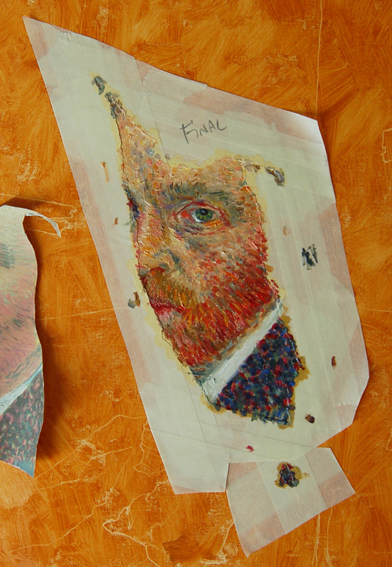
I’m doing a partial master copy, with limited success. This does not look like the original at all. I am working same size as the original painting. My brush strokes are small and tiny, I don’t think I can get much smaller, yet my strokes are still fatter than van Goghs. And I think it odd, I think he used small, but not super tiny brushes. He has too much energy in his strokes to be using tiny tiny brushes. How do I fix this? Do I sand it down and start all over, or do I paint on top?
Being born places you at a greater risk of dying later in life.
http://www.artallison.com/December 14, 2015 at 5:46 am #1243882Since you basically have the darker values in already, I think you can continue on with the lighter. Try using the chisel edge of a filbert for the tiny strokes. You may need to thin your paint too.
If you're asking me for advice, I'm going to assume that you've run out of rational options.
My work on FacebookDecember 14, 2015 at 5:50 am #1243912I’m sure there is some book somewhere that would have the brush answers
December 14, 2015 at 9:06 am #1243911This is a noble effort and its hardly surprising that Van Gogh’s technique would be difficult to copy. I’m not sure exactly what the intention for the final piece is but I don’t think you need to get too caught up in perfection. Paint does cover paint, after all, and most of Van Gogh’s work has a lot of paint. I suspect that he painted and re-painted a lot on his own work.
As far as the brushes- I could be wrong but my impression is that he used some rather small ones. Some of my favorite paintings of his are postcard size which means he must have used small brushes to get any detail.
Keep us posted on how this works out and thanks for sharing
 December 14, 2015 at 1:46 pm #1243886
I’ve looked at a few Van Gogh paintings and I think what he did was paint basic paintings, was not happy with them, so then went over them with small strokes already having that base.
This is not from any book or expert on Van Gogh. Just looking very closely at his paintings and forming my own opinions on his work. Try it and I think you’ll see what I mean, or perhaps not.I don’t think he purposely painted that way. I think he found a way to brighten what began as incredibly dull paintings.
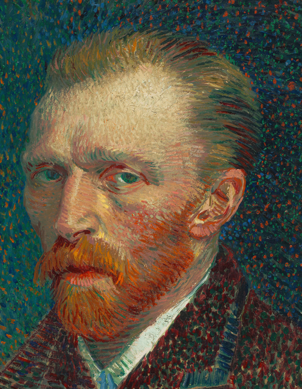
December 15, 2015 at 5:16 am #1243904Van Gogh painted this Self-Portrait in Paris in 1887. He was influenced by works of impressionists which revolutionized his style.
This painting’s size is 42 x 34 cm.
I think that he might use tip of small-size brush. Because there is a lot of long thin strokes especially in hair and beard. However his jacket shows thicker strokes.
Van Gogh used to paint in hastely manner. And in his final years he completed one painting each day even though he mostly used 90 x 72 cm canvases.
December 15, 2015 at 5:39 am #1243905Here is very detailed close-up of the picture. You may see basically every brush stroke
https://socialstructures270.files.wordpress.com/2010/10/img_0368.jpg
https://socialstructures270.wordpress.com/page/2/
December 15, 2015 at 3:29 pm #1243896Thanks for all the ideas about Van Goghs painting style. I think I will try and touch up the version I have, with some thinner, more accurate strokes. If it does not work, I will sand it down and start over.
Van Gogh painted this Self-Portrait in Paris in 1887. He was influenced by works of impressionists which revolutionized his style.
This painting’s size is 42 x 34 cm.
I think that he might use tip of small-size brush. Because there is a lot of long thin strokes especially in hair and beard. However his jacket shows thicker strokes.
Van Gogh used to paint in hastely manner. And in his final years he completed one painting each day even though he mostly used 90 x 72 cm canvases.
I’ve looked at a few Van Gogh paintings and I think what he did was paint basic paintings, was not happy with them, so then went over them with small strokes already having that base.
Yes, I think there is some truth to this. Does look like some basic overall hues laid in, on the face, then build up of more strokes, for detail and stronger color, on top – and these strokes are also quite thick.
savras – thanks for the close up! Interesting to see all over the face and hair is buildup of the thicker, more “detailed” strokes, whereas on the blue jacket, they are all very thin spots. I think he did not have to think much about he jacket, just pick a few colors and build up the dots until it was done. But the face he had to think about more, work on more, over a second sitting, maybe even more.
And yes, the size is correct. I got a lovely reply back from Art Institute of Chicago with a bit of history about the painting.
Being born places you at a greater risk of dying later in life.
http://www.artallison.com/December 16, 2015 at 12:36 pm #1243895For all the wild exuberance Van Gogh is associated with, his brushwork was actually very precise. Pay close attention to the direction of the brushstroke, I think that is one of the hallmarks of his technique.
December 16, 2015 at 11:05 pm #1243890 Anonymous
Dirty is right about that, I have copied several Van Gogh’s including the Starry Night, and trying to cop those intricate varied strokes around the stars is as hard to do as anything I have attempted in brushwork, dude had some chops and could swing a brush!
I think what you have done so far is looking pretty good Allison.December 17, 2015 at 5:37 am #1243897Dirty is right about that, I have copied several Van Gogh’s including the Starry Night, and trying to cop those intricate varied strokes around the stars is as hard to do as anything I have attempted in brushwork, dude had some chops and could swing a brush!
I think what you have done so far is looking pretty good Allison.Dude had some chops – Aint that the truth! Much harder to do than it looks, and I have the convenience of a finished painting to work from. When one copies master works, one learns not just how to paint better, but one gains some real respect for the original artist.
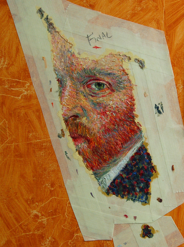
I’ve tried to fix my copy. It’s not great, but I think it is better than before. Photo looks a bit too contrasty-saturated.
Being born places you at a greater risk of dying later in life.
http://www.artallison.com/December 17, 2015 at 5:45 am #1243883I think it will look different when you remove the tape too Allison. Colors will show different against your background. Very good!
If you're asking me for advice, I'm going to assume that you've run out of rational options.
My work on FacebookDecember 17, 2015 at 3:28 pm #1243910looking forward to seeing the tape removed :). great work :thumbsup:
Current style : Taking bad photo's of Bad paintings painted from a bad photo . Successfully
December 17, 2015 at 3:43 pm #1243906This does not look like the original at all.
i think you are being very hard on yourself, i would be Delighted to have it come out like this !:clap:
December 17, 2015 at 4:24 pm #1243887After just reading another thread here about impasto. It’s a question you should be asking for I believe Vincent was a great user of impasto.

-
AuthorPosts
- The topic ‘Copy Van Gogh – how to fix’ is closed to new replies.
Register For This Site
A password will be e-mailed to you.
Search