Home › Forums › Explore Media › Watercolor › The Learning Zone › How do I go about mixing a deep dark red?
- This topic has 17 replies, 10 voices, and was last updated 9 years, 5 months ago by
 Dcam.
Dcam.
-
AuthorPosts
-
October 31, 2014 at 6:01 am #992374
Hi all,
I’m wanting to use crimson red but I also have carmine that I want to darken down in about three or four steps.
How do you suggest I darken it down? I’m wanting a deep dark red at the bottom but I keep getting a purple color when I try.Thank you,

a.k.a. Rick
At my age, 'Happy Hour' is a nap...October 31, 2014 at 6:13 am #1213516If you use blue to darker red you always get purple. I would try brown or brownish color to make darker red. Personally I just buy shade that it is difficult for me to master by mixing
October 31, 2014 at 9:08 am #1213510Add green… judiciously! Use a single pigment green, and be especially judicious if it’s a phthalo
Try some test swatches to make sure your dark red doesn’t end up grayer than you want. If it does, try a different green.
CK =)
I take great comfort in knowing that my genuine typos will probably be blamed on some device's autocorrect.
DIY art supplies, sketches, and more: cyntada.com / @cyntadaOctober 31, 2014 at 9:12 am #1213501Perylene maroon works well when you want to darken other reds.
October 31, 2014 at 10:29 am #1213511I only have these 3 greens.
1. sap green
2. viridian
3. chrome green a.k.a. Rick
At my age, 'Happy Hour' is a nap...October 31, 2014 at 5:57 pm #1213508When you say “darken down”, what do you mean:
–darker value, or
–darker chroma, or
–some combination?Adding a complementary or near-complementary color (viridian or phathlo green), will create a darker value, but result in more neutralized hue.
Adding P. Maroon or Quin Maroon will maintain the general chroma, but result in a darker red up to that of a fully saturated P or Q Maroon.
Depending on your goal, you may also combine these two approaches.
Try them all on a test strip and tell us which most closely matches your goal.
Sling paint,
VirgilSling paint,
Virgil Carter
http://www.virgilcarterfineart.com/October 31, 2014 at 6:01 pm #1213504Add viridian it should give you beautiful deep burgundies
MY WEBSITE:http://vivienblackburn.com MY BLOG:http://vivienb.blogspot.com/ ETSY for original paintings http://www.etsy.com/shop.php?user_id=6150568
October 31, 2014 at 7:13 pm #1213506Try mixing two reds….your strongest values of Cool Red (Aliz Crimson, for instance) and your Warm Red (which is orangey). You can use that as you progress down, and then add the smallest bit of Ultramarine Blue, it will darken those reds without making them purple. UMB is quite strong, so if it turns purplish, add some more red.
Also, when you start mixing your reds, be sure to use a “dryer” brush so the paint is not saturated with extra water, and after it is mixed, let it dry on the palette somewhat if you do have a watery wash. And, of course, you can layer the darker red you arrive at!Unless you are mix very carefully, greens, a complement to reds, would dull your colors. Be careful when mixing if you choose green when darkening. I would choose Viridian, mainly because it is a single pigment….you could try some sap green. The other green, I believe is more opaque and will overpower your reds. (I still like adding the teeniest bit of UMB to preserve the color quality!)
Margarete
When he, the Spirit of truth is come...he will be your Guide... Holy Bible (Old and New Testament)
Under the Concrete are Flowers Yet to be Born...from a Chilean PoemOctober 31, 2014 at 7:54 pm #1213502
Hope this helps.
Char --
CharMing Art -- "Where the spirit does not work with the hand, there is no art." Leonardo DaVinci
November 1, 2014 at 12:53 am #1213512[IMG]http://s3.amazonaws.com/wetcanvas-hdc/Community/images/31-Oct-2014/20514-Reds.jpg[/IMG]
Hope this helps.
Actually, this is exactly what I’m trying to do. Going from red to deep dark red into shadows but looking for a more subtle graduation from the red to dark red shadow. I’d like it to blend a little more then shown here.
Thank you Char, your contributions are always welcomed.. Unfortunately, I don’t have all those colors.
I did get pretty close with my sap green + carmine but I’m having to do it in layers to get it that dark which makes the painting look over worked as was pointed out to me by, pjartwc, in another thread.
I’ve also added a tad little bit of ultramarine as suggested but I’m still not getting the deep dark red I’m looking for without using layers.
Actually, I’m used to doing under paintings to get the effects I wanted when painting in oils and acrylics. I’m going to try this concept to see if it works in watercolors for me as well. Since watercolors are transparent in nature, it should work.
I now must experiment with various colors for the under painting washes I’ll need to do this with.Thank you, Margarete. You, too, are always a huge help.
And, Virgil, many thanks for that information.
To the others, I thank much for all the helpful suggestions and ideas!!! (I love this place!
) a.k.a. Rick
At my age, 'Happy Hour' is a nap...November 1, 2014 at 9:51 am #1213509Char, your illustration is not just a red study, but a text-book illustration of how to use illumination, shade and shadows to enliven a subject. Thanks for posting.
Sling paint,
VirgilSling paint,
Virgil Carter
http://www.virgilcarterfineart.com/November 1, 2014 at 3:52 pm #1213507A perfect (and a colorful) example of how to paint an object showing reflected light, direct light, shade, all the good things about an object!
Margarete
When he, the Spirit of truth is come...he will be your Guide... Holy Bible (Old and New Testament)
Under the Concrete are Flowers Yet to be Born...from a Chilean PoemNovember 1, 2014 at 3:59 pm #1213513OK, I thought I’d go ahead and share my endeavors with you.
I’m trying to improve on my Two Cherries painting.
The top painting is the ‘over worked’ attempt using many layers to create the shaded areas.The second are under paintings of ultramarine and homemade Payne’s Gray respectively.
I intend to wash crimson red over both of these to see what happens. You ‘pros’ out there already know what the results will be but I have to learn it for myself so I can catch up.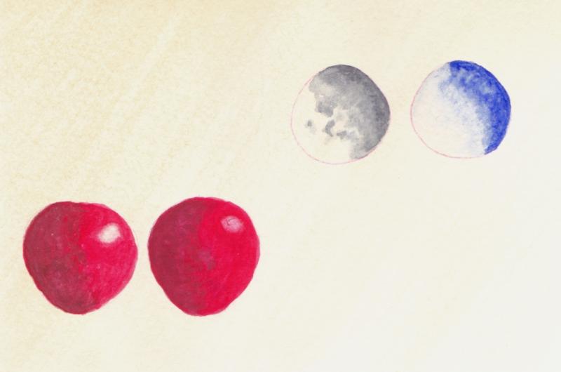
==========================================================================================
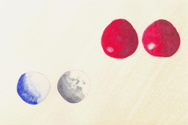
Comments, suggestions and ideas are welcomed.
a.k.a. Rick
At my age, 'Happy Hour' is a nap...November 1, 2014 at 6:49 pm #1213517Great start — experimenting is one of the best ways to learn!
Since you’re building up colors by layering, do think about which of your pigments are staining vs. non-staining. It’s less messy for me when I get my staining colors down first. I’d guess your reds (carmine/crimson) are fairly staining, while your ultramarine blue & homemade gray lift fairly easily. Do you have a staining yellow pigment? Try underpainting with that, then adding your staining reds, then the ult blue/gray and/or viridian over the top to finish some of the shadowing. Don’t forget to be patient enough to let each layer dry before adding the next; have fun playing around with the ordering, though! Can’t wait to see the next round of cherries
Jen
November 1, 2014 at 7:48 pm #1213505I found to achieve rich red i need to have a yellow underpainting ,and need several layers of red’s ,to make colors deeper i use my mix of thalo green and a red i use alizarin or another red in a neutral dark,i mix that in to the red i find that this mix darken the red without changing it to a purple.i note you have veridian ,you could mix that with a red to create the neutral dark,not too red not too green a hue,i use this what call a shadow color to many pigments tsunami to get deeper values.
Visit my webpage : www.marylkaart.com
http://www.facebook.com/profile.php?id=100000516056786 -
AuthorPosts
- You must be logged in to reply to this topic.
Register For This Site
A password will be e-mailed to you.
Search