Home › Forums › Explore Media › Oil Painting › Still Life – Flower Pot
- This topic has 15 replies, 8 voices, and was last updated 5 years, 10 months ago by
 hoylander.
-
AuthorPosts
-
June 11, 2018 at 7:02 pm #457347
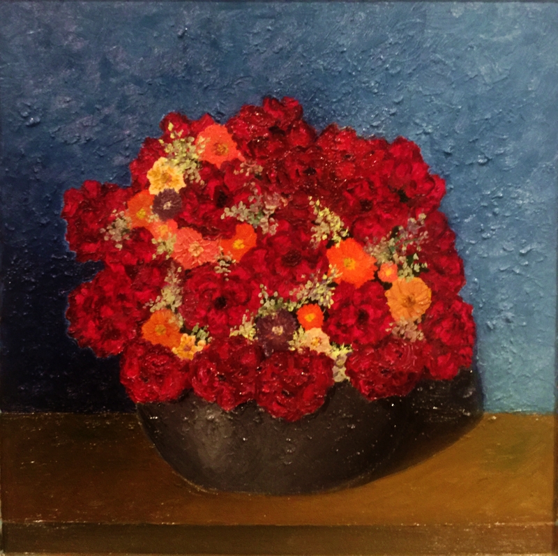
My first painting Stiil Life. Almost finished.
Forgive me the shot, because it was made of an iphone.
I decided to make a Wet-on-wet (“alla prima”) painting, without drawing in graphite, or even photographic reference. I painted and drew at the same time. Madness for an amateur, but I tried.

There is still a lack of green foliage and some crimson flowers, for I rushed to paint the bottom.
What is your opinion?
It’s very bad?
Big mistake?How can I improve the work? If it’s possible!
A big hug and thank you very much!

Alexandre George
Just an amateur artist trying to learn the noble art!June 11, 2018 at 10:45 pm #638879Get some books by the late, great Helen Van Wyk, study them and try to do what she says. Everything she says is correct and she says it better than anyone has ever said it.
You should paint more.
You learn more by making awful paintings than you do by making good ones.
For this one.. look again at the bowl.
Your darks need to be a lot darker and your lights need to be a lot lighter.I only regret not drinking more champagne -
Winston Churchill.
http://billfitzgerald.blogspot.com/June 12, 2018 at 5:17 am #638887Get some books by the late, great Helen Van Wyk, study them and try to do what she says. Everything she says is correct and she says it better than anyone has ever said it.
You should paint more.
You learn more by making awful paintings than you do by making good ones.
For this one.. look again at the bowl.
Your darks need to be a lot darker and your lights need to be a lot lighter.Hi Billmahler!
I thank you for the tip and I will be getting that book. She was great. There are also her videos on Youtube.
https://www.youtube.com/watch?v=dANl1TnT8fw
I’m going to adjust the picture and as you said by mistake it is that you persevere.
Thank you!
Alexandre George
Just an amateur artist trying to learn the noble art!June 12, 2018 at 8:00 am #638881What is your opinion?
It’s very bad?
Big mistake?How can I improve the work? If it’s possible!
Difficult to answer without knowing what your intentions were. Your painting has a naive or symbolic feel to it. It that was what your were after, then it’s a nice painting! If you were striving for realism, there are some things you could improve on.
June 12, 2018 at 1:19 pm #638888Difficult to answer without knowing what your intentions were. Your painting has a naive or symbolic feel to it. It that was what your were after, then it’s a nice painting! If you were striving for realism, there are some things you could improve on.
Hi Ochre!
You’re absolutely right! A huge gaffe when I failed to mention my artistic purpose with painting. Beginner Trolling. :confused:
It would be easy for me to claim idealism, but in fact I desire a Realism and that the figure is credible, with a good connection to reality.
I haven´t yet applied the lights on the flowers, but I thought it best to ask the opinion of the forum friends because something seems to me out of context.
Your help will be a blessing!
A big hug!
Alexandre George
Just an amateur artist trying to learn the noble art!June 13, 2018 at 8:03 pm #638889I tried to apply the advice provided. I don´t know if I screwed up any more!
As it is for my learning I will not be sad if you advise to put fire!
C & C are welcome!
Iphone shot. Sorry.
Alexandre George
Just an amateur artist trying to learn the noble art!June 13, 2018 at 8:13 pm #638882I actually really like this. Alla Prima is tough, and I have found it difficult to retain strong chroma, but the colors are very strong in this.
Your latest update did a lot for making the vase more rounded.
The shadow seems a bit hard edged to me, but then again, the strong chroma suggests strong direct light, so it may be accurate.
You might also consider a bit of yellow on the lower right side of the vase. That strong light would almost definitely cause a reflective highlight on the vase from the ground.
"Mais que veux tu?" - Vincent van Gogh
June 14, 2018 at 5:31 am #638890I actually really like this. Alla Prima is tough, and I have found it difficult to retain strong chroma, but the colors are very strong in this.
Your latest update did a lot for making the vase more rounded.
The shadow seems a bit hard edged to me, but then again, the strong chroma suggests strong direct light, so it may be accurate.
You might also consider a bit of yellow on the lower right side of the vase. That strong light would almost definitely cause a reflective highlight on the vase from the ground.
Hi CynicalSaint!
I thank you immensely for the help and analysis.
I understood the placement on the intensity of the colors and throughout the painting I thought to lower their tone, but gave up.
I had very light shadows, as Billmahler commented. As well as, a very fussy light. So, I thought about lowering the tone of the background a bit and giving more drama to the bowl and the shadows.
Quite frankly, I also share the same idea about the very dark shadows, yet as you have very wisely explained, something has to justify my obsession with strong colors. I have to be more restrained with my color palette, because less is more.
The idea of the yellow reflection from the floor in the pot is great. I had only thought of the blue background on the floor, but I did not mind the bowl.:clap:
As soon as I make the changes and add a small detail to the flowers I will post a new photo and I would be very grateful for a new help, again!
I apologize for my rude English.
Regards,
Alexandre George.
Alexandre George
Just an amateur artist trying to learn the noble art!June 14, 2018 at 6:41 am #638885I liked the first one. There is a simpleness and texture to it I found appealing.
If you are going for realism you have to go strictly by whatever your subject is. Any “thought” on your part is generally a mistake. If you “think” the bowl should be darker and don’t look at it to see the actual color it is. In the shadow as well as the actual color of the bowl, even the highlight.. It’s a mistake. That’s what realism is.. You are simply a catalyst of real life light to paint.
A few realists that have great videos on youtube are Paul Foxton and Mark Carder. You can learn a ton of stuff from them and fast forward your quest for realism. You should probably start with Carder, he has more beginner videos.
Check out my work in the acrylics Hall of Fame Camellia WIP
oil and acrylic paintings..
 June 14, 2018 at 8:16 am #638886
Interesting you called it flower pot. Is the subject the pot or the flowers? The first image theres more pot. The second more flowers. Something made you alter course. Stick with the original thought. Its often the right one.
June 14, 2018 at 9:52 am #638880I liked the first one too. The second version is OK.
What is nice about the painting IS the intensity of the colour. I don’t know why you want to subdue the colours.
Look around online and elsewhere and note pictures you like. Try to do something like them. I think this is how most people start painting.C&C always welcome.
Instagram harry.hamillJune 14, 2018 at 10:28 am #638883I still prefer the second one, but that is what it is all about, all personal preference. It’s really up to what you as the artist prefers.
I agree with the comment about the simplicity of the first version. However, the flower pot itself in the first one feels flat because of how light the shadows are.
I also agree with the above posters that the intensity of the colors is great. I can’t really give you a ‘why’, but the intensity of color really reminds me of van Gogh (though he would have used more abstract colors for the background).
Carry on though, this is looking great to me.
"Mais que veux tu?" - Vincent van Gogh
June 14, 2018 at 1:55 pm #638891I liked the first one. There is a simpleness and texture to it I found appealing.
If you are going for realism you have to go strictly by whatever your subject is. Any “thought” on your part is generally a mistake. If you “think” the bowl should be darker and don’t look at it to see the actual color it is. In the shadow as well as the actual color of the bowl, even the highlight.. It’s a mistake. That’s what realism is.. You are simply a catalyst of real life light to paint.
A few realists that have great videos on youtube are Paul Foxton and Mark Carder. You can learn a ton of stuff from them and fast forward your quest for realism. You should probably start with Carder, he has more beginner videos.
Hi Ellis,
I understood the explanation. I made a beginner mistake. This bowl I created from my imagination, so I did not have a concrete reference.I don´t have a sedimented technical content to be able to deftly represent the necessary techniques of realism. Reading in books is one thing, but in practice it’s quite different.
I´m thinking that Realism isn´t very much in line with my personality. I really do not know. I’m studying and trying to paint something decent. lol
Thank you very much for the help. Everyone in the forum is attentive and with good opinions and advice.
Interesting you called it flower pot. Is the subject the pot or the flowers? The first image theres more pot. The second more flowers. Something made you alter course. Stick with the original thought. Its often the right one.
Hi Raffless,
You’re absolutely right! In fact I should give more realism to the bowl and just adjust the flowers. This would be more consistent with the title. However, I have structurally modified the work.
I’m super happy with your usual help!
I liked the first one too. The second version is OK.
What is nice about the painting IS the intensity of the colour. I don’t know why you want to subdue the colours.
Look around online and elsewhere and note pictures you like. Try to do something like them. I think this is how most people start painting.My friend is very grateful to be helping me again.
I´m afraid to put on very bright colors, as I have read that in fact the slightly grayish colors, so to speak, are more feasible in a painting. I don´t want to get too far from a plausible reality.
I’m finishing painting a Camille Pissarro Representation. Let’s see if I will not make the brilliant author roll in the grave.
I still prefer the second one, but that is what it is all about, all personal preference. It’s really up to what you as the artist prefers.
I agree with the comment about the simplicity of the first version. However, the flower pot itself in the first one feels flat because of how light the shadows are.
I also agree with the above posters that the intensity of the colors is great. I can’t really give you a ‘why’, but the intensity of color really reminds me of van Gogh (though he would have used more abstract colors for the background).
Carry on though, this is looking great to me.
Hi CynicalSaint,
You are a gentleman!
I really enjoyed the bowl of this second version, yet I appreciated the background of the first version.So I got stuck and decided to lower the depth of the background to give the pot of flowers more depth. I do not even know if my thinking was correct.
You’ll see I made a Frankenstein!I’m very pleased with your help and information. EVERYONE is very supportive of me and helps me a lot.
I’m at the pucos finishing 2 new pictures. I lack time, since I paint for love and hobby.
Stay with God!
Alexandre George
Just an amateur artist trying to learn the noble art!June 15, 2018 at 7:01 am #638892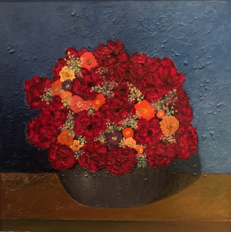
That’s it.
Alexandre George
Just an amateur artist trying to learn the noble art!June 18, 2018 at 9:39 am #638884Nice painting
Forgive me the shot, because it was made of an iphone.
You can take really good photos with an iPhone or Android if the model of your cell phone is not very old and you know the correct way to photograph. The link below is of a very good video in which Mark Carder shows how to photograph a painting using a cell phone.https://youtu.be/tIDdsj3iMiw
Gil
YouTube -
AuthorPosts
- You must be logged in to reply to this topic.
Register For This Site
A password will be e-mailed to you.
Search