Home › Forums › Explore Media › Pastels › Soft Pastel Studio and Gallery › First time using colorfix-WIP – Finished
- This topic has 15 replies, 8 voices, and was last updated 6 years, 2 months ago by
 KreativeK Moderator.
-
AuthorPosts
-
January 1, 2018 at 9:39 am #448698
Ok so I ordered the paper sample pack from Dakotas and I am now starting to try a few of them. This is my first start with the Art Spectrum Colorfix paper. And with just the little bit that I have started so far I am amazed at the difference bet even this paper and the cheap Canson and other pastel papers you can buy at the hobby stores. The pastel goes on so much smoother and blends and moves on the paper much easier. I can’t wait to try all of the others in this pack and decide what ones I like best and prefer. Then I feel like I can really start working on and making art!
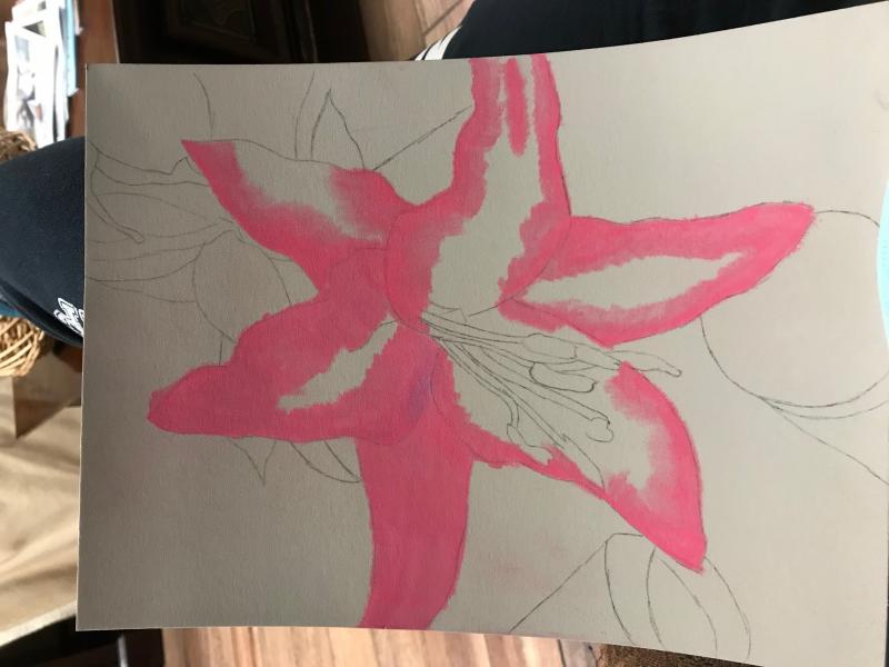
Here is the beginning of what I have started so far:
 January 1, 2018 at 11:05 am #535782
Nice start. I have tried many papers but not this one yet. It received a lot of votes on the survey about papers so I will give it a try.
I find I like using several different papers. I am doing a simple 5×7 painting (same painting) on a piece of Uart and a piece of Fisher 400. Thought I really wasn’t a fan of the Fisher but my acrylic ink under painting ended up showing up much more prominent on the fisher. The Uart grabbed the pastel better which didn’t give me the effect I wanted.
I’m attending a class where the teacher only uses Uart 400. I bring in all these different papers and I suspect she sneaks some Tums when she sees me. She uses a lot of pastel pencils and for her that is the perfect paper. She is an award winner while I “play”.
Looking forward to seeing final painting.
Pam
 January 1, 2018 at 12:40 pm #535780
Isn’t it fun to try new papers? You now have so many choices out there on the market. We’ll be looking forward to your fabulous finish!
[FONT="Comic Sans MS"]Karen, IAPS/MC, PSA WC Moderator-Pastels

web site , Getting started in soft pastels., What you need to know, Critique Guide LinesJanuary 1, 2018 at 1:10 pm #535784Great start!! Paper was totally the difference for me to start loving this medium.
Rebecca
January 2, 2018 at 12:24 pm #535785I think this one is going to be a lot of experimenting and trying to figure out these new pastels that I’ve got. I have a lot more choices now and I’m going to be doing a lot of mixing and blending I’m sure!!
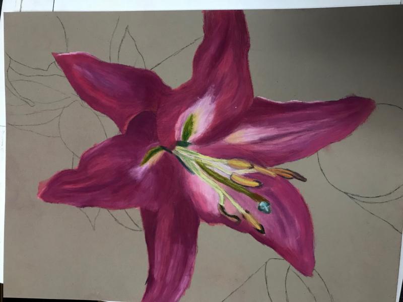
January 3, 2018 at 12:19 pm #535786Here is some an update of what I’ve gotten completed so far. I’ve really only been able to work on it for a few minutes each day at lunch break at work. I’m really quite liking how it is going, I feel like I’m doing something good with this one! If that makes any sense lol! I know the colors aren’t quite right but I still feel like it’s going well. Any tips or comments or ideas? I’ll also post the original. And maybe when I’m finished with this one I’ll post the first one I did of this lily when I had the canson paper. Before it got ruined!
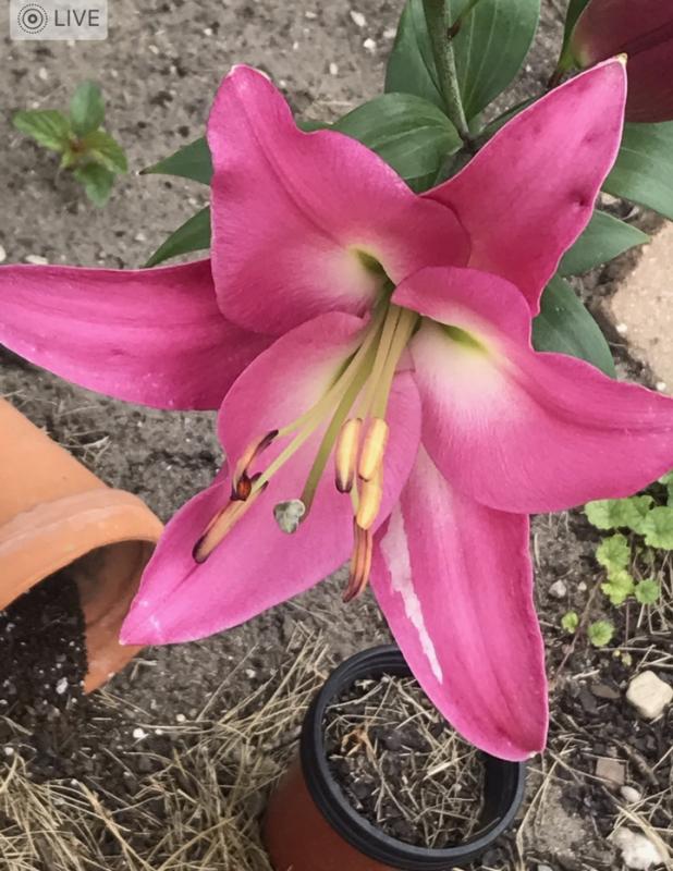
And the original photograph, taken in my garden this past spring.
 January 3, 2018 at 1:08 pm #535781
This is coming along nicely. Squint to check the values of your colors and you’ll be fine.
[FONT="Comic Sans MS"]Karen, IAPS/MC, PSA WC Moderator-Pastels
web site , Getting started in soft pastels., What you need to know, Critique Guide LinesJanuary 3, 2018 at 1:51 pm #535777yes it is coming along nicely. Isn’t Colourfix a nice surface?

Lady Mars Orange Marmalade Stapleford
Moderator: OIls, Pastels, Plein Air
Be yourself. Everyone else is already taken. -Oscar Wilde
 January 3, 2018 at 9:51 pm #535783
Coming along nicely. Karen’s comment about getting values correct is key. I had a teacher advise us regularly that if you get your values right you can use any colors you want. Unless you are doing photo realism use the colors you like. I did a sketch of a rose and have done several paintings of the same rose and each one is totally different, one a yellow rose, one purple, etc.
Once the painting is done, the reference goes away so no comparison of the two – the same teacher would often suggest putting the reference photo away about 2/3 of the way towards completing the painting. Both I and the teacher moved states away from each other but at least on WC we have accomplished artist like Karen to guide us.
Pam:wave:
January 4, 2018 at 9:50 am #535787I’ll try to work on the values and getting them right, it’s been a long time since my high school art classes and we didn’t really work a whole lot with values and such. So a lot of my learning is coming from whatever I can find on here when I get the chance and the e-book that Deborah Secor sent me the link to a while back when I first found this website. So a lot of this really is relatively new to me and I’ve never really worked a whole lot with the more technical sides of colors and values and all that. I’ve always just kind of matched what I see. Which is why a lot of my art doesn’t always look as realistic as I want it to. But the only way I can change that is to learn more and experiment!! So anything helpful you guys can throw at me I will definitely appreciate!
I also do a lot of my drawing by hand, I’ve heard/read that a lot of people will use a projector or trace the original photo of what they’re working eking on and then add their colors. I’ve always thought that was cheating!! So since I was little I’ve always just carried a sketchbook around to draw and doodle in. Sometimes looking back at some of those early pieces is a bit scary!!
January 4, 2018 at 1:46 pm #535779It looks like you and this new surface are getting along real well! It’s so nice to have the freedom to keep adding layers and adjusting value and colors without worrying about filling the tooth too quickly. One thing I learned in my last still life that I’ll pass along in case it helps: try not to rush into doing the light areas too quickly. I know we all want to get the colors right and make the thing we’re painting look like the thing it’s supposed to be but once you put the light colors (values,really) down going back and making adjustments can result in dull, muddy areas. I learned to get all the darks where I wanted them first, including the background, then put down and adjust all the medium colors and finally, when I was absolutely sure there were no more adjustments to be made, add the lights and the lightest accents. Keeping those layers pure without a lot of mixing of different values keeps the colors looking fresh. Keep up the great work!
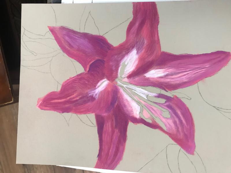
January 4, 2018 at 4:29 pm #535778Oh the joy of sanded pastel surfaces! Colourfix is good stuff and I love the way it comes in so many colors too. Good progress on your pink lily! You moved the flower a bit and yet still have the likeness, go for it. Squint to see values, but also remember how the real plant looked or glance at it if you have it around. The photo’s a good one.
Actual hue doesn’t always matter as much as getting the value right. One nuance in this lily that I notice though is the yellow-to-yellow green bit inside the white bits at the throat of the lily. You haven’t gotten to them yet, watch values on those. They go all the way down to mid-value sap green at the deepest but on the stamens (?) they are close to the same hue in a rather light tint, faintly darker at the edges – easiest done by going one step darker and then draw a narrower lighter line over that. You have those all reserved.
The greens complement the pink and so are a good contrast, lovely balance of hues there. Yet they only touch where the green medium-light stem of the anther (big blobby thing on the end one) crosses the pink petal, most of the greens shade off through lemon yellow to white. The paper color is a good match to the ground, so looser treatment of the leaves especially other vegetation is a way to move away from the tighter rendering of the flower. Unless you go in with various neutrals and just paint the background impressionistically too. You have it all laid out so it’d work either way.
Very good initial drawing and layout. The shifts you made in the directions of certain petals work and don’t change the accuracy of the likeness, they just look like the flower turned a little. Yet this is clearly not just a copy of the photo, you’re interpreting well.
Looking forward to seeing more stages!
Freehand sketching as you’re doing it is great. That gives freedom to change the photo, combine photos, do whatever you want in using a reference. You’re already good at that. Well done!
What pastels are you using? i am curious now, you mentioned something about new pastels or a lot of pastels and i love hearing about others’ tools. Different textures of pastels give different results. There’s a great video on paper and pastel textures compared on YouTube that Colorix did. Search on “Pastel Brands Matter” and enjoy that one. She compares a coated paper, a sanded paper and a plain paper with some hard pastels and some softer Unison pastels.
I would love to see the version you did on Canson paper. I’ve used Canson Mi-Tientes for decades, it’s good stuff in its own right. Especially the smooth side. But it handles differently and takes more skill to get good results on it. Sanded paper makes it very easy to get good results and lots of layers!

Robert A. Sloan, proud member of the Oil Pastel Society
Site owner, artist and writer of http://www.explore-oil-pastels-with-robert-sloan.com
blogs: Rob's Art Lessons and Rob's Daily PaintingJanuary 5, 2018 at 12:44 pm #535788Oik I’ve started working on the inner parts of the flower, I used pastel pencils and since I only have a set of 12 that’s what I used and tried to make work. Any help on how to improve this and get that fold of the petal with the green peeking out correct would be fabulous. I’m also including the link to my deviant art page with the original flower that I did since I no longer have the image on my phone and I tossed the original out after the fixative I tried to spray it with ruined it.
I think there is quite a difference between the two already, and it’s only been a few months since I did the first one.
Thanks for all the other wonderful ideas, I didn’t really notice that faint yellow before and I did once you mentioned it! I tried to add that it. Hopefully I was a bit successful. I’m kinda thinking that the abstract background might be good to do, it will put more of the focus on the flower.
Also this image turned out darker when I took the photo, not sure if it’s the lighting (I am sitting on the opposite side of the room since my last update photo). It really isn’t as dark as it looks in the photo.
And the link to the previous version of the flower that I did. https://horsecrazy2131.deviantart.com/art/Pink-Lily-from-the-Garden-699036801
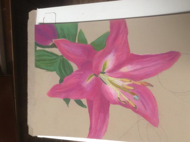
January 10, 2018 at 12:35 pm #535789Ok I think I’m nearing the end of this one at least for the flower. I think I may just do a simple light gray or brown on the background?
I’m having a bit of digficulty with the leaves though, I don’t quite feel like I’ve quite made them look like actual leaves, and I’m not really sure what to do with it. There are a few places on the petals that I want to touch up but I may come back to those later.
I feel that there is more to do with some of the folds in the petals as well but again also not sure what to do with them at this point!
 February 5, 2018 at 10:14 am #535790
Alright. It is finally cpmpletwd and I do quite like the colorful paper. I was trying some of the riches on paper over the weekend and I really just didn’t like it, maybe if I come back to it later I will find it more likeable but at this moment I’m not a fan of it

-
AuthorPosts
- You must be logged in to reply to this topic.
Register For This Site
A password will be e-mailed to you.
Search