Home › Forums › Explore Media › Colored Pencil › Baled Hay Field with Sunset
- This topic has 14 replies, 7 voices, and was last updated 4 years, 8 months ago by
 Yorky Administrator Ormskirk.
-
AuthorPosts
-
August 6, 2019 at 9:22 am #476559
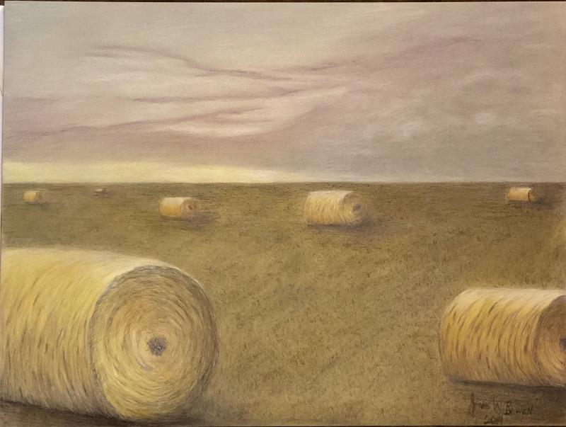
(Untitled for now) 18” x 24” Colored Pencil Drawing on Strathmore Mixed Media Gray Paper done in Faber Castell Polychromos, Koh-i-Nor Woodless Colored Pencils, and Charcoal. No reference. Please comment and critique (and don’t hold back). I appreciate any time you can share.
 August 6, 2019 at 7:51 pm #864364
Updated — I added some contrasts with darks (storm cloud, hay bales and the shadows) and some highlights to the sky and a little to the hay bales. The paper is “full” and would only take gouache etc at this point.
Please be blunt in your comments and critiques. You will not offend me.
 August 7, 2019 at 10:31 am #864359
Nice subject! The contrast you added is working. My crit would be in composition rather than execution. To my eye the second row of bales is a little to evenly spaced. It’s little thing and doesn’t kill the composition. Just what my eye picked up first.
 Thanks for sharing with us!
ELAINE~ Moderator-Colored Pencil Forum ~ [FONT=Times New Roman]New to the forum? Visit the Welcome Thread ~ [FONT=Times New Roman]New to CP? Check out the CP Libray Index for information about about pencils, paper, sharpeners.[FONT=Times New Roman]
InstagramSaveAugust 7, 2019 at 11:21 am #864358This is beautiful!
Quwatha Valentine

August 7, 2019 at 10:52 pm #864360The contrast you added with the storm clouds works beautifully. I agree with Elaine, maybe place the hay bales slightly differently to be a little more randomly placed, or something. That’s about it…I really love this.
Kathy Sieloff
 My Website August 8, 2019 at 6:54 am #864361
It’s wonderful. Gives you that feeling of a big place with lots of room, when I look at it I can breath easier

[FONT=Impact]Sharp Images https://www.facebook.com/pages/Sharp-Images/245503015639558
http://fineartamerica.com/profiles/1-karen-sharp.html?tab=artwork
August 8, 2019 at 2:55 pm #864365Nice subject! The contrast you added is working. My crit would be in composition rather than execution. To my eye the second row of bales is a little to evenly spaced. It’s little thing and doesn’t kill the composition. Just what my eye picked up first.
Thanks for sharing with us!Thank you. I truly appreciate it. I would redo the closest bale in the front on the right, also. To me, it is too small. I see what you are saying about the 2nd row of bales. That was a complete accident! I will be more mindful of that in the future.
Also, I think the bales are too round. I would use a different approach drawing them more like how I draw pine needles. I think that would also really help with the realistic feel of the bales.August 8, 2019 at 2:56 pm #864366This is beautiful!
Thank you!
August 8, 2019 at 2:57 pm #864367The contrast you added with the storm clouds works beautifully. I agree with Elaine, maybe place the hay bales slightly differently to be a little more randomly placed, or something. That’s about it…I really love this.
Thank you for taking time with me!
August 8, 2019 at 2:57 pm #864368It’s wonderful. Gives you that feeling of a big place with lots of room, when I look at it I can breath easier
Thank you!
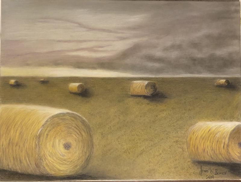
August 9, 2019 at 9:45 am #864362I like both versions. They appear to be at different times of the day. Makes me miss the midwest
[FONT=Impact]Sharp Images https://www.facebook.com/pages/Sharp-Images/245503015639558
http://fineartamerica.com/profiles/1-karen-sharp.html?tab=artwork
August 9, 2019 at 11:47 am #864363I mostly like this. The only thing I don’t like is the bale on the right which is falling out of the picture. This does look like a dry and dusty place with storm clouds looming. Nice atmosphere.
VenaAugust 9, 2019 at 8:16 pm #864369I like both versions. They appear to be at different times of the day. Makes me miss the midwest
Thank you!
August 9, 2019 at 8:19 pm #864370I mostly like this. The only thing I don’t like is the bale on the right which is falling out of the picture. This does look like a dry and dusty place with storm clouds looming. Nice atmosphere.
VenaThank you for this ❤️ Im not happy with that bale on the far right that is closest to the front. Imho, it is too small for the placement, and I don’t really like the placement. I also am not happy with how round the bales are. I will do another hay bale drawing in the future and learn from my mistakes.
August 12, 2019 at 9:39 am #864371Your painting is beautiful and resembles fields in NW Minnesota….big and open.
Our area is not as dramatic but we do bale large round bales, similar to those in your painting. Sometimes a bale will “settle” and the bottom will flatten out a bit so it is no longer completely round. A bit of a random feature in our fields.
A wonderful gift! Lucky recipients!
Mary Flora
-
AuthorPosts
- You must be logged in to reply to this topic.
Register For This Site
A password will be e-mailed to you.
Search