Home › Forums › The Learning Center › Composition and Design › (another)Photo and Painting thread
- This topic has 34 replies, 13 voices, and was last updated 6 years, 1 month ago by
 SparowHawk7 Moderator Drawing and Sketching.
-
AuthorPosts
-
February 11, 2018 at 3:13 pm #451177
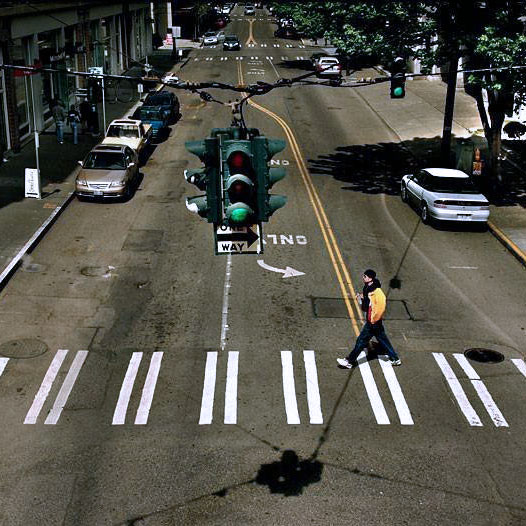
I took this back in my street photography dayz and decided to make a painting from it. We “TAKE” photos, but we “MAKE” paintings. So I thought about what I might change and what worked well that I wanted to be sure to keep – street markings, traffic signal, the pedestrian intersecting with the shadow…I know whenever I show this photo to people the first thing noticed is the odd perspective of the traffic light and I’m asked “Where were you when you took this?”. “On a pedestrian overpass”. The second comment is usually “Wow, lucky to catch that guy just as he crossed the shadow” Actually No. Not lucky. I planned it that way. I planned the entire composition. I waited for the clouds to pass. I waited for the street to clear. I waited for the pedestrian to show and timed his walk. I didn’t “take” a photo of a random event, I “made” the photo. And now I want to “make” a painting based on it.
But here’s the dilemma. While the elements I’m fond of work in the photo, they’ll read false in the painting. Since you can make a painting any way you choose the traffic light will appear as a mistake in perspective, the pedestrian crossing the shadow as contrived.
I’ve made aerial perspective paintings before, but in those there is no ambiguity. With this… I don’t know. I hate to waste time, money and effort if the painting is doomed from the start… am I being too nuanced or will this photo work as a painting… also like to read other laments on the perils of the photo references.
http://s3.amazonaws.com/wetcanvas-hdc/Community/images/18-Sep-2019/1999899-sigsmall.jpg
STUDIOBONGOFebruary 11, 2018 at 3:49 pm #564041I would definitely eliminate the shadow crossing the figure. Although you intended it , to me it reads more like a mistake to be airbrushed out or repositioned behind the figure. You could exaggerate an elongate the shadow cast by the figure. The obscured ‘one way’ sign hanging below the traffic light may not play well in paint. The perspective is a little unconventional but can work. I’ve seen a lot of bird’s eye perspective street scenes lately, usually of crowds of people crossing roads.
I’m not used to green traffic lights- they are yellow in these parts. A yellow light would echo the double yellow line and the figure’s yellow jacket. This green light is a little too close in color and value to the street and shadows and doesn’t stand out. Also the perspective puts the traffic light almost front and center and will cause it to compete with the figure as a center of interest.
What you could try is print the photo in black and white on cheap printer paper and then hand -enhance the printed black and white photo with colored pencils or oil pastels to see it will be worth pursuing. You can print several black and white copies and try out different color and value approaches.*edited to add You could also try different crops of this same photo. for example you could crop below the traffic light and have sort of a panoramic view of the street with the figure crossing The light would be implied by the shadow it casts. It might play well from this perspective. Just a thought. So many possibilities.
Christophervasil.com
February 11, 2018 at 4:12 pm #564048I have lots of photos I’ve taken of objects but very few people pictures. Weirdly though, I’m only interested in PAINTING people and since I work from photos all the time, I use other people’s people pictures as a jumping off point.
So, personally I would never be interested in TAKING a picture like this, but you obviously did, and you said why, and what elements you were interested in. I like that we can always easily “edit” out elements from a photo. Like you, I like the street markings because they’re bold and graphic and would be easy to paint. Unlike you, I would edit out the traffic light because it’s an object that I can’t see any way to paint so that it wouldn’t come out boring. Your imagination may differ, of course. I also like “the idea” of a shadow crossing the person, but this one is too skinny for me to be satisfying. The perspective, while cool, does nothing for me (painter-wise) either because as a figurative painter, he’s too small. He’s like the same object size as the stoplight.
The way MY mind works (which differs from the way your mind works) is that I would search for another picture of a person, in an interesting position. Maybe sitting, maybe walking in a costume or in an unusual way, or dancing across the street, or floating, or something totally nonsensical. But in any case, the human would be the focal point. Then I would think on all the bits until I came up with an idea about what I wanted to say about “the street,” and how to incorporate my person into the scene, and how he/she would relate to markings and shadows, and how to best compose the whole thing with some kind of color scheme in the back of mind. I would leave out anything superfluous.
But, the last thing I would ever think about is the “falseness.” Art is a totally fake thing, unless you need to capture reality for some reason. If you need to do that here, and that’s what you’re wondering about, then never mind. I know nothing about reality. Like right now, I’m doing actual photo transfers of technology imagery on unprimed basswood and then I’m copying (but not precisely and exactly) illuminated manuscript drawings and painting them right in top. So you know…my reality is usually majorly skewed.
Anyway, I hope I didn’t come across as bossy. You should certainly “do your own thing” so all I’m able to offer is another perspective from another painter who also uses photos. And uses them pretty much all the time. Nothing more.
Good luck.
February 11, 2018 at 4:43 pm #564051I would definitely eliminate the shadow crossing the figure. Although you intended it , to me it reads more like a mistake to be airbrushed out or repositioned behind the figure. You could exaggerate an elongate the shadow cast by the figure. The obscured ‘one way’ sign hanging below the traffic light may not play well in paint. The perspective is a little unconventional but can work. I’ve seen a lot of bird’s eye perspective street scenes lately, usually of crowds of people crossing roads.
I’m not used to green traffic lights- they are yellow in these parts. A yellow light would echo the double yellow line and the figure’s yellow jacket. This green light is a little too close in color and value to the street and shadows and doesn’t stand out. Also the perspective puts the traffic light almost front and center and will cause it to compete with the figure as a center of interest.
What you could try is print the photo in black and white on cheap printer paper and then hand -enhance the printed black and white photo with colored pencils or oil pastels to see it will be worth pursuing. You can print several black and white copies and try out different color and value approaches.Those are my thought exactly, except for the street light color. OVerhere green means go. So the pedestrian is jay walking, crossing against the light – which adds interest.
Move the figure, remove signage under the light – all on my todo list. Going to shuffle some cars as well.
There is a much easier way to preview the changes than making b&W prints – all can be easily done in photoshop. Thanks for the input we’re on the same page.
http://s3.amazonaws.com/wetcanvas-hdc/Community/images/18-Sep-2019/1999899-sigsmall.jpg
STUDIOBONGOFebruary 11, 2018 at 4:56 pm #564035The first thing I thought of when looking at the was a tryptique. Amber based painting in the middle. Green to the left, red to the right. Guy at the beginning of the crossing, green, middle Amber, end of crossing on red. Or something on that concept. My mind isn’t quite average so I doubt anyone really understands what I mean.
Dcam (Derek) would know. He can make a great painting out of photos I’d think we’re impossible.
February 11, 2018 at 5:46 pm #564049Things I like about your photo:
– The shadow jumped out at me straight away. I love the way it intersects the scene. It adds diagonals, where everything else is perpendicular. I think it works well with all the other strong lines (I like strong lines in pictures)
– I find the traffic light interesting. It might be because they are completely different to the traffic lights here and I like things that are different. It might dominate the scene, but it’s the thing that controls what happens in the scene, if you see what I mean. I’m not sure what you mean by the perspective looking wrong, could you explain please?
– I like that the pedestrian has a yellow top on that matches the line in the road. It ties him into the scene really nicely.
– The point of view. The vast majority of paintings of urban scenes I’ve seen recently have been from street level, with traffic and lots of people (and usually a wet road) and it’s refreshing to see something else.
– I like that the pedestrian is walking against the direction of the arrows.I think what I would change is the position of the pedestrian, maybe have him closer and a bit further back, so that he was about to cross the shadows and the line and nearly everything would intersect, but not quite yet. I would also add a touch more yellow, maybe to one of the cars on the left. I would maybe take out the cars coming down the road in the distance, and the traffic light further away. I would keep the nearest one though, I think it adds to the scene, and without it there wouldn’t be that shadow (and that shadow makes the picture for me).
So many possibilities and opinions

Kay D - Edinburgh, Scotland
So long, and thanks ...
February 11, 2018 at 6:11 pm #564052olive – thanks for the input – you’re not bossy at all
ianuk – I get it, just not into it.
Triduana – the pedestrian has to be moved _ the yellow lines, shadow, arrow all pointing at the pedestrian is the kind of thing that makes a street photographer salivate – but not so much for a painting. I like your idea of where to put him.http://s3.amazonaws.com/wetcanvas-hdc/Community/images/18-Sep-2019/1999899-sigsmall.jpg
STUDIOBONGOFebruary 11, 2018 at 6:34 pm #564042Those are my thought exactly, except for the street light color. OVerhere green means go. .
Sorry I didn’t mean the green color of the ‘Go’ lens. I meant green as in the painted outer metal casing of the entire light assembly. Here they are always that same shade of dirty yellow as the double yellow line. I never made the jaywalking connection. That’s an interesting little detail.
Although if you were to illuminate the yellow lens that would send the ‘caution’ warning-a subtle little narrative in an of itself.Christophervasil.com
February 11, 2018 at 6:51 pm #564045I would not paint that.The end.
Someday everything is going to be different,when I paint my masterpiece.
Bob Dylan.February 11, 2018 at 7:33 pm #564036I would not paint that.The end.
I congratulate you on what is the first sensible post.
February 11, 2018 at 9:34 pm #564053I congratulate you on what is the first sensible post.
curious to know why you don’t think it would make a good painting?
http://s3.amazonaws.com/wetcanvas-hdc/Community/images/18-Sep-2019/1999899-sigsmall.jpg
STUDIOBONGOFebruary 12, 2018 at 4:07 am #564037I simply don’t believe it has the balance and visual strength to lead the viewers eye anywhere without the viewer being overly aware of the traffic lights. Composition rules are only really guides. However, I do not see that the photograph falls into any rule of composition I’m aware of.
February 12, 2018 at 4:57 am #564054I simply don’t believe it has the balance and visual strength to lead the viewers eye anywhere without the viewer being overly aware of the traffic lights. Composition rules are only really guides. However, I do not see that the photograph falls into any rule of composition I’m aware of.
Thank you. I disagree but I respect your view.
I don’t think it’s always necessary or desirable to lead the viewer around by the nose – lay down a nice railroad track so they can zip thru the painting and be done with it. The traffic light here serves as a beacon – big and bold it attracts the viewer’s attention. Once there the eye isn’t directed – this painting is not for children, no hand holding – but there is plenty of eye-candy imo. The maze of graphic lines, patch patterns on the pavement, tilted perspectives, etc. And a bit of a story – a man walking against the light – oblivious to the graphic explosion around him and the part his presence makes in the design.
So I think it makes a good photograph. I like you have concerns that it may not make a good painting – but for other reasons. Most of which I’ve addressed in my mind.
Again thanks for your input. Your points are well said and valid for your point of view, we just have a different takes on this particular image.
http://s3.amazonaws.com/wetcanvas-hdc/Community/images/18-Sep-2019/1999899-sigsmall.jpg
STUDIOBONGOFebruary 12, 2018 at 5:08 am #564038What are your ‘other reasons’?
I’m taking a break from today, but I’ll read your response.
February 12, 2018 at 5:41 am #564033I’m taking a break from today, but I’ll read your response.
How do you take a break from today? It will be today where ever you go.
If you're asking me for advice, I'm going to assume that you've run out of rational options.
My work on Facebook -
AuthorPosts
- You must be logged in to reply to this topic.
Register For This Site
A password will be e-mailed to you.
Search