Home › Forums › Explore Media › Acrylics › The Information Kiosk › July Classroom – Painting Domestic Animals
- This topic has 188 replies, 28 voices, and was last updated 18 years, 7 months ago by
 Miss J.
-
AuthorPosts
-
July 1, 2005 at 9:19 pm #985088
Part 1 – Intro
Hello, everybody!
Welcome to “Painting Domestic Animals.” For the purpose of this thread, we’ll define that as anything that can live in a house or barn. Cats, dogs, pet rats, pet reptiles, horses, cattle, sheep, llamas, birds…whatever, it’s up to you!
For the next few days, I’ll be posting a few hints and information, based on my experiences an animal painter. Some of you know I’ve painted racehorses for quite awhile. What you might not know is that, just out of college, I was one of those pet portrait artists who advertise in the backs of magazines. “Send me your photo, and I’ll paint a lovely portrait of your cat/dog/horse.” My prices were in the $40-150 range. We all have to start somewhere, right?
My very first commission was of a white toy poodle named Cotton. His photo lived up to his name. It was a flash shot taken indoors at night, so overexposed I could see nothing but a fuzzy white blur with a couple of black button eyes. From this I was supposed to bring to life his grieving owner’s memories? Unfortunately, Cotton was deceased, so it was impossible to request better shots. In desperation, I found several photos of white toy poodles sitting in similar poses, and combined them into one dog. I nervously sent the finished oil portrait off to the client. He was ecstatic. He said I’d even captured the look in his eyes. I did?? If I captured any part of that dog, I must’ve been channeling his ghost!
Over the next three years, I worked from one bad photo to the next. Somehow I muddled through, painting mostly animals who were deceased. These were owners who had never gotten a good shot of Fluffy or Buster while they were alive, but could I – please – paint from it anyway? The stress level was high and the rewards were low, until late December. That’s when the letters started rolling in. Ninety-five percent of my paintings were given as holiday gifts, usually from one spouse to another. I’ve never made so many people cry in my life! Every single letter told stories of tears and joy as the present was opened. I must say, it feels really good to have such an effect on people through art.
So, there are two things you need if you’re going to paint someone’s animal: A good supply of tissues, and really great reference photos. Having experienced some of the worst types of photos, I’ll be sharing my thoughts this weekend on how to avoid some common photography mistakes.
Please feel free to jump into this thread at any time with your questions, comments, photos, and remarks. I’m relying on you guys to fill in some of the gaps in my knowledge.
Instead of posting everything at once, I’m going to post my tips over the course of a few days. By all means, don’t wait for me to finish! Go ahead and start a painting if you like. Post your WIPs in this thread, so we can all learn from your work.
To be continued….
Upcoming this weekend:
Part 2 – Exploring Acrylic Painting Styles
Part 3 – Getting Great Reference Photos
Part 4 – Drawing – Getting the Structure Right
Part 5 – Eyes – The Windows to the Soul
Part 6 – Painting TexturesJuly 1, 2005 at 9:28 pm #1053808Part 2 – Exploring Acrylic Painting Styles
Acrylics are one of the most versatile mediums we can use. They lend themselves to a variety of styles, and combine beautifully with other media.
When painting animals, I am sometimes overwhelmed a by their complexity. I often want to retreat to the safety of the “easiest” painting style I know, which for or me is realism. For you, it might be something else. What I’d love to see us do here is explore acrylics to their fullest, trying different kinds of styles. Bold and loose, tight and detailed, decorative, abstract. Everything from traditional portraits to blue bulls and orange dogs. Anything and everything goes. Do what feels right, and don’t be afraid to explore, because it’s just paint!
I’m posting a few sample of my favorite acrylic techniques here, details of larger images. They’re all horses, because that’s what I have the most of, but these styles will translate to other animals. These are by no means a definitive sample, so please post some of your own ideas if you’d like.
I’d love to post these full size, in one thread, but I don’t want to bog down those on slower connections. So I’m going to have to post these seven styles one at a time as attachments. Please be patient with me.

Here’s the first one:
1. Realistic and highly detailed, using multiple layers of thin glazes and tiny strokes applied onto a wet glazed surface. The goal was to represent every highlight, every hair. This is actually an oil, but the same look can be achieved in acrylic.
Full imageJuly 1, 2005 at 9:59 pm #1053809Part 2 – Exploring Acrylic Painting Styles
2. Multiple layers of small overlapping directional brushstrokes, no glazing. Still fairly realistic, but without every little hair showing. The painting begins with the large areas blocked in with flat paint, over which the layers are built.
Full imageJuly 1, 2005 at 10:01 pm #1053810Part 2 – Exploring Acrylic Painting Styles
3. Dry-brushed acrylic over transparent washes. Light and form are dominant, and details are ignored. This painting began with watercolor on paper, but could just as easily been done with water-thinned acrylic. The thin paint is applied first as a thin wash within an ink outline, then thicker acrylic is dry-brushed over the top. Bits of the background were allowed to show through the dry-brushed layer.
Full imageJuly 1, 2005 at 10:04 pm #1053811Part 2 – Exploring Acrylic Painting Styles
4. Pastel over acrylic (thick and thin) with India ink outlines. The painting is started in a manner similar to #3, but instead of dry-brushing acrylic over the top, pastels are used instead. The pastel is set with steam.
Full imageJuly 1, 2005 at 10:05 pm #1053812Part 2 – Exploring Acrylic Painting Styles
5. Loose paint, tight structure. Fluid acrylics on paper over loose India ink sketch. The colors were laid in boldly, with little regard to the true color of the horse, but I am trying to keep the form of the horse accurate. Note the strokes on the shoulder which loosely follow the lines of the bones in the shoulder. The background – which is a wash of thinner paint applied to a damp surface – is allowed to peek through. If you enlarge this image to its full size, you can clearly see my initial loose sketch in black ink.
Full imageJuly 1, 2005 at 10:09 pm #1053813Part 2 – Exploring Acrylic Painting Styles
6. Acrylic washes. Acrylics are applied in very thin washes on damp paper, like watercolor. There’s some opaque paint in the background, which is the opposite of how I usually work.The drawing is stylized, emphasizing the long, lithe lines of the horses. Black India ink lines added over the top of the paint reinforce the horizontal movement.
Full imageJuly 1, 2005 at 10:12 pm #1053814Part 2 – Exploring Acrylic Painting Styles
7. Pure fancy. Anthing goes. Everything from thin washes to black ink marker to thick paint. Paint what you feel, not what you see. The idea here is suggest the energy of the horse through vivid use of color.
Full imageJuly 1, 2005 at 10:15 pm #1053815That’s all for tonight! Dinner awaits, so I will be back tomorrow to post some photo tips. Unless you’ve done it, you have no idea how strange it feels to hog an entire thread, so please feel free to post your comments, work, or questions.
Tami
July 2, 2005 at 2:01 am #1053927Tami,
I am so happy to see this thread! Your work is beautiful! I hestitate to post my painting next to yours but I could use some advise so here goes…..
I x posted this a couple days ago but its buried now a couple pages back. This is a painting of my own horse. I will show the reference photo, my sketch and the WIP painting. I am pleased with the dappling and the coloring on the muzzle. I am less pleased with the ears (look too flat and blah), the length of the muzzle (but am afraid to mess with it and ruin the coloring) and the eyes. I am still planning on doing detail work but this will give you the idea. I also am not done with the background.
What attracted me to this photo was the shadows on the horse’s face and neck from the windblown mane. I liked the criss crossed shadows on the neck and the stripes on the face. I wanted to use blues/purples in the shadows and yellows in the highlights. The look I am after is not super realistic – maybe more stylized but to be honest I am still too new at this to aim for a specific style…
I am just hoping to get something presentable! Thank you for looking and thank you for sharing your knowledge! I had to laugh when you described the life of a pet portrait artist! What is so funny to me too is I just came across some ads like that in a magazine at the vets office and I spent the time I had to wait daydreaming about getting good enough to do that!
thanks again and take care!

web site Sue Steiner Blog www.amulti-coloredlife.blogspot.comJuly 2, 2005 at 5:00 am #1053943Hi Tami, thank you very much
 and I’m very happy too, need very much help as always
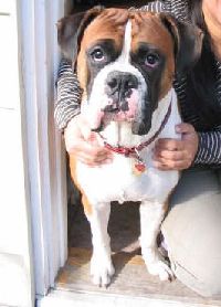
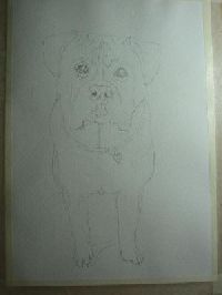
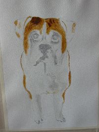
The second pic took 2 hours to draw, does he looks similar enough?
Max (uncut ear boxer) body was paint with titanium white mix with a dot of black (is it supposedly better with yellow ochre?) But oops when starting his fore head brown was too thick
Thank you for taking time and need advice desperately
 July 2, 2005 at 7:37 am #1053869
Ah Tami! Just what’s needed – thank you!
This has the makings of a brilliant thread – already so much work from you
I, too, had to laugh about the pet portraits/deceased/Christmas gift – exactly what happened to me last Christmas ….. I could have written that bit myself
BUt hey! I’m not knocking it at all – the recipient was delighted, even amidst the tears!I’ll be following, learning and trying to participate.
Cheers, Maureen
Forum projects: Plant Parade projects in the Florals/Botanicals forum , WDE in the All Media Art Events , Different Strokes in Acrylics forum .July 2, 2005 at 8:56 am #1053940i have just recieved my first commision….his name is Rodney…once i have stopped laughing i will try and draw him…..
this wont be an acrylic so possibly not relevant to the thread topic but he is so funny i had to share! feel free to paint him btw…a Rodney series would be hilarious!
[FONT=Verdana] Moorereppion.com
My Facebook page July 2, 2005 at 10:35 am #1053816
I had to laugh when you described the life of a pet portrait artist! What is so funny to me too is I just came across some ads like that in a magazine at the vets office and I spent the time I had to wait daydreaming about getting good enough to do that!
You’re already good enough.
If I can find one of my pet portrait photos from those days, I’ll post it so you can see my beginner phase. Let’s just say they were less than impressive, I was rarely happy with them, yet people loved them! Maybe they don’t have high expectations when they’re commissioning an artist from the back of a magazine, or maybe they’re just so tickled to see their pet in paint they don’t get caught up in the finer details. Doing pet portraits from client photos is one of the most difficult, nerve wracking things I’ve done, but it’s a great way to learn.You own that gorgeous refined animal? Lucky you! It looks like it’s coming along very well. I like the natural pose you’ve chosen. Dappled greys are the hardest color to paint, especially in acrylics, so I’m impressed with your dapples, and your color. I’m really loving some of those shadows on the face. The color and value are right on.
I agree with your assement of some of the things you’re not so happy with, except the eye, which I like. You know what I think happened? Your initial drawing was correct, but you might have lost part of your drawing when you painted the background. Some parts got a little too small, like the muzzle. (I hope you don’t mind – I’ve converted the images of the photo and painting to line only. This is one of the tricks I use when my eye gets fatigued and I need a fresh perspective on a structural problem.) I can understand not wanting to risk losing the delicate colors you’ve achieved on the muzzle already. I often choose pleasing paint over drawing when I have to decide on one. But perhaps you could beef up the bottom line between the cheekbone and the muzzle, though, especially at the point where it meets the cheekbone? That’s a low-risk fix, because if it doesn’t work, you can always just cover it up with background paint and return it to its current state.
The neck looks a bit heavy now, but I realize you’re not done. When you define the crest and seperate it from the muscles of the neck, it’ll look more elegant. Those two areas are in full sun and close in value, so it might be tricky. I usually use a bit of blue (reflected color from the sky) on the top of the neck muscles, to seperate it from the more vertical crest.
Looking forward to seeing your detail work. I think this is a real winner!
Tami
July 2, 2005 at 10:39 am #1053817Rodney is too funny! An actual commission of a hamster? LOL! I think I’d feel cheated if you didn’t show the results, acrylic or not.
I can see this as a very serious ancestral type of portrait, in a big, ornate gold frame.
Tami
-
AuthorPosts
- You must be logged in to reply to this topic.
Register For This Site
A password will be e-mailed to you.
Search