Home › Forums › Explore Subjects › Landscapes › A painting by Susan M. Story that I recreated called "Evening Blush"
- This topic has 6 replies, 5 voices, and was last updated 5 years, 3 months ago by
 KreativeK Moderator.
-
AuthorPosts
-
January 15, 2019 at 3:44 am #467585
I am still learning how to apply different techniques about painting in the medium of soft pastel so I do this occasionally to gain the experience needed to gain my skill level. I do not intend to profit when posting but rather to get feedback on how my attempt looks when compared to the original. I need to learn what colors work in what combinations also on technique. So C&C welcome.
I did my painting on the cardboard backing of a watercolor pad coated with Artspectrum Colorfix primer in the color Aubergine for a little extra tooth.
I used Rembrandt’s artists pastels for the block in. Then as I built up layers I used more buttery pastels like Jack Richeson handrolled atrists pastels and some Blicks artists pastels and a few others random brands. Here’s how mine came out…..

Here’s the original it’s in the Pastel Journal October 2015 issue#100.

"There is something wonderful about the tactical feeling of a pencil or crayon being dragged across a receptive surface!"
a quote from talented artist...
~John Husley~January 15, 2019 at 4:27 am #763295The warm/cool color statement works well IMO, although The ‘values’ in the distance could be reduced perhaps if your intention is to mimic the original below.
The sky colors can be used to soften those distant values.
Squinting your eyes may help with value judgment, bearing in mind that as colors & values recede, they fade.
Hope that helps – Well Done !
Michael
michaelcartwrightart.com.au
https://bluethumb.com.au/michael-cartwright
I'M NOT AS THINK AS YOU DRUNK I AMJanuary 15, 2019 at 7:24 am #763293Well, you succeeded very well.
Regards
RudiJanuary 15, 2019 at 7:36 am #763296Hello Michael I actually wanted to stick to the original but that being said it was just an error on my part maybe even rushing to get it finished? But your suggestions are very correct as I can already imagine it would greatly enhance the feeling of more distance due to the arieal perspective.! I will implement the changes and repost thanks again.
And Rudi thanks for the encouring words they mean more than you know!"There is something wonderful about the tactical feeling of a pencil or crayon being dragged across a receptive surface!"
a quote from talented artist...
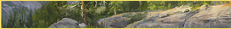
~John Husley~January 15, 2019 at 11:12 am #763297Well guys here’s my painting with adjustments made! In my opinion it reads to more of the feeling of space.
I toned the furthest line of trees with a light redish violet then scumbled a light greyish green to get the background bushes to come forward a tiny bit. Then applied loose horizontal marks in the waters reflecting what’s above!
Do you think i was able to achieve a sense of depth and or space a lot more or is there more i could do but not overwork it?

Sorry for the wrongly uploaded image being upside down I’ve attached a request to do so so hang on a few for the correction."There is something wonderful about the tactical feeling of a pencil or crayon being dragged across a receptive surface!"
a quote from talented artist...
~John Husley~January 15, 2019 at 12:10 pm #763294January 15, 2019 at 1:34 pm #763292I wonder if she did a soft blended base under painting , then the stronger work on top.. Could be softened /blurred it a bit in the magazine photo reproduction..
Your final is nice, there is one spot in the right side sky /tree line has a sharp line that grabs my eye to it.. Maybe soften some of the diagonal lines in the lavender trees and smooth/blend the water a bit more? I don’t know if you can still do that now, but it would make the water seem more glassy and smooth if you can..
~Joy~
-
AuthorPosts

- You must be logged in to reply to this topic.
Register For This Site
A password will be e-mailed to you.
Search