Home › Forums › Explore Media › Pen and Ink › House Sparrows
- This topic has 5 replies, 6 voices, and was last updated 6 years, 2 months ago by
 Yorky Administrator Ormskirk.
-
AuthorPosts
-
February 4, 2018 at 3:41 pm #450761
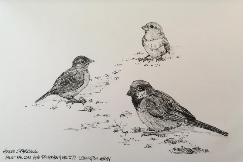
This didn’t go exactly as planned. The one in the distance is supposed to be another female…in the distance. I think the scale is off. It’s too big and something about it makes it advance in the picture plane. I think maybe the eye is too large and too dark creating too much contrast. The female on the left is a bit too small. Oh, well. Still enjoyed an hour listening to music and sketching in ink!
Cheers,
Herb
 February 4, 2018 at 5:57 pm #559656
The back one looks like a fluffy little young ‘un because of its big eye – doesn’t worry me at all, the discrepancy in size/proportion.
They’re very nicely observed and very good variation of tone and texture.Cheers, Maureen

Forum projects: Plant Parade projects in the Florals/Botanicals forum , WDE in the All Media Art Events , Different Strokes in Acrylics forum .February 4, 2018 at 6:40 pm #559659 Anonymous
More excellent birds !
No I don’t think it is the scale of the background bird that throws it forward , perhaps more that it is isolated on the white paper.
Maybe a little more generalised suggestion of grass might stop the eye been led to it too ?
Using the two devices to deepen the perspective might have been too much used together ?
Although I do very much like the use of the S curve to lead the eye through the drawing.It’s funny isn’t it, all this intellectual analysis after the event – in which when in the process of making it NO or very little analysis was involved

Still it can help the next one on occasion
Cheers Mike
February 5, 2018 at 10:19 am #559658Nicely done Herb. I agree with all of the above, and my only reservation is the foreground bird is a little heavy-handed. Minor nit-picking though. I’m glad I’m not the only artist who listens to music while working. Oddly enough, I like bird-song sessions on YouTube. Makes a gloomy February Ontario day seem brighter.
John
http://www.watercoloursforfun.comFebruary 7, 2018 at 3:42 pm #559660February 10, 2018 at 3:59 pm #559657Seeing this lovely drawing made my heart sing! This is PRECISELY the kind of pen and ink drawing style that makes me love the medium as much as I do. Well done.
"An artist should never be a prisoner of himself, prisoner of style, prisoner of reputation or prisoner of success". ~Henry Matisse
-
AuthorPosts
- You must be logged in to reply to this topic.
Register For This Site
A password will be e-mailed to you.
Search