Home › Forums › The Learning Center › Color Theory and Mixing › Why not pyrrole red instead of cadmium red?
- This topic has 25 replies, 11 voices, and was last updated 5 years, 3 months ago by
 sheri.
-
AuthorPosts
-
December 20, 2018 at 7:47 am #466375
Pyrrole red is a medium red that has more chroma than cadmium red and is also opaque and permanent. Why does everyone seem to use cadmium red? I think I’m going to buy Pyrrole red instead of cadmium. I love to buy the colors that have the most intense hues. They’re glorious.
December 20, 2018 at 9:17 am #748576Anonymous
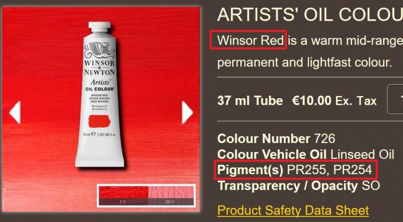
I have WN Winsor Red which I think is the best kept secret in oil paints, cheap, wonderful red that simply gets it done.
December 20, 2018 at 11:13 am #748589I have WN Winsor Red which I think is the best kept secret in oil paints, cheap, wonderful red that simply gets it done.
I have W&N’s Scarlet Lake, which is in the same ballpark (Scarlet Lake is more scarlet, Winsor Red is a more mid-red blend). But my painting style doesn’t really need it; I only have it “just in case” I need to go there, because I have no other high-croma red.
But regarding the OP: Whether or not to use high-chroma colors, is a matter of the painter’s subject-matter and painting style. Also a matter of medium (oil, acrylic, watercolor?). Landscape artists, especially in oils, usually don’t need much by way of high-chroma colors. Nothing in nature is an intense red, except for some flowers, and that’s a genre in itself. Portrait artists might prefer to use a duller red, as it can more easily be used to modify skin tones, without excessive color shifts. On the other hand, modern abstract artists often use high-chroma colors.
There is also the issue of mixing performance with other colors. Some pigments “play nicely” with other commonly-used colors, producing useful mixtures that can be easily controlled. Others don’t. Using mixtures to get color gradients is common in landscapes and portraits, but may not be very useful in modern abstracts.
December 21, 2018 at 1:38 pm #748577Why not Quinacridone red instead of Red Pyrrole?
December 21, 2018 at 8:38 pm #748597Single pigment Pyrrole red PR 254 is a very good choice of red for a limited pallete of high chroma primary. Considered a mid red, not leaning to blue or yellow, high tinting strength. Pyrrole scarlet, PR 255, also strong bright red, leans a little more yellow than PR 255. Can be more or less opaque depending on Mfg.
I got some PR 254 Pyrrole Red, M Graham. Very good!December 21, 2018 at 8:46 pm #748592I have both Winsor Red PR254 and W&N Cadmium Red PR108 because the cadmiums are forbidden to art students here in Ireland:rolleyes:
If you’re using a lot of red paint the PR254 was a third of the price of PR108 in the 200ml size. A tiny bit of sennelier Venetian Red takes the Fire Engine look out of either of them.
For portraits so little is needed that it wouldn’t bother me if I used real vermilion.
A portrait with Lead White, Naples Yellow and Vermilion would cause a lot of trouble in Art School here

Best wishes…
December 31, 2018 at 12:26 am #748578My W&N pyrrole red is brighter, cheaper, and more consistent in mixtures than my cadmium red, haven’t used my cadmium red since.
Regarding opacity, pyrrole red has about the opacity as cadmium red, there is a very slight difference, but it’s so minor that it doesn’t bother me at all. It’s not like the difference between azo yellow and cadmium yellow.
If you really need the super highest possible opacity, cadmium red is still the most opaque by a small margin, but otherwise pyrrole red is superior in every way.
December 31, 2018 at 2:56 am #748573Pyrrole Red shifts slightly towards purple in tints (although not as much as Naphthols and Quinacridones), while Cadmium Red has an insignificant hue shift (do a side-by-side comparison to see & judge for yourself how much or little the diff is). Some artists, especially portrait artists, might not like any slight unwanted purplishness. But like anything, it depends on what you’re used to.
In some paint lines (like Golden), Pyrrole reds are almost as expensive as real Cadmium reds, but in others (as already pointed out) they are a lot cheaper. Is it due to lower pigment cost or using less pigment to get a lower final cost in budget paint lines – I dunno.
December 31, 2018 at 3:20 am #748579Pyrrole Red shifts slightly towards purple in tints (although not as much as Naphthols and Quinacridones), while Cadmium Red has an insignificant hue shift
Brands using PR254 on its own shift to pink when adding white, but mixtures of both pyrrole do not.
This partly explains why W&N winsor red seems to be the most popular pyrrole I think. Winsor red doesn’t have that hue shift you mention.
W&N has PR254+PR255 in a single tube. PR254 does have the shift to pink if you add white, but Winsor red does not, due to the addition of PR255 which keeps it out of the pink range.
PR254+PR255 is superior to PR254 in my opinion.
 December 31, 2018 at 3:42 am #748580
handprint with extra info
 December 31, 2018 at 4:39 am #748594
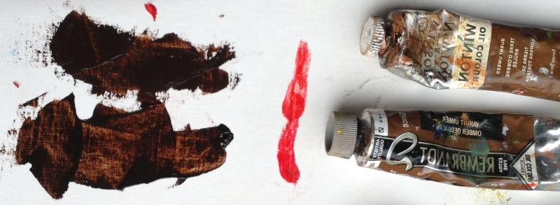
I’ve found cadmium reds to be more opaque than the Rembrandt Pyrrole Red I tried. As the W&N red is cheap I would have thought it would be about the same level of opacity as the Rembrandt version?
December 31, 2018 at 4:54 am #748581I’ve found cadmium reds to be more opaque than the Rembrandt Pyrrole Red I tried. As the W&N red is cheap I would have thought it would be about the same level of opacity as the Rembrandt version?
Rembrandt is a very transparent paint to begin with. It is a very oily brand just like Sennelier.
Rembrandt uses a metric ton of oil in their tubes. Burnt and raw umber from Rembrandt is like watercolor. Great if you glaze, but not great if you are looking for opacity.
Regarding pyrrole red, it’s slightly less opaque than cadmium, but really not by a lot. Certainly not like the difference between azo and cad yellow.
December 31, 2018 at 5:51 am #748595I haven’t found Rembrandts to be that much more oily when compared to W&N paints?
I think some pigments are more transparent compared to the equivalent in W&N (PBr24), while others seem the same or more opaque than the W&N version (Titanium White).
December 31, 2018 at 6:25 am #748582I haven’t found Rembrandts to be that much more oily when compared to W&N paints?
Oh no, Rembrandt is considerably more oily than W&N, Rembrandt is very comparable to Sennelier. Very high oil content, relatively low pigment load. Great for glazing, but not opaque.
(I am pushing the oil out of the paint with my knife in these examples, so the difference is slightly magnified)
My Pyrrole red in Rembrandt is considerably more oily than that of my W&N.

Even when compared to W&N Winton student paint, Rembrandt is much more oily and less pigmented. (burnt umber comparison)
 December 31, 2018 at 6:28 am #748583
That’s not to say that they both aren’t oily paints. They’re both oily compared to something like Old Holland. But yah, Rembrandt and Sennelier are probably the oiliest paints out there. W&N is middle of the road in terms of oilyness I would say.
-
AuthorPosts
- You must be logged in to reply to this topic.
Register For This Site
A password will be e-mailed to you.
Search