Home › Forums › Explore Media › Pastels › Soft Pastel Studio and Gallery › Jailhouse Rock
- This topic has 12 replies, 6 voices, and was last updated 4 years, 9 months ago by
 My Beloved Muse.
-
AuthorPosts
-
July 7, 2019 at 10:41 pm #475432
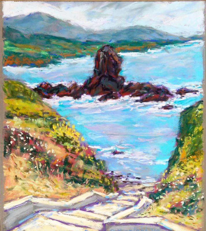
Yes, that’s what I’m told they call this coastal formation at Pigeon Point Lighthouse in Pescadero, CA. Love this place. Tons of great views, and today the wildflowers were all over the place.
Enjoying Sennelier softs on Pastelmat (this is on dark gray), 9×12″
 July 8, 2019 at 11:00 am #852225
So vibrant!
The brilliant colors of sea, sun, and flora are evident.Kim
c&c is always welcome
http://KBEdwards.comJuly 8, 2019 at 3:25 pm #852217I can see another painting, painted in this same location. I see the interesting staircase leading down to the water. Your warm and cool pops of color are wonderful. The composition takes you from the left hand corner, down the stairs and just out past the small rock not far from shore. The colors in the ocean are outstanding and draw me in. The stairs are framed nicely by the steep hillsides. You wouldn’t have to move your easel. Am I being too lazy?

[FONT="Comic Sans MS"]Karen, IAPS/MC, PSA WC Moderator-Pastels

web site , Getting started in soft pastels., What you need to know, Critique Guide LinesJuly 8, 2019 at 10:36 pm #852220I can see another painting, painted in this same location. I see the interesting staircase leading down to the water. Your warm and cool pops of color are wonderful. The composition takes you from the left hand corner, down the stairs and just out past the small rock not far from shore. The colors in the ocean are outstanding and draw me in. The stairs are framed nicely by the steep hillsides. You wouldn’t have to move your easel. Am I being too lazy?
If I understand, you’re actually suggesting cropping this down losing the top 40%.
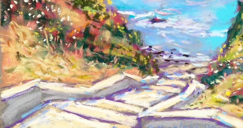
July 9, 2019 at 2:58 am #852218As I did a quick scroll, I spotted the second possibility. You could paint a second version, concentrating on the area closer to where you were standing. I was drawn to your color choices when you painted the stairs. That second, closer version has a very nice composition. I was just thinking out loud.
[FONT="Comic Sans MS"]Karen, IAPS/MC, PSA WC Moderator-Pastels
web site , Getting started in soft pastels., What you need to know, Critique Guide LinesJuly 10, 2019 at 3:17 pm #852216I agree with water girl I thought the same thing. The steps leading down to the sea are really nice and that part of the sea to the first rock does make a painting all of it’s own. Really nice painting!
[URL=http://www.simmillarts.co.uk
http://simmill-arts.blogspot.com/
Success is never found. Failure never fatal. Courage is the only thing.
Winston Churchill.July 11, 2019 at 8:52 am #852221Appreciate the kudos and feedback.
I realize the painting looks like 2 different paintings, because the main rock formation is a different color and value range. Reality is that in life that’s very true: it’s black volcanic rock.
Yes, I like the forground best as well, but hadn’t thought about cutting down the painting before. I doubt I could repaint it the same, but you never know, might try as an experiment.
July 13, 2019 at 8:12 am #852214Nicely done, Bart! I admire the looseness of your strokes and your colors are gorgeous! It would be interesting to see you do another version of this, even if it’s just for practice. If you were standing there looking out at the rock you wouldn’t even notice the stairs and if you looked at the beautiful design the stairs make you wouldn’t see the rock or the distant hills. It’s so hard to subordinate everything else that isn’t the main concept when our photos show everything. At least that is my struggle.
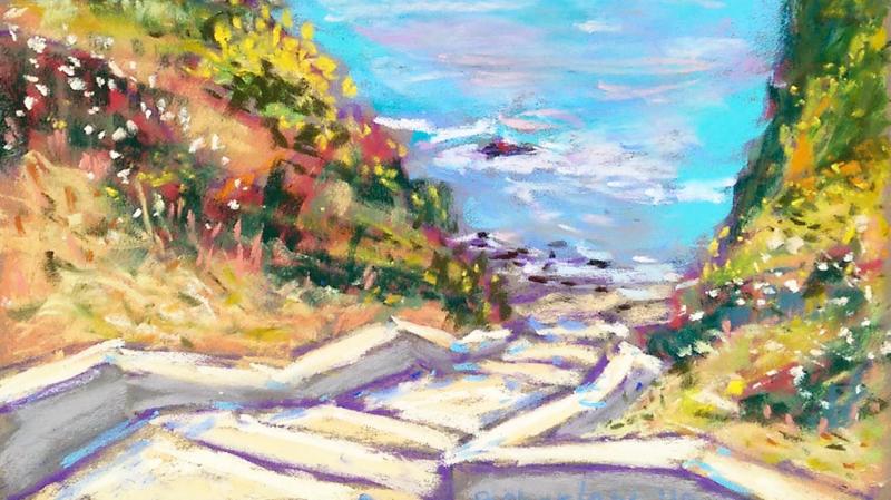
July 13, 2019 at 5:01 pm #852222OK which of these is what you’re all suggesting? Both cropped down, but one more than the other. Thanks.
 July 15, 2019 at 6:55 am #852215
I prefer the second crop because it includes more of those beautiful flowers on the hillside. What would you think about adding a couple of people walking along the beach near the bottom of the steps? Or a person and a dog. Would that make it too busy or provide an extra element of interest? I’m just throwing out ideas!
July 15, 2019 at 10:36 am #852223I prefer the second crop because it includes more of those beautiful flowers on the hillside. What would you think about adding a couple of people walking along the beach near the bottom of the steps? Or a person and a dog. Would that make it too busy or provide an extra element of interest? I’m just throwing out ideas!
Nah, but thanks for the idea anyway. I don’t like putting people in my landscapes, though I can certainly paint people. This was just about the scenery.
July 15, 2019 at 12:27 pm #852219The second one gives us more open ocean. The way you have handled the water deserves that extra room. The composition is spot on.
[FONT="Comic Sans MS"]Karen, IAPS/MC, PSA WC Moderator-Pastels
web site , Getting started in soft pastels., What you need to know, Critique Guide LinesJuly 20, 2019 at 11:43 am #852224The second crop works very well as composition. A very nice painting.
Esther
-
AuthorPosts
- You must be logged in to reply to this topic.
Register For This Site
A password will be e-mailed to you.
Search