Home › Forums › Explore Subjects › Florals and Botanical › Background frustrations ex oil pastel forum
- This topic has 18 replies, 11 voices, and was last updated 5 years, 9 months ago by
 tuscanny Moderator oil pastels.
-
AuthorPosts
-
June 14, 2018 at 1:09 am #457436
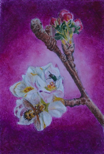
I’m having ‘fun’ with changing my background colors. Which works the best though? A4 using oi pastels
Christel
June 14, 2018 at 6:45 am #639642all attractive but I prefer the ‘warmth’ of the 1st one….:thumbsup:
 June 14, 2018 at 1:58 pm #639648
Thanks Blue! It’s so interesting to hear the different tastes of the artists.
Christel
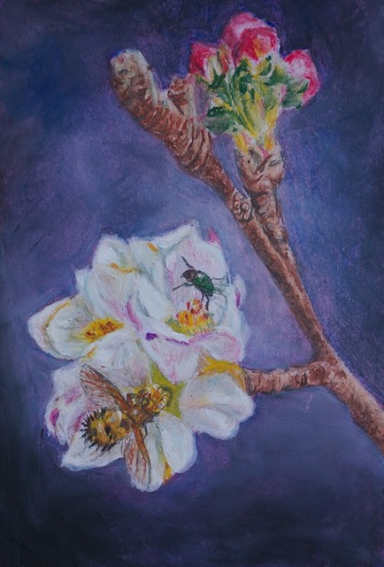
June 16, 2018 at 4:15 pm #639655I think they all work well, but I think I prefer the last one as the flower buds at the top stand out just a bit more. It’s a lovely picture, I like the little green beetle.
Kay D - Edinburgh, Scotland
So long, and thanks ...
June 16, 2018 at 7:47 pm #639644Agree with Kay M. The last one is best.

-- EP
 Moderator for:
All Media Art Events, Artwork From Life, Art JournalsJune 17, 2018 at 12:53 am #639649Thanks Kay and EP!
Christel
June 17, 2018 at 5:00 pm #639647All are good Christel and so are the backgrounds.
Shane
https://artbyshanec.com
June 17, 2018 at 11:24 pm #639650Thanks Shane!
Christel
June 18, 2018 at 10:05 am #639641The reds and purples have more dynamism, the blue is quieter – so maybe it’s in the viewer’s eye!!!
Have you tried a more diagonal aspect – light up in the top right where the shapes are darker and darker bottom left where the flower is light?
Just a thought – and another experiment!:lol: …. or even a curved diagonal like the arcs of radiating light.:)Cheers, Maureen
Forum projects: Plant Parade projects in the Florals/Botanicals forum , WDE in the All Media Art Events , Different Strokes in Acrylics forum .June 18, 2018 at 3:42 pm #639639One is my least favorite. A bit too bright and sort’of blinding.
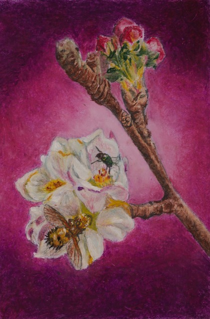
Two is interesting and warming, very girly boudoir-ish velvet almost.
Third I find more realist and makes the flowers stand out more, but also a little more conventional.So I’d say two and three would find a place in my moods, one, not so much.
Hope that was not too opinionated.:crossfingers: :clear:
Ladysue
June 18, 2018 at 9:40 pm #639645Christel – A really interesting exercise! All are lovely! But everyone has a different preference – so it just goes to show – “beauty is in the eye of the beholder” or in this case the artist!
I prefer the pink background. The 1st one with the purple background is a bit “in your eye” and the 3rd and last one – after viewing the previously two, – it looks a bit staid and ordinary. Colour is certainly a individual thing!
Well done Christel, an interesting Discussion :thumbsup:
Moderator: Animal & Wildlife, Floral & Botanical, Watermedia
June 18, 2018 at 11:39 pm #639651Maureen – thanks for those thoughts. For the next exercise though. I see I should rather lighten off center too.
LadySue – my thoughts too.
Vivien – good points to keep in mind. I’m just not used to going bold I guess.Christel
June 19, 2018 at 7:41 am #639643interesting data here…..I’m an impressionist and like bold color, but different individuals see ‘color’ differently…
we generally all have three areas of our retina who focas on color but 2-3 % of woman, have a 4th focal point in their retinas, allowing them to see almost limitless blend of color..:thumbsup:
June 19, 2018 at 12:46 pm #639652Very interesting.Thanks for that info.
Christel
June 25, 2018 at 12:28 am #639646I like the third one…but all are well done.
-
AuthorPosts
- You must be logged in to reply to this topic.
Register For This Site
A password will be e-mailed to you.
Search