Home › Forums › Explore Media › Acrylics › background question before I start this one….
- This topic has 9 replies, 3 voices, and was last updated 5 years, 4 months ago by
 KreativeK Moderator.
-
AuthorPosts
-
December 11, 2018 at 4:52 pm #466012
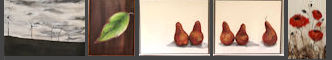
I’m starting a new painting for my dining room. I’m looking for advice on the background so I can get started. My house is very contemporary, lots of white and taupe. Originally I wanted to do just a plain white background on this instead of trying to replicate the photo. I don’t want the background to look like my countertop (which it is in the photo). I’m wavering on the pure white but don’t actually want a “color” either as my home is all neutrals and I don’t want a “pop of color”. That being said, I’m not sure how a stark white background will fare on white walls….TIA!

Lorraine
 December 11, 2018 at 6:13 pm #744849
Here’s what I would do. Go to the local paint dealer(s) and scarf up as many “white” color chips as you can carry. Pick the one that works best as a background. Take it back to the store and have them make a sample size batch of their best latex paint. (Says latex on the can, but the binder is almost certain to be acrylic.)
Are you planning to color match those pears? Tricky.
A painting is never really done as long as I can get my hands on it.
December 11, 2018 at 7:11 pm #744853Here’s what I would do. Go to the local paint dealer(s) and scarf up as many “white” color chips as you can carry. Pick the one that works best as a background. Take it back to the store and have them make a sample size batch of their best latex paint. (Says latex on the can, but the binder is almost certain to be acrylic.)
Are you planning to color match those pears? Tricky.
Thanks!
As much as I can. Are those going to be particularly difficult?Lorraine
December 11, 2018 at 9:07 pm #744850I know you can mix colors. The difficulty comes in seeing the true colors. We all have a mental picture of a pear, complete with shape, color, texture and taste. These preconceptions about things like pears can get in the way of actually observing the objects.
A painting is never really done as long as I can get my hands on it.
December 11, 2018 at 11:11 pm #744854Hmmm…that never even occurred to me…I may have to ponder that!
Hehe….that’ll be in the back of my mind now making me apprehensive…
Lorraine
December 12, 2018 at 4:24 pm #744851I’m sure you’ll get it right; I’ve seen your work.
There are some things that can be done.
One possibility is to make an arbitrary decision about the palette. Select a color scheme and use only those colors.
Another is to use a color finder. That’s a piece of neutral gray material with a hole in it. Look at the color through the hole and match what you see. There’s a ready made tool called a view catcher available from both Blicks and Jerry’s Artarama. Or you can make your own. Just make sure that yours matches the value 5 on your value scale.
A painting is never really done as long as I can get my hands on it.
December 12, 2018 at 6:46 pm #744855I’m sure you’ll get it right; I’ve seen your work.
There are some things that can be done.
One possibility is to make an arbitrary decision about the palette. Select a color scheme and use only those colors.
Another is to use a color finder. That’s a piece of neutral gray material with a hole in it. Look at the color through the hole and match what you see. There’s a ready made tool called a view catcher available from both Blicks and Jerry’s Artarama. Or you can make your own. Just make sure that yours matches the value 5 on your value scale.
Are we talking about an 18% gray card? I’m not sure I understand the “matches the value 5 on your value scale”?
Thanks for the vote of confidence, all I’m saying is I’m nothing if not persistent. Some might call it pig headed…lol, I refuse to throw in the towel.
Lorraine
December 12, 2018 at 11:42 pm #744852Yes, an 18% gray will probably work. In B&W photography I always used a 50% card. Just darker, that’s all. The main thing is having a neutral gray.
A gray scale and value finder is a good tool to have, and not expensive. A craft store may not have them but an actual art supply store certainly will.
A painting is never really done as long as I can get my hands on it.
December 13, 2018 at 10:06 am #744848I just use white paper. But mostly I have my reference on the computer in a photo editing program and use the colour picker to look at the colours.
C&C always welcome. Michelle

mkmcreations.com
Every painting is a new adventure.December 13, 2018 at 2:01 pm #744856I just use white paper. But mostly I have my reference on the computer in a photo editing program and use the colour picker to look at the colours.
That’s a good idea too….thanks!
Lorraine
-
AuthorPosts
- You must be logged in to reply to this topic.
Register For This Site
A password will be e-mailed to you.
Search