Home › Forums › Explore Subjects › Abstract and Contemporary Art › Another set of two abstracts
- This topic has 13 replies, 11 voices, and was last updated 6 years, 1 month ago by
 cmallav.
-
AuthorPosts
-
March 7, 2018 at 9:29 am #452549
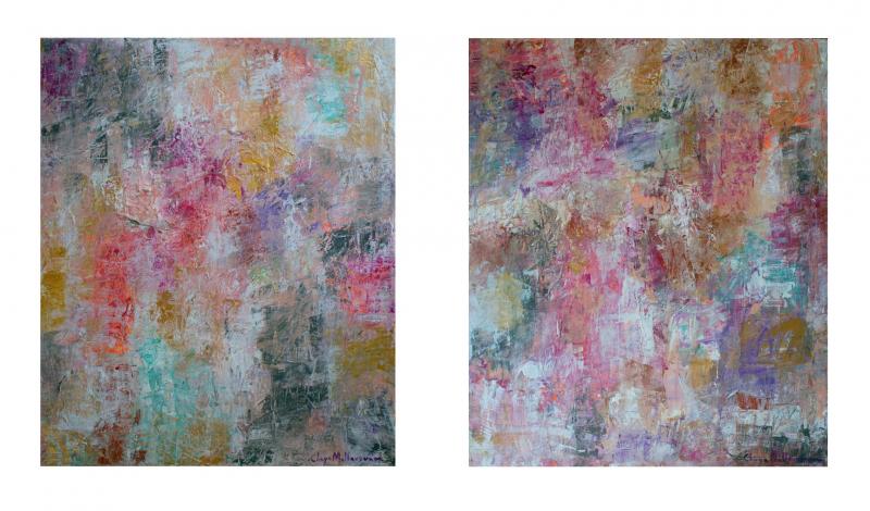
Another set of two abstracts. 24 X 20 each. Acrylics on canvas.
Looking forward for the C & C’s
Thanks!
~ Chaya
Chaya Fine Art
Facebook / InstagramMarch 7, 2018 at 10:46 am #579988The splotches of colour create a wonderful soft pattern for both of these.
If I had to crit anything it would be that the second one echos the first one perhaps too much.
Katie Black Fine Art"Life is far too important to be taken seriously." - Oscar Wilde
March 7, 2018 at 10:48 am #579995Chaya, these will make a beautiful pair of painting on any wall. Very nice work and the bright colors really speak volumes in the overall quiet mood of the pieces.
March 7, 2018 at 11:42 am #579989Katie, Thank you and agree with you completely that the second one mimics the first a lot. I will try to keep that in mind when I make the next set of twos
 I guess these are somewhat like identical twins
  ?
? Anthony, Thank you so much!
~ Chaya
Chaya Fine Art
Facebook / InstagramMarch 7, 2018 at 3:17 pm #579993They are well done. I think the texture suggests a lot of energy but the color choices restrain that energy. Interesting.
A painting is never really done as long as I can get my hands on it.
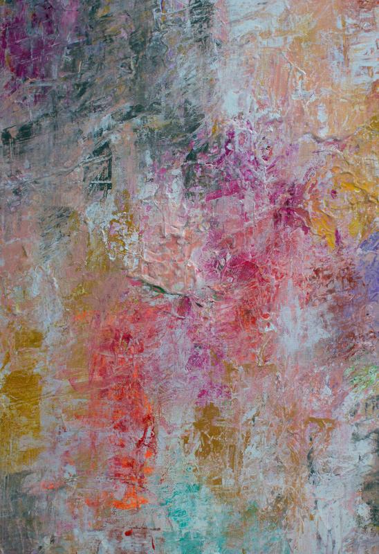
March 7, 2018 at 5:04 pm #579987Great warm color. It reminds me of a technique I learned about years ago called tonking, where a piece of paper or a cloth is pressed against wet paint and then removed and reapplied to cause the soft blends. Sponges work too.
Christophervasil.com
March 7, 2018 at 11:35 pm #579984These pieces give me a comforted and contented feeling.
[FONT=Century Gothic] [FONT=Century Gothic]Comments and critique actively sought and much appreciated! [/SIZE][/B]
Rick. . . [/COLOR][/COLOR][FONT=Century Gothic]. [/COLOR][FONT=Century Gothic]. . [/COLOR][FONT=Century Gothic]. . . [/COLOR][FONT=Century Gothic]. . . [/COLOR][FONT=Century Gothic]. . [/COLOR][FONT=Century Gothic]. .[/COLOR][FONT=Century Gothic] . [/COLOR][FONT=Century Gothic]. . . [/COLOR][FONT=Century Gothic]. . . [/COLOR]pigment storm fine art[FONT=Century Gothic] . . . watch the paint flow![/SIZE]March 8, 2018 at 12:49 am #579994Since they are a set, similarities seem to be the right idea. I love the soft colors and can actually feel the texture just through the way the light plays across the surface. Nice job Chaya.
The first has a little bit better balance, while the second seems a little top heavy. Maybe you can add some visual balance to the second that would also serve to differentiate them more? That’s the only suggestion I can think of because these are lovely as is.[FONT="Palatino Linotype"]“Do not fear mistakes - there are none.” Miles David
March 8, 2018 at 12:54 am #579985Lovely, shimmery colours!
"I am not yet born; provide me, with water to dandle me, grass to grow for me, trees to talk to me, sky to sing to me, birds and a white light in the back of my mind to guide me." From Prayer Before Birth by Louis Macneice.March 8, 2018 at 5:25 am #579992What everyone else has said.
The essential thing, for me, is to offer a visual expression of those things in our experience that words cannot express www.jim-whalen.artistwebsites.comMarch 8, 2018 at 9:49 am #579983Both are calming influences and agree with others remarks.
Kay
Moderator: Watermedia, Mixed Media, Abstract/Contemporary
March 8, 2018 at 10:34 am #579990Thank you all for your wonderful comments, thoughts and suggestions! Much appreciate it!
Christopher, I used “scraping” technique here for this work. I’m attaching a closeup. I’ll have to lookup “tonking”
~ Chaya
Chaya Fine Art
Facebook / InstagramMarch 8, 2018 at 1:20 pm #579986Somewhere I saw two paintings attached together, back to back, and hung from the ceiling. The breezes kept them gently moving.
The effect was quite interesting, giving the viewer a constant variety.I see these done that way, rather than the usual side by side.
Like children, each one is different, but special
good Art!
https://s3.amazonaws.com/wetcanvas-hdc/Community/images/17-Jul-2013/110200-Tatrabanner.jpg [FONT=Times New Roman] Click here for>> WC FAQS >
March 9, 2018 at 9:45 am #579991birdhs – Thank you! What you described sounds so very cool, and I would like to see these two like that!
~ Chaya
Chaya Fine Art
Facebook / Instagram -
AuthorPosts
- You must be logged in to reply to this topic.
Register For This Site
A password will be e-mailed to you.
Search