Home › Forums › The Learning Center › Color Theory and Mixing › Need help feeling out Bougeareau flesh tones
- This topic has 50 replies, 12 voices, and was last updated 10 years, 2 months ago by
 Anonymous.
-
AuthorPosts
-
January 16, 2014 at 7:19 pm #991533
I’m feeling a lot more comfortable with a basic skin tone palette. I generally use Naples, Cad Red Light, Crimson Aliz, Burnt Sienna, Yellow Ochre, Burnt Umber, and a random blue or green to gray things out. Oh and Titanium and flake white with some occasional Ivory black, though I try to mix grays from complimentary colors. I’m comfortable with this but I’d like to start shifting my range in other directions.
For whatever reason (lack of knowledge, skill, theory, sight) Bougeareaus very light tones elude me. Its so delicate and light but not quite white or gray or pink or whatever it almost feels like it is but isn’t. Now I know it’s much easier to paint high contrast, strong light figures because the variations are more obvious. Somehow he manages to (at least to my eyes) do a lot in a smaller rage of tone and hue without looking like mud.
I know how well regarded he is and I can’t expect to just pump something out like him but I feel like there is some fundamental piece that I’m not quite picking up. I’m thinking just pale blues, greens, pinks but it never seems to feel right. I think perhaps my detection and sense of value just aren’t at a place where I can move in that direction while maintaining a cohesion of value and chroma.
Just seeing if anyone had some advice in terms of color, value, or technique. If I remember correctly he didn’t glaze a ton of layers. God, I’m just in awe of his ability to portray light and form like in the Saytr painting. Just marvelous. I just don’t know if it takes so much more to play in that subtle range of tone or if I’m just overlooking something that could nudge me that direction. Thank you for your time and advice.
January 16, 2014 at 9:32 pm #1198716There is gray (pale gray!) to some extent in all of his skintones. Perhaps you are getting stuck in the process of mixing grays from opposite colors. Perhaps you might try mixing a neutral gray paint (if you have it) with white, and then adding (just a touch!) of color to it when you have the value about right. You could start from a middle neutral gray (N5) if you have it, or from a lighter neutral gray (say, N7) if you want something lighter to begin with. You might still have to mix it with white in a 3-to-1 ratio to get the correct value (lightness) before you add any color. At least this way you can keep the two steps – getting the correct value, then getting the correct hue – separate, and it should help you if you need to troubleshoot where you are going wrong.
P.S. – Welcome to WetCanvas!
AJ (opainter), C&C always welcome
:::: Helpful links for new users: User Agreement || Reference Images || C&C Suggestions || Color Theory and Mixing (color theory and color selection) || Full List of Forums
:::: Painting Blog with an article now and thenJanuary 16, 2014 at 11:14 pm #1198735I need to go ahead and buy a set of premixed grays. I think it would speed things up a lot, and I’m really trying to learn how to utilize grays more. It really adds another dimension that I wasn’t getting early on, and while I can mix them, knowing exactly what I’m going to get would really help. Where can I find a premixed set? I just checked out Munsell and Windsor but didn’t see a set. I’m going to keep looking but in the mean time if anyone knows right off hand I would appreciate it.
I think you are right, I need to start with my whites first, normally I go the other direction. It would probably be easier to build up rather than white down.
P.S. Thanks! I’ve been pouring over the forums, years of great information. I’m kind of alone in terms of friends or people I know who are artists so it’s great to see all of this discussion.
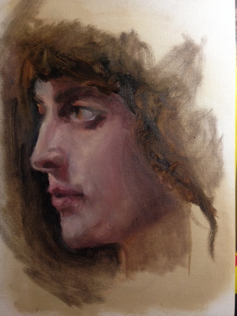
P.S.S. Suppose I should post something to show where I’m at. I just did a one hour study of a profile of his. It’s dark for him but I’m thinking I do darker studies and then slowly move to a lighter tone so it doesn’t feel like a tremendous jump. A ton of errors in it but I’m trying to keep the hour limit so I’m forced to be more efficient. I’ve only been painting for about four months and it seems like painting as many different things as I can works better than agonizing over trying to make a few ‘perfect’.
 January 17, 2014 at 1:03 am #1198717
As far as other lines, I don’t know, but I do know that Golden Paints has Munsell Number 2, 3, 4, 5, 6, 7, and 8 in their acrylics, and that their Williamsburg line of oils has special edition Munsell grays Numbers 2, 4, 6, and 8 – but only for a limited time. I can’t tell for sure, but I think your portrait is done in oils (nice painting, by the way!), so if I were you, I’d jump at the chance to pick up Munsell Numbers 6 and 8.
I also think you are right to add darker colors to lighter colors as you mix your paint. That is recommended by others, and not just me.
AJ (opainter), C&C always welcome
:::: Helpful links for new users: User Agreement || Reference Images || C&C Suggestions || Color Theory and Mixing (color theory and color selection) || Full List of Forums
:::: Painting Blog with an article now and thenJanuary 17, 2014 at 2:43 am #1198694Online photos can be a bit deceiving. For an example at the IMA we have the Rêve de printemps by William Bouguereau doesn’t look anything like its ARC photo.
Here is what it looks on ARC,

Here is the photo I took which is what it really looks like.
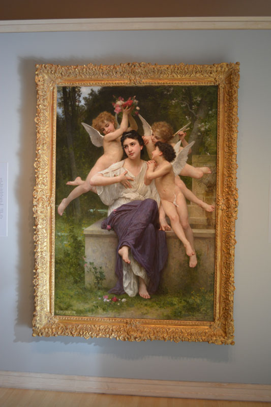
This one has some glare, but you get the idea

[FONT=Arial, Helvetica, sans-serif]
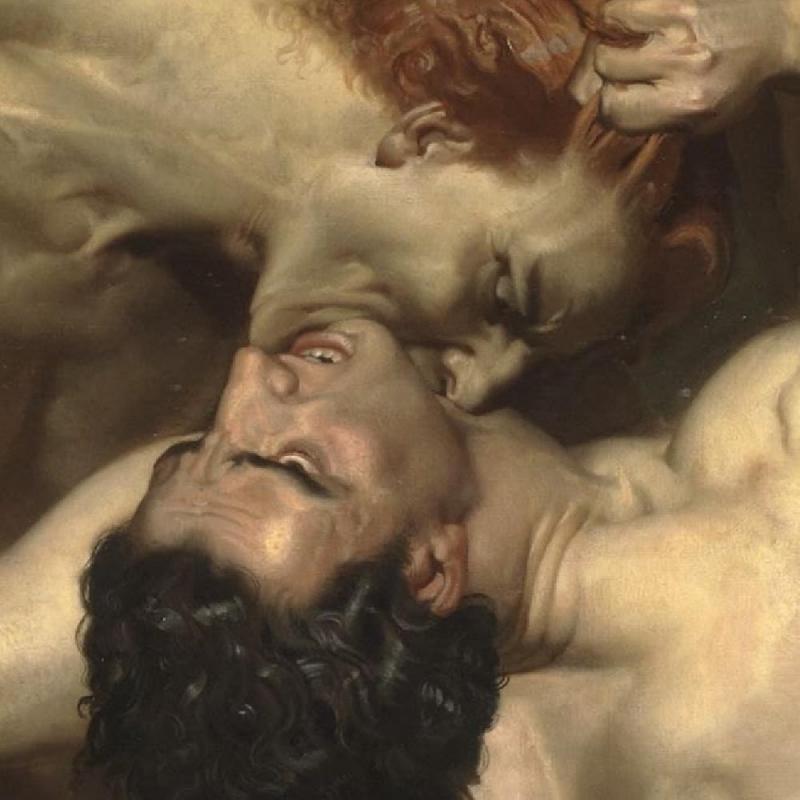
January 17, 2014 at 4:58 am #1198715rltromble – your remarks about online reproductions are surely correct and it’s very difficult to judge how good the copy is without real first hand observation and memory. To my mind the best online source is the Google Art Project – Google it. From the well publicized investment that has been made I have to assume that the colours are correct – the resolution is certainly extraordinary. I enclose a tiny fragment from Bouguereau’s Dante and Virgil.
Of course, how true the colours are displayed on your screen, or printed out, depends on how well calibrated your screen and printer are. That’s a whole ‘nother ball game.
 January 17, 2014 at 1:15 pm #1198691
One of the most useful grays you can mix for use in portraits is Raw Umber and Ivory Black, two pigments you probably have already. It’s very quick to mix and easily repeated. You’ll find it has a low tinting strength so is easily controlled. And with the sort of colours you use for skin tones will not shift the temperature of the colours as you adjust tone. Flake White will give you better results than Titanium White again because of its low tinting strength and also the luminosity. But like most people I usually just use titanium for convenience.
 Dave
Dave“What peaches and what penumbras! Whole families shopping at night! Aisles full of husbands! Wives in the avocados, babies in the tomatoes!—and you, Garcia Lorca, what were you doing down by the watermelons?”
— Allen Ginsberg
Are you ready for a Journey?
PS Critiques always welcome but no plaudits or emoting, please don’t press the like button.January 17, 2014 at 8:12 pm #1198721I think perhaps my detection and sense of value just aren’t at a place where I can move in that direction while maintaining a cohesion of value and chroma.
That’s bound to be a substantial part of the problem, and would be true of most people attempting the subtlety of a Bouguereau.
Quite apart from that, however, you can’t hope to match the appearance of Bouguereau’s flesh with a single layer of paint, as these were obtained in many areas by the academic method of painting the lights thinly and translucently over a darker and sometimes more colourful layer. Virgil Elliott includes a demonstration and a couple of pages of discussion in his book Traditional Oil Painting. Here’s a short extract:
I’ve seen a protracted debate on another forum over whether some of the details of Elliott’s demonstration actually apply to Bouguereau, but at the very least he shows one way of obtaining a Bouguereau-like effect.

Bouguereau hand study from here:
http://inspirationalartworks.blogspot.com.au/2010/07/bouguereau-misc-studies-and.html
.Colour Online (hundreds of links on colour): https://sites.google.com/site/djcbriggs/colour-online
The Dimensions of Colour: www.huevaluechroma.com
Colour Society of Australia: www.coloursociety.org.auJanuary 18, 2014 at 12:22 am #1198688Believe me when I say that there is not a flesh color in a Bouguereau painting that both you and I could not match.
However, I could not do it by merely guessing at it, and hoping to “remember” the appearance of those colors, when I begin to apply it to my own painting. I would need to have a Bouguereau painting, or very accurate reference photo in front of me as I did it.
Generally, his flesh colors are values of gray, each with just enough hue in it to identify it as a specific flesh color. “Gray” is not a dirty word, in describing flesh colors. Those who choose to eliminate Black paint from their palette are probably destined to struggle more with those target colors than those who are willing to employ it. There are many ways to create “gray”, but beginning with Black and White is a pretty good start, in terms of effectiveness, and efficiency. The chief reason?……more control, with much less wild, offshoot, color swings.
One, very appropriate and effective way to create the subtle, blue-green appearance of veins, such as in hands, and temples, is with a blend of two, very unlikely paint colors–Yellow Ochre, and Ivory Black. Give it a try sometime.:)
wfmartin. My Blog "Creative Realism"...
https://williamfmartin.blogspot.comJanuary 18, 2014 at 2:56 am #1198696Generally, his flesh colors are values of gray, each with just enough hue in it to identify it as a specific flesh color. “Gray” is not a dirty word, in describing flesh colors. Those who choose to eliminate Black paint from their palette are probably destined to struggle more with those target colors than those who are willing to employ it. There are many ways to create “gray”, but beginning with Black and White is a pretty good start, in terms of effectiveness, and efficiency. The chief reason?……more control, with much less wild, offshoot, color swings.
I think, artist must eliminate (temporary!) all impressionistic garbage from his or her mind, as first step to paint in this style. No palette knives as a painting tool, no yellow and green spots on the skin, throw away any Monet’s ideas about “do not use black”, no Richard Shmidt, no Bob Ross. Avoid any visible brush strokes, any thickness, “fast foodish” painting recommendations :D. Those ideas are good to make a clone of Monet’s paintings (:thumbsup: ), but not useful for William-Adolphe Bouguereau portraits.
Skin on his portraits are very fresh, rose colors (vermilion +Alizarin?) are perfect, veins are bluish (I guess, he use a deep cobalt and black), yellow is very soft and “skinnish”. I think, one milligram of Cadmium yellow pigment or AZo stuff added to a paint can kill everything in his skin color. I really admire these fantastic skin tones! A great master colors!
http://www.bouguereau.org/Mignon-Pensive-large.html
He also knew a preraphaelites purple formula.January 18, 2014 at 6:11 am #1198722I think, artist must eliminate (temporary!) all impressionistic garbage from his or her mind, as first step to paint in this style.
Yes, and especially to eliminate the alla prima idea of obtaining each colour with a single mixture, instead of creating many of them from a planned combination of two or more superimposed layers. If anyone is not familiar with this distinction between alla prima and the traditional technique of painting in layers, they could consult the Virgil Elliott book I mentioned, or this series of posts by Matthew Innis:
http://underpaintings.blogspot.com.au/2010/08/color-palettes-academic-ebauche-part-i.html
http://underpaintings.blogspot.com.au/2010/08/color-palettes-academic-ebauche-part-ii.html
http://underpaintings.blogspot.com.au/2010/08/color-palettes-academic-ebauche-part.html
or any number of 18th-19th century painting manuals such as that of Templeton (1845):
http://books.google.com.au/books?pg=PA37&id=NKJbAAAAQAAJ&redir_esc=y#v=onepage&q&f=falseHere is a detail of another study from the page I previously linked to, showing the superimposed layers very clearly, and what appear to be some “optical greys” formed by dragging a thin layer of flesh color over a dark underlayer:

Some of the documented information on Bouguereau’s palette (which indeed included black) and working methods (which actually did include the palette knife – as a finishing tool) can be found in this pdf:
http://www.subterraneanstudio.com/documents/Bouguereau_at_work.pdfColour Online (hundreds of links on colour): https://sites.google.com/site/djcbriggs/colour-online
The Dimensions of Colour: www.huevaluechroma.com
Colour Society of Australia: www.coloursociety.org.auJanuary 18, 2014 at 2:44 pm #1198689Yes, both Alex, and David made some excellent points regarding brush strokes in the previous two posts.
Strokes need to be subtle, and blended, with very little, if any evidence of visible, or dimensional brush strokes. The popular concept among more modern artists is the achieving of what I like to call the “carved granite” appearance, created by allowing brush strokes of varying hues, and values to be applied and left, unblended. That’s not the way DaVinci painted, with his soft, subtle, stippled strokes, and delicate blending using much finesse, and I don’t believe that Bouguereau intended for his humans to appear like carved granite, either.
wfmartin. My Blog "Creative Realism"...
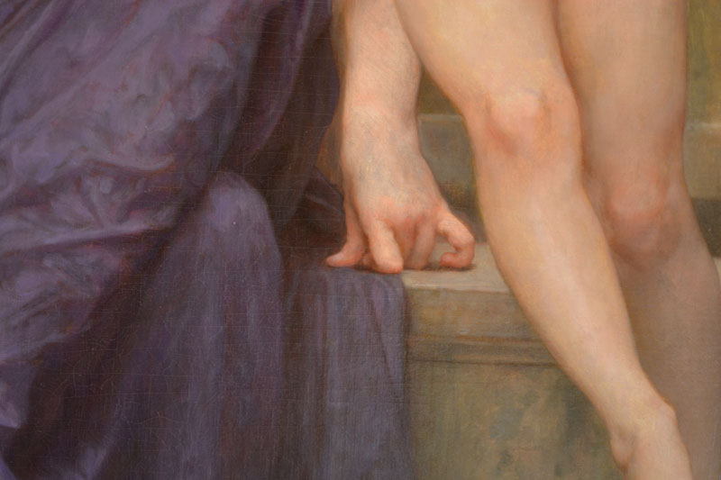
https://williamfmartin.blogspot.comJanuary 18, 2014 at 11:49 pm #1198736rltromble: Thanks for posting the pictures, that is a pretty big difference. Unfortunately I live in West Texas and I won’t be seeing one in person anytime soon, but that looks even more amazing in your picture. That hand detail with the blue in the veins, wow.
joepublik: I can’t believe I didn’t look on google art project. Great detail.
journeyman: I will definitely try out the raw umber and ivory black mix. Thanks for the tip.
davidbriggs: Thanks for the excerpt. I think what I’m going to do is a large number of studies of the same limb. I will try different methods and record everything along the way, I assume out of the studies i’ll find a layering method that I really like or can do well enough.
WFMartin: I remember reading early on that you shouldn’t have black in your palette. I didn’t for awhile and then once I started seeing how valuable grays were I added it. Well after starting to mess with the Zorn palette I did, and saw how versatile it could be. I wouldn’t use it straight from the tube on the canvas but sometimes it’s just enough to push the paint a certain direction. I don’t believe I’ve ever mixed yellow ochre and ivory black. I’ll try that here in a minute.
Gigalot: My first paintings were master copies of van gogh, renoir, and monet, so I definitely read a lot about the impressionist style. While it has it’s place, it wasn’t really my thing, but was a bit easier to deal with as opposed to some of the pieces I chose. It did teach me that there are no right answers or real rules, if you like what you produce, by whatever means you do so then that was right for you. I think most artists struggle with their critical eye growing faster than their ability to match it. Mistakes are the best way to learn. Good thing I’m making a lot of them now

davidbriggs: I went through an alla prima phase lately (thank you Sargent) and it’s as fun as it is frustrating. I think it has helped me with mixing colors though, in that I end up doing it a lot. The problem is that I have no where near the sense of value to make it work right away. Again, it’s good practice, but I think I’ll move back to layers. I’ll just need to work and do studies on getting the end color I want via extrapolating the effect of the layers. Good point on the optical gray, I hadn’t really looked at it that way.
WFMartin: The brushstrokes was another ‘rule’ that I ran into early. The first portrait I did was criticized for not showing any brushstrokes. I like the rough look too when done well, but I find something more challenging or exciting about getting that blend right (ha not that I do, but I like seeing it in other’s works).
If anyone has any unique or interesting ways of creating flesh like this through layers that wouldn’t be found on every ‘how to’ flesh website I’d be interested to hear it. I’m going to do a study with a bunch of methods (grisaille, veradicchio, different mediums at different times, whatever I can come up with) so adding another to the mix would be appreciated.
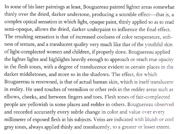
January 19, 2014 at 7:55 am #1198710Here is a detail of another study from the page I previously linked to, showing the superimposed layers very clearly, and what appear to be some “optical greys” formed by dragging a thin layer of flesh color over a dark underlayer:
[IMG]http://s3.amazonaws.com/wetcanvas-hdc/Community/images/18-Jan-2014/1189008-1_23_03_08_10_41_05-1.jpg[/IMG]
I don’t see that in this particular study. Where would you say this is visible?
It’s hard to judge with certainty from a digital picture, but I see a painting painted alla prima here, done on a light, ochre-ish (as seen in many of his other studies) toned canvas. I think this is one of the “secrets” to the liveliness of his flesh: to use a relatively light, warm underpainting, or tone and to allow this to shine through the (more or less transparant) shadows. My own experiments of this method have yielded very similar appearances. Greys especially get a very nice, lively quality this way.
In his more elaborated works, this effect tends to be somewhat less visible, though. He probably used more layers in his more finished paintings. As a consequence they do have more subtleties and depth in the flesh than his studies.
January 19, 2014 at 8:55 am #1198723I don’t see that in this particular study. Where would you say this is visible?
I think I see it almost everywhere except in the full lights of the face, the deep shadows, and the hair. He’s said to have worked very quickly even in his finished paintings, often painting into the ebauche layer when it was still wet, so in that sense the distinction between painting in layers and alla prima could be considered to be blurred.
Have you posted any of your experiments here?
Colour Online (hundreds of links on colour): https://sites.google.com/site/djcbriggs/colour-online
The Dimensions of Colour: www.huevaluechroma.com
Colour Society of Australia: www.coloursociety.org.au -
AuthorPosts
- You must be logged in to reply to this topic.
Register For This Site
A password will be e-mailed to you.
Search