Home › Forums › Explore Media › Colored Pencil › Blue Grosbeak – WIP (first ever CP drawing)
- This topic has 17 replies, 9 voices, and was last updated 5 years, 2 months ago by
 La_.
La_.
-
AuthorPosts
-
January 17, 2019 at 12:07 am #467666
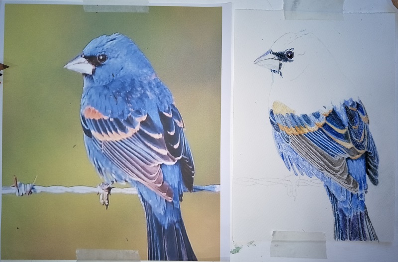
I just got myself a 150 set of Prismacolor pencils and here is my first attempt to draw with them. On el cheapo A5 watercolor paper, which I don’t think is helping the process much, but I’m quite enjoying playing around with it. Much slower than soft pastels, for sure! This is about 6 hours in. Any tips/suggestions/advice welcome, as I really don’t know what I’m doing with them. I’ve got isopropol alchohol, which I’ve read can be used for blending.

I'm here to grow and learn as an artist, so C&C always welcome
 January 17, 2019 at 8:15 am #764198
It turned out wonderful, nice in process photos too

[FONT=Impact]Sharp Images https://www.facebook.com/pages/Sharp-Images/245503015639558
http://fineartamerica.com/profiles/1-karen-sharp.html?tab=artwork
January 17, 2019 at 8:59 am #764201Oh, the process ones are what I’ve done. The image on the left of each one is the reference. Sorry for the confusion.
I'm here to grow and learn as an artist, so C&C always welcome
January 17, 2019 at 6:39 pm #764200Very nice work Kerri!
January 18, 2019 at 12:36 am #764202Thanks, Jon

I'm here to grow and learn as an artist, so C&C always welcome
January 18, 2019 at 8:17 am #764207Very good start. You’ll find lots of layers does well.
Penny
I live in Wiltshire, England
“If there are no dogs in Heaven, then when I die I want to go where they went.” -Will RogersJanuary 19, 2019 at 5:41 am #764203
More progress. I’m finding the less defined feathers in his head and neck quite hard. I have to try and stop myself from embellishing and adding detail that isn’t actually there, but that my brain is telling me has to be there, whether I can see it or not.
I'm here to grow and learn as an artist, so C&C always welcome
January 22, 2019 at 3:32 pm #764194Very nice work. Lovely color and looks nearly identical to the other .
Elinor:wave:
"keep your own time tickin"January 22, 2019 at 4:56 pm #764191Very good work!!!
Whatever you do, don’t lose the highlighted edge of the large feathers, that add great volume information to the body… Have you ever used masking film? This seems like the ideal situation for it, as the pencil pigment removal can be very subtle, but not after “fixing” the colour with any solvent, though.
And don’t be afraid to mix other blues, so the basic blue doesn’t look flat. Of course always test the combinations on a scrap piece of the same paper. Blues can be glorious used that way…!
Raquel from Toronto, CDA
January 23, 2019 at 12:47 am #764204This is how he’s ended up. Not fantastic, but a good first practice with CPs, I think. I might revisit him at a later date once I get better with them. I’ll use different paper for the next one, and maybe try different blending techniques.

I'm here to grow and learn as an artist, so C&C always welcome
January 23, 2019 at 8:37 am #764197This is a beautiful first CP practice piece!! As Frida said, different blues will add depth. Here’s a trick I use to figure out exactly which ones: cut scraps of the same paper into small squares with a hole in the middle. Place the scrap over a place on your ref photo you are trying to match the color, the color you are trying to match showing through the hole. Then use different pencils to layer on your scrap piece, trying to get as close to the color showing through the hole as possible. Isolating areas in this way is tedious, but you would be surprised how many different ranges of color you will discover. Then make notes on which colors and which order you arrived at. I hope this helps, and happy coloring!! I can’t wait to see more, this bird I beautiful!!!
Kathy Sieloff
 My Website January 23, 2019 at 11:21 am #764205 Thanks for the all tips and encouragement. The bits of paper with the holes in sound like a good idea.
I'm here to grow and learn as an artist, so C&C always welcome
January 23, 2019 at 2:31 pm #764192I guess that in the confusion with your references at the beginning I missed the fact this was your “first ever CP drawing”… My apologies. You are doing great, and the important thing is that you are open to feedback! :thumbsup:
To amplify on what Kathy recommends for selecting colours, this is what I learned along the way. I usually use a separate strip for each piece, and note the # of the pencils around the hole, which comes in handy for something else:

Raquel from Toronto, CDA
January 23, 2019 at 5:05 pm #764199:thumbsup: :thumbsup: Most impressive, Two Thumbs Up
[FONT=Impact]Sharp Images https://www.facebook.com/pages/Sharp-Images/245503015639558
http://fineartamerica.com/profiles/1-karen-sharp.html?tab=artwork
January 23, 2019 at 5:16 pm #764193What better endorsement than Karen’s??? If you know your way around WC look for her work WIPs. A CP Animal Encyclopedia…
Raquel from Toronto, CDA
-
AuthorPosts
- You must be logged in to reply to this topic.
Register For This Site
A password will be e-mailed to you.
Search