Home › Forums › Explore Media › Pastels › Soft Pastel Learning Center › The Spotlight – April 2015 – Atmospheric Perspective
- This topic has 306 replies, 25 voices, and was last updated 8 years, 11 months ago by
 KeeverMacLeod.
-
AuthorPosts
-
March 31, 2015 at 8:11 pm #992846
Welcome artists!
[FONT=Verdana]Here is a quick recap of what The Spotlight is all about!
[/FONT]
The Spotlight is an activity thread for pastel artists of all experience levels working from photos chosen by a monthly host. Most months, the host will choose photos from only one subject, putting that subject into “the spotlight,” so to speak! For example, one month the subject will be painting water, another month will spotlight flowers, etc.Some months, rather than spotlight a subject, the focus will be on a challenge of some sort. In those cases, we might have a wider variety of photo references, but “the spotlight” will be on the challenge itself.
Since this is a group activity, we can pool our knowledge and resources, and grow as artists in a fun, “no-pressure” atmosphere.
And, remember, no critiques unless specifically asked for.
The intent is to have fun, try new things, experiment, and perhaps most of all, to see what our friends and colleagues are painting from the same reference material!
Please note: The photos this month were taken by me or are from the Reference Image Library. You have permission to use the photos as reference to create your artwork and to sell them and/or exhibit them. The actual photos still retain the copyright of the photographer. So you cannot copy the photo to your blog, for example, without the permission of the photographer, or digitally alter or reproduce the photo for any purpose other than for your personal use, with the exception of crops, digital alterations and posts of these photos within “The Spotlight” thread.
This month’s Spotlight is on…Atmospheric Perspective!
Atmospheric perspective – also called aerial perspective – is certainly one of the most fundamental concepts in painting, especially landscape painting. Most of you are probably already aware of the basic concept, so please skim or skip over any parts that are already familiar to you. But since many newcomers to painting visit the Spotlight, I will try to start with the basics.
Atmospheric perspective is essentially the concept that there is air (or atmosphere) between artist and subject. As the distance increases, the amount of air between artist and subject increases, too, thus altering the colors and values of objects as they recede into the distance. Fog, haze, smog, mist, etc. can also increase the thickness of the air between subject and artist producing the same altering of color and value. The importance of atmospheric perspective in art is due to the fact that we artists paint and draw on 2-dimensional surfaces, but try to convey 3-dimensional scenes. The use of atmospheric perspective is therefore one of the most important strategies at the artist’s disposal to convey the illusion of depth and distance.
As we have been studying the individual colors over the past year, a couple aspects of color that we mentioned frequently were value and intensity. These two aspects of color are very much influenced by atmospheric perspective!
Value:
Value refers to how light or dark something appears. What then is the value of the atmosphere? When we look at the sky, or when we can see miles into the distance and everything disappears into a haze, or when the atmosphere is thick with fog – we can see that the atmosphere is fairly light in value. Most things are darker than the atmosphere, so when we paint them, they will get lighter in value as they become more distant. Very light objects that are lighter than the atmosphere, will become slightly darker with distance, but the effect on light objects – especially white objects is very minimal. So minimal, in fact, that many art books maintain (or recommend) that atmospheric perspective should be ignored when painting white objects (and keep them white at all distances). Personally, I think a gradual value change with distance is recommended even for white objects, but as with all principles the best rule is to observe and see what is actually happening!
Here’s an example of the lightening of values with distance:
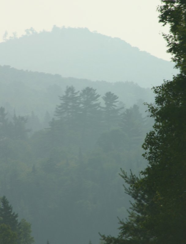
There is obviously a lot of atmosphere in the above example!
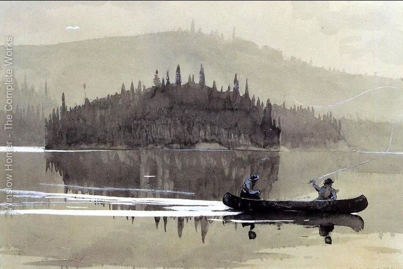
And here is a lovely painting by Winslow Homer that demonstrates that same lightening of values with distance!
Color Intensity:
Since the color of the air or atmosphere near the surface of the earth during most daylight conditions is a light blue or light blue-gray, it also makes sense that colors will lose their intensity as the distance increases. Imagine painting a thin glaze of atmosphere color over all the colors in your painting and I think you will get the idea!
Here are a couple more examples of the effects of atmospheric perspective. (If they look familiar, it is because I have used these photos before!)

In this first example, we see the colors becoming lighter in value as well as more gray and colorless with distance. Since the atmosphere is heavy with air, none of the colors are particularly intense, but the color does decrease in intensity as better seen in the second example:
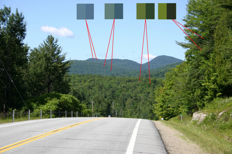
Here we see some color swatches that show both light and shadow color at the different distances. We can see that the green in the sunlit areas transitions from a more intense yellow-green to a very low intensity blue-gray. The color in the shadows changes, too – becoming less green and more blue with distance. So, in terms of color, we can see that the color and value of an object changes with distance due to the influence of atmospheric perspective.
We can also see another effect of atmospheric perspective, the decrease in contrast. The nearby trees have more contrast between light and shadow – the distant trees have almost no contrast between light and shadow.
The above photo also shows one other aspect of atmospheric perspective – the amount of visible detail also decreases with distance.
So, based on the above photos, we can deduce that atmospheric perspective usually produces a lightening in values, less intense colors, less contrast and less detail as the distance increases.
Color Temperature:
In our Spotlights on color, we often mentioned the concept of color temperature. It is a popular – if somewhat imprecise – way of defining and categorizing colors. The colors yellow, orange and red are often considered the warm colors, with green, blue and violet considered cool. Blue is often considered to be the coolest color, thus when artists speak on the topic of atmospheric perspective, they will often say that colors become cooler with distance. Since, as we mentioned, under most atmospheric conditions the sky and atmosphere are blue, we are adding more blue to our colors with more distance. More blue equals cooler color temperature.
Keep in mind, however, that the atmosphere isn’t always blue. Many times when painting white clouds, for example, they may get warmer with distance. This is because, nearer the horizon, the atmosphere often becomes more pink or red – not just during sunrise and sunset. So, the more distant clouds may have more of that warmer pink colored air between them and the viewer, giving them a hint of pink color.
Here’s a lovely painting by William Trost Richards that has some lovely atmospheric perspective!

Varieties in the Color of the Atmosphere:
As mentioned, it is important to note that the atmosphere can be many different colors. Especially at sunrise or sunset, the atmosphere may be filled with oranges, reds, violets, pinks, etc. If the atmosphere or air is a certain color in your scene, then that would be the influencing color for your atmospheric perspective! As always – observe, don’t just follow rules!
Here are some great examples compiled by Scott Burkett:
[/URL]https://www.wetcanvas.com/ArtSchool/Landscapes/LearningFromPhotos/Sunsets/Atmospheric/The Exaggeration of Atmospheric Perspective:
The two photos I showed earlier of the Adirondack mountain scene are obviously taken at the same location, yet with quite different amounts of atmospheric perspective! On a clear day, as in the second photo, the distant mountains do not look that far away and the effect of atmospheric perspective may be minimal. So, the amount of atmospheric perspective that we show in our painting will help indicate how clear or how hazy the day is.
Sometimes, however, when the day is clear and the effects of atmospheric perspective are not evident (or minimal), we may have trouble conveying distance. Therefore, in order to accentuate distance on our 2-D paintings, we may have to – or want to – exaggerate the amount of atmospheric perspective in our paintings.
For example, we may encounter a scene such as this one.
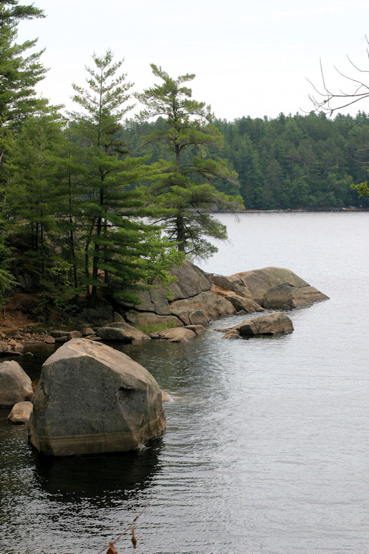
The distant shore is almost a mile away, but it is a fairly clear day without much fog or haze or atmosphere. Therefore the nearby trees on the rocks are not clearly delineated against those background trees. To see those nearer trees better and/or to better show the distance to those background trees, we might want to exaggerate the atmospheric perspective by lightening the value and reducing the color intensity (and less contrast and detail, too) of those background trees.
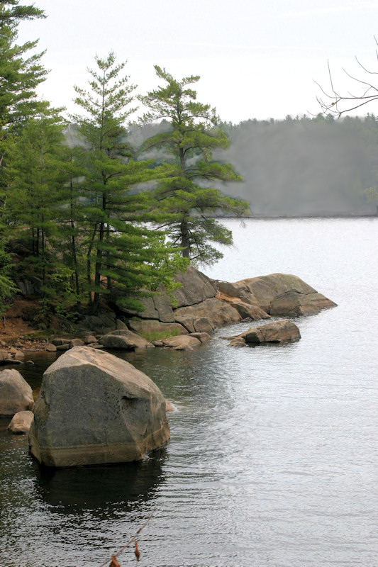
To me, this second version has more depth and creates a clearer, simpler painting due to the use of exaggerated atmospheric perspective! It does, however, make the day seem less clear and sunny. So, as with most artistic decisions, there is a trade-off – and the decision whether to exaggerate atmospheric perspective or not is solely up to the artist and may vary from painting to painting!
Just for Landscapes?
While the use of atmospheric perspective is most used in landscapes, the same principles can be used to help show distance in any painting. We might not call it atmospheric perspective when doing a still life or a portrait, but we can use the same principles to create distance between objects in any painting.
References:
I’ve included references with lots of atmospheric perspective and others with less!
Photos by me:
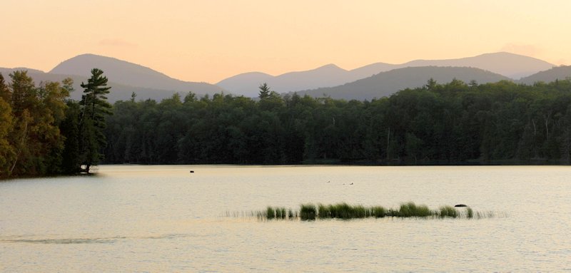
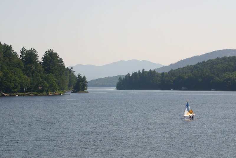
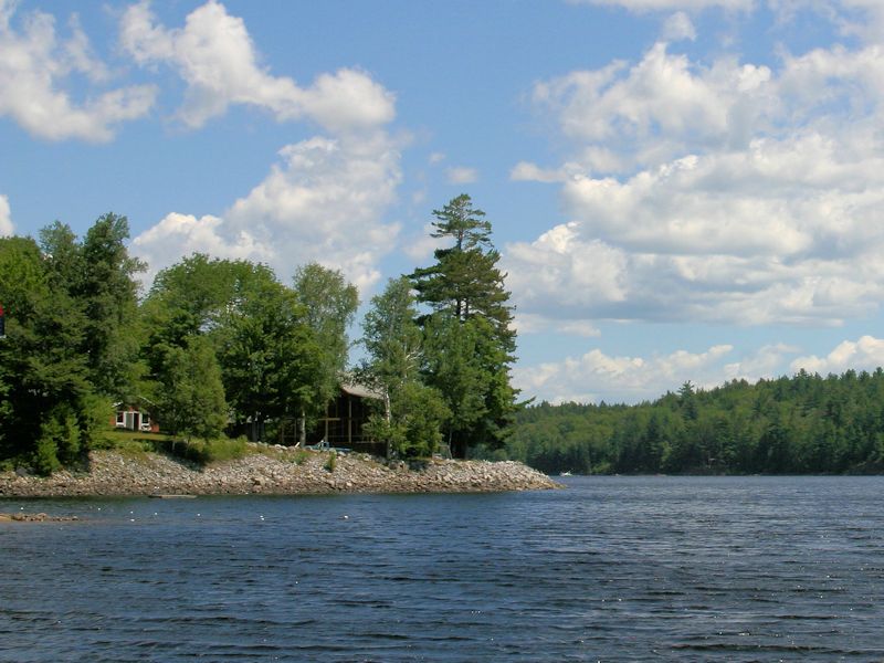
Photo by Ivyleaf
As always, feel free to modify the references in any way you please!
And have fun!
Don
March 31, 2015 at 8:41 pm #1222365Thank you, Don. Yes, I peeked early
 As I mainly do landscapes, this topic is near and dear to my painting heart.
Peg
and we all shine onMarch 31, 2015 at 9:18 pm #1222291Lovely! Thank you so much. Going to be fun.
Happy to say "hello". C and C always welcome.
JAY:wave:
March 31, 2015 at 11:51 pm #1222226Don, another great lesson, hopefully this month I will be able to participate.
JenC & c's always welcome
April 1, 2015 at 1:10 am #1222103Don, this is a great topic! I painted one of these in an earlier Spotlight and may have a go with a different crop, or just do a different one. Wonderful lecture and examples! Love it!

Robert A. Sloan, proud member of the Oil Pastel Society
Site owner, artist and writer of http://www.explore-oil-pastels-with-robert-sloan.com
blogs: Rob's Art Lessons and Rob's Daily PaintingApril 1, 2015 at 3:58 am #1222223Great topic and a really great lesson on it. This is a great thing to think about if you’re a beginner or if you think your landscapes look a bit flat. Photos often do flatten atmospheric perspective and I used to copy them faithfully…well, the photo shows it like that! However, as one learns one also becomes freed from the photo. This sort of lesson is just what we need!
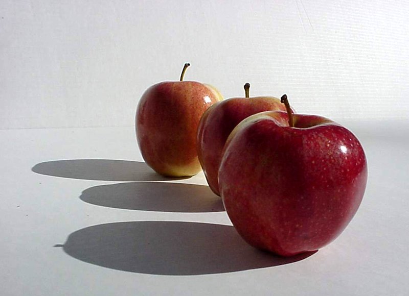
So, if I get round to it this month, I will try the apples, as I think that one will be the most difficult for me.My website http://ruthmannpastelart.com/
Pastel Guild of Europe http://www.pastelguild.org/
April 1, 2015 at 8:48 am #1222371I have not had much success with doing landscapes with pastels, but Don, I will give at least one of these a go this month. Thanks for all the helpful info on atmospheric perspective.
April 1, 2015 at 9:22 am #1222214thank you, Don, for another great lesson. It is something I do need to work on, so will definitely try one or two this month…
(I have copied and put all of your lessons into a folder….you should really make them into a book!)

C&C always welcomed and appreciated
JudiBApril 1, 2015 at 2:10 pm #1222366Oh this is a fantastic topic! Thank you so much, Don!
"Persistence, and practice will get you where you want to be, even though you will go through some 'dark' stages"
April 1, 2015 at 3:19 pm #1222234wow, I only hope I have the correct colors. Wonderful photographs Don!
Are these scenes nearby to you?April 1, 2015 at 3:53 pm #1222187Are these scenes nearby to you?
The 3 photos in the lesson, as well as 3 of the references are taken in the Adirondack Mountains in NY state – about a 4 hour drive away. Spent many summer vacations there.
Don
April 1, 2015 at 5:01 pm #1222235That is well worth the drive a couple hundred miles is nearby enough to see this beautiful country!Nice, really nice photos!
April 1, 2015 at 7:49 pm #1222188That is well worth the drive a couple hundred miles is nearby enough to see this beautiful country!Nice, really nice photos!
Thanks!
Don
April 1, 2015 at 7:54 pm #1222096Oh this is a fantastic topic! Thank you so much, Don!
I agree…I’m giving it 5 stars!:cat:
[FONT="Tahoma"]Regards, Deirdre (Always pleased to get C&Cs!) Don't forget - comment on other threads in the forum as well as posting your own work - also, we encourage you to post WIPs, they help others to learn as well as you.
 Moderator[/COLOR] [April 1, 2015 at 9:30 pm #1222391
Thanks for these Don, I might have a go at some trees….but not the ones I did before :).
jim -
AuthorPosts
- The topic ‘The Spotlight – April 2015 – Atmospheric Perspective’ is closed to new replies.
Register For This Site
A password will be e-mailed to you.
Search