- This topic has 67 replies, 13 voices, and was last updated 4 years, 7 months ago by
 ArtMarkie.
-
AuthorPosts
-
July 13, 2019 at 10:43 am #475630
Kristy’s thread on Rembrandt got me thinking about composition. Something is puzzling me. Most paintings have a focal point – a person, an object, whatever… and the background recedes and becomes secondary. But what if one wanted the background to be strong? If the background has interesting colors or elements… how would one do this without killing the smaller portrait or whatever is in the foreground?
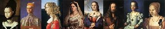
Generally, in western art at least, the more detailed, sharper, more colorful elements become the focal point and the other areas, like background, are less detailed, softer or duller, so they become secondary.
Here are some examples of busy backgrounds that I think do work. Fred Wessel’s backgrounds are intricate and sharp and very busy. However, despite all the detail, the backgrounds are all one basic hue. So the more colorful things in the foreground can still be the focal point.


Another example is Ikenaga Yasunari’s paintings. They are sort of the opposite of western art. They have tons of busy patterns all over the background. But the faces are smooth and flat. I think it works because the “plain” skin areas provide a resting point for the eye. So it is the plain areas that become the focal point. These plain areas are also of very interesting shape and take up maybe a third of the painting. If they were smaller, or plain shaped, I do not think it would work.


Are there any other artists that you can think of that have very interesting backgrounds that do not overshadow the subject? And how is it possible? Any ideas on how to incorporate a very busy background without it overwhelming the smaller subject in the foreground?
Being born places you at a greater risk of dying later in life.
http://www.artallison.com/July 13, 2019 at 4:19 pm #854295I’d earlier posted a couple from my friend Beth Parker. Kind of has this idea?

 July 13, 2019 at 5:36 pm #854332
I think in Western Art there was a period of time at least before the late Renaissance when the backgrounds were quite busy. I am not thinking of icon paintings of the Madonna, but rather Larger painted works by Giotto, for example, that have lots of detail in the background.
The backgrounds can be very busy. Giotto seems to have pushed the focus on the subject by the use of positioning (subject-centre), light colours or radiance in the clothing and skin, and of course, a halo to demonstrate that “this guy is the important figure”.

I suppose this was successful for its time, place and subject matter.

In the West there was extensive use of pattern in backgrounds in tapestries.
"None are so old as those who have outlived enthusiasm." - Henry David ThoreauModerator Acrylics Forum~~~Reference Image Library
July 13, 2019 at 5:37 pm #854333These are great images, by the way. Arty, your friend Beth Parker paints really well. Very impressive.
"None are so old as those who have outlived enthusiasm." - Henry David ThoreauModerator Acrylics Forum~~~Reference Image Library
July 13, 2019 at 10:01 pm #854311Generally, the figure-ground relationship in Western Art involves greater detail in the foreground (this “detail” may involve actual rendered detail or greater use of impasto and texture, etc…)


Rubens and Ingres add much more to the “background”… but still the background is painted thinner and the colors are generally lower-keyed than the foreground.
Essentially, it comes down to Contrast. The contrast is what draws the eye. In the paintings by Yasunari Ikenaga…

… the artist contrasts the simplified figures… the big simple shapes that make up the flesh tones and the hair… with the surrounding details. This inverts the usual Western approach… but is not unknown in Western Art. The most obvious example of such is Botticelli’s Primavera:

The figures are far less detailed than the surrounding flora: flowers, leaves, grass, fruit, all rendered in exquisite detail like a medieval tapestry:

The simplified shapes of Botticelli’s Three Muses, Flora, Eve, etc… or the Unicorn in the famous Unicorn Tapestries… stands out against all the surrounding detail. The detail is so much that it actually recedes. You can see this at work in paintings by other early Renaissance artists, medieval artists, painters of Persian and Indian miniatures, etc…
This approach is common throughout more “decorative” works of art:


Matisse famously declared himself to be an Expressionist… but he quantified this by stating that the “expression” in art is not found in the subject matter… but rather in the painting as a whole. In other words, the “background” is as important as the “foreground”. Personally, I believe Matisse was right… and I work in a manner not unlike that of many of the “decorative” painters I posted above. It should then come as no surprise that Klimt, Yasunari, Mucha, and Bonnard rank among my favorite artists… and that if forced to choose a single favorite painting, I would likely go with Primavera.
Saintlukesguild-http://stlukesguild.tumblr.com/
"Beauty is truth, truth beauty—that is all ye know on earth and all ye need to know." - John Keats
"Modern art is what happens when painters stop looking at girls and persuade themselves that they have a better idea."- John Ciardi
 July 13, 2019 at 10:13 pm #854312
I think in Western Art there was a period of time at least before the late Renaissance when the backgrounds were quite busy. I am not thinking of icon paintings of the Madonna, but rather Larger painted works by Giotto, for example, that have lots of detail in the background.
The backgrounds can be very busy. Giotto seems to have pushed the focus on the subject by the use of positioning (subject-centre), light colours or radiance in the clothing and skin, and of course, a halo to demonstrate that “this guy is the important figure”.
I suppose this was successful for its time, place and subject matter.
I don’t think of the secondary figures in Giotto’s paintings as being part of the “background”. The figures are all part of the foreground… crammed into a shallow stage-like space. The sky is the background. Giotto then denotes which character is most important through the use of placement and lighting… as well as those torches and clubs which all point like arrows toward Christ and the central drama.

Look at the figures in the foreground in this painting. They all face the drama of the dead Christ mourned over by his mother, Mary. The background reinforces the focal point with the hill sloping downward at a diagonal toward the central drama.
Giotto’s backgrounds are “simple”… but in a way… more essential to the paintings than the backgrounds in many paintings by Rembrandt or Velazquez.
Saintlukesguild-http://stlukesguild.tumblr.com/
"Beauty is truth, truth beauty—that is all ye know on earth and all ye need to know." - John Keats
"Modern art is what happens when painters stop looking at girls and persuade themselves that they have a better idea."- John Ciardi
July 14, 2019 at 9:33 am #854296I love how Klimt made his backgrounds flow into his subjects–it’s all so magical. Ethereal. Beautiful. There will never be anyone like him. He is in a class of his own.
July 14, 2019 at 10:02 am #854322I love how Klimt made his backgrounds flow into his subjects–it’s all so magical. Ethereal. Beautiful. There will never be anyone like him. He is in a class of his own.
I agree, his work is quintessentially unique. Its art one can look at and find something new there every time. He must have had the most amazing romantic mind.
July 14, 2019 at 12:00 pm #854327I’d earlier posted a couple from my friend Beth Parker. Kind of has this idea?
[IMG]http://s3.amazonaws.com/wetcanvas-hdc/Community/images/13-Jul-2019/24237-bethparkerbrother.jpg[/IMG]
This is fantastic. The values and colors of the background figures are consistent with the main figure, but the design is quite unique and very pleasing, and even though very busy it does not compete with the main figure.
Primavera is an obvious example but I hadn’t even thought of it, so thanks SLG for posting, also for the more “decorative” examples.
Being born places you at a greater risk of dying later in life.
http://www.artallison.com/July 14, 2019 at 12:01 pm #854334[COLOR=”RoyalBlue]I think in Western Art there was a period of time at least before the late Renaissance when the backgrounds were quite busy. I am not thinking of icon paintings of the Madonna, but rather Larger painted works by Giotto, for example, that have lots of detail in the background.
The backgrounds can be very busy. Giotto seems to have pushed the focus on the subject by the use of positioning (subject-centre), light colours or radiance in the clothing and skin, and of course, a halo to demonstrate that “this guy is the important figure”.
I suppose this was successful for its time, place and subject matter.[/COLOR]
I don’t think of the secondary figures in Giotto’s paintings as being part of the “background”. The figures are all part of the foreground… crammed into a shallow stage-like space. The sky is the background. Giotto then denotes which character is most important through the use of placement and lighting… as well as those torches and clubs which all point like arrows toward Christ and the central drama.
…
Look at the figures in the foreground in this painting. They all face the drama of the dead Christ mourned over by his mother, Mary. The background reinforces the focal point with the hill sloping downward at a diagonal toward the central drama.
Giotto’s backgrounds are “simple”… but in a way… more essential to the paintings than the backgrounds in many paintings by Rembrandt or Velazquez.
Good points. But Giotto is the first (post-Roman) European painter I can think of who made a consistent effort to include some elements of a real background, which he did in his frescoes especially. Perhaps there were other earlier attempts. But even so that would have meant that Giotto was trying to work out all this positioning of sky, hills, trees, buildings, and even his secondary figures and their torches and pitchforks with relatively little in the way of precedent.
I always like looking at his backgrounds because he strikes me as one of the first artists to not just start looking at the world around him again but to try and make it part of his art. And in this painting of the Flight into Egypt he is really playing with the pattern created by the rocks and trees. It’s maybe a bit clumsy compared to what Botticelli was doing a little later, but I still like it.

Klimt of course did amazing work, and I agree that his paintings are in a league of their own, but by then the Europeans had been introduced to a lot of wood print art from Japan with its stylized figures and backgrounds, and had the works of the Art Nouveau and Arts and Crafts movement and all the artistry put into creating patterned china and wallpaper. By 1900 the Europeans were swimming in rich pattern and a long tradition of placing subjects in backgrounds of all sorts.
But a few artists had to pioneer all that.
"None are so old as those who have outlived enthusiasm." - Henry David ThoreauModerator Acrylics Forum~~~Reference Image Library
July 14, 2019 at 7:03 pm #854313Don’t forget the Persians and the whole of the Islamic world:


The contemporary painter, Robert Kushner… one of the leading figures of what was termed “Pattern Painting”… traveled through Turkey and the Middle-East with an art historian who was something of a mentor. He was struck by the fact that pattern and even calligraphy were not dismissed as secondary to painting and sculpture as they are in the West. He found this was equally true in India, China, and Japan. It was not always this way. Pattern and Calligraphy were major art forms in the West in the Middle Ages:


With the onset of the High Renaissance and the mastery of linear perspective, the focus of Western Art, for better or worse, centered upon the illusion of form and space as they appeared in “reality”. The Pre-Raphaelites, who are often unfairly dismissed as “reactionary” were among the first to look back at the art prior to the High Renaissance (Pre-Raphael) and embrace pattern and decorative art and art forms:

Their ideas would spread throughout Europe through the Arts and Crafts Movement in Britain and the US, the Nabis in France, and Art Nouveau… and later Art Deco throughout Western Europe and the US.
There remains, however, a bias in Western Art against Decorative Art. The very term, “decorative”, is commonly used in a pejorative manner denoting a failing equally egregious to “illustrative” or “narrative”.
Saintlukesguild-http://stlukesguild.tumblr.com/
"Beauty is truth, truth beauty—that is all ye know on earth and all ye need to know." - John Keats
"Modern art is what happens when painters stop looking at girls and persuade themselves that they have a better idea."- John Ciardi
July 15, 2019 at 11:19 am #854335Yes the Celts, Anglo-Saxons and Scandinavians took patterning to extraordinary levels of intricacy. But the Franks seem to have insulated Southern Europe from that influence. The Spanish rediscovered it and for a time embraced it as they conquered Al-Andalus but it never really made its way back into Spanish painting during the Renaisance or Baroque periods.
Hildegard of Bingen produced paintings of her visions that relied heavily on the use of pattern as well.
The similarities in style between the Persian illustrations and the Giotto are interesting. I wonder if Giotto had access to Arabic or Persian illustrations, or vice versa. Both make me think of backdrops to a stage. The backgrounds in some of Giotto’s works and in some Persian illustrations is not unlike the backgrounds in the mosaics created in Sicily under the Normans, a culture that briefly combined Byzantine, Arab and Northern European influences.
https://en.m.wikipedia.org/wiki/Norman-Arab-Byzantine_culture
"None are so old as those who have outlived enthusiasm." - Henry David ThoreauModerator Acrylics Forum~~~Reference Image Library
July 15, 2019 at 11:39 am #854323An illustration (engraving) from the ‘Sejarah Melayu’ (Malay Annals).

Or exquisite old maps from same books.
 July 16, 2019 at 2:47 am #854336
This masterpiece (🤓🤓🤓) by Agnes Martin is at the MOMA.
You may wonder “this is the background, where is the subject”.
It’s called “The red bird”!…..
Do we really need to care that she started out with intricate paintings when she was younger and then reduced and reduced and reduced until there was nothing left to reduce??
No, we should not care. We should relate to this masterpiece in front of our eyes and it’s absolutely ridiculous. The stories behind it may be of interest to some, but are irrelevant.
And by the way, similar masterpieces by her sell for millions at auction.July 16, 2019 at 6:23 am #854337One can imagine how when a billionaire has a few house painters to repaint the walls of his Park Avenue penthouse and they remove an Agnes Matin masterpiece and splash it a bit with the wall paint thinking that it was just a frame displayed there. When the boss returns from his latest Tuscany fling he gets pretty pissed and sues the company that employs these wall decorators for $3,000,000. A few months later the judge, who doesn’t give a damn about “fine”
art dismisses the case. -
AuthorPosts
- You must be logged in to reply to this topic.
Register For This Site
A password will be e-mailed to you.
Search