Home › Forums › The Learning Center › Composition and Design › W.I.P.(another)Photo and Painting thread
- This topic has 22 replies, 8 voices, and was last updated 6 years ago by
 Jon.
Jon.
-
AuthorPosts
-
February 15, 2018 at 3:40 pm #451420
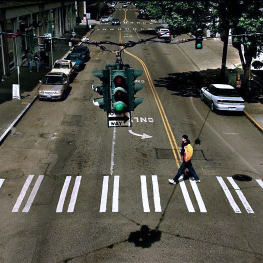
24″x24″ gessoed panel. Paynes Gray
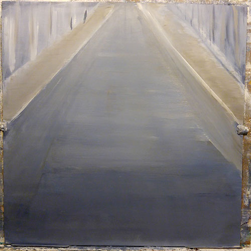
paynes gray plus a rumor of raw umber
http://s3.amazonaws.com/wetcanvas-hdc/Community/images/18-Sep-2019/1999899-sigsmall.jpg
STUDIOBONGOFebruary 15, 2018 at 4:34 pm #566610Looking good! I love watching WIPs
 Katie Black Fine Art
"Life is far too important to be taken seriously." - Oscar Wilde
February 15, 2018 at 4:56 pm #566602Are you looking for critique? If so, I guess my first question would be where would you (for now) like to go with this image? If not, then I’ll keep my lip zipped, and just enjoy the WIP.
Cheers;
ChrisC&C of all sorts always welcome! (I don't mind rude or harsh criticism.)
I suppose I have to do this too (my blog, & current work). My Visual Arts Nova Scotia page.
Art is the most intense mode of individualism that the world has known - Oscar Wilde
The primary palette: Attention, observation, memory, imagination, integration, executionFebruary 15, 2018 at 5:17 pm #566615Are you looking for critique? If so, I guess my first question would be where would you (for now) like to go with this image? If not, then I’ll keep my lip zipped, and just enjoy the WIP.
Cheers;
ChrisWide open to all comments. And thanks for looking
My idea is to lay in some b.g
Then f.g elements
Then road graphics and shadows
Then decide if any glazing is necessary
Then refine
Then “texturize” road
Then refine, refine.http://s3.amazonaws.com/wetcanvas-hdc/Community/images/18-Sep-2019/1999899-sigsmall.jpg
STUDIOBONGOFebruary 15, 2018 at 9:31 pm #566616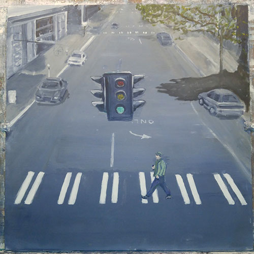
http://s3.amazonaws.com/wetcanvas-hdc/Community/images/18-Sep-2019/1999899-sigsmall.jpg
STUDIOBONGOFebruary 16, 2018 at 11:43 am #566611Again, looking good. The road is great and seems to go on forever.
Katie Black Fine Art"Life is far too important to be taken seriously." - Oscar Wilde
February 16, 2018 at 1:37 pm #566605looking good!
it appears you’re giving him a green jacket (to go with the green light?)
i wonder if it’s intentionally defiant that you’re allowing him to cross on a green light … or if it might create more ‘tension’ if he was crossing on yellow.
just out loud ponderingsla
_____________________________________________
When the power of love overcomes the love of power, the world will know PeaceFebruary 16, 2018 at 6:24 pm #566606Nice WIP. So far so good.
Christophervasil.com
February 16, 2018 at 11:56 pm #566617looking good!
it appears you’re giving him a green jacket (to go with the green light?)
i wonder if it’s intentionally defiant that you’re allowing him to cross on a green light … or if it might create more ‘tension’ if he was crossing on yellow.
just out loud ponderingsla
The green jacket is a bit of a goof. I did the jacket after having done the green on the light and there was still a lot of green on the brush – and when it dried it matched the light, so I glazed it trying to tone it down. I’m not good with details so I was reluctant to paint it again. I don’t like it matching the light!
Didn’t occur to me to change the light to yellow. I don’t think it would create much tension since there are no cars about — however it would solve the green jacket problem, and might look good with the yellow lines on the road – I might just do that.Thanks crispy, more soon.
http://s3.amazonaws.com/wetcanvas-hdc/Community/images/18-Sep-2019/1999899-sigsmall.jpg
STUDIOBONGOFebruary 17, 2018 at 1:25 am #566618Again, looking good. The road is great and seems to go on forever.
Thanks Katie – it looks more like someplace in Southern California than it does Seattle – but—
http://s3.amazonaws.com/wetcanvas-hdc/Community/images/18-Sep-2019/1999899-sigsmall.jpg
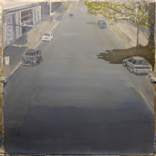
STUDIOBONGOFebruary 17, 2018 at 8:28 am #566607Since you mentioned texture I was going to suggest trying using sponges instead of brushes for the pavement. (Maybe that tip would have been more useful before you rouged in the figure and the lines. :))
Christophervasil.com
February 17, 2018 at 3:42 pm #566619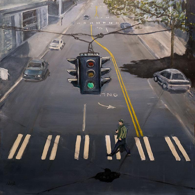
This is it with proper lighting and photography. not sure where to go with it next…http://s3.amazonaws.com/wetcanvas-hdc/Community/images/18-Sep-2019/1999899-sigsmall.jpg
STUDIOBONGOFebruary 18, 2018 at 1:01 pm #566612I like it. I am going to mention a couple of things… Under the traffic lights, there is a sign that says ‘one way’ have you deliberately missed this off?
The one other thing is that the tree shadow looks a little like an animal’s paw to me and maybe a little on the dark side..but I’m loving the rest of it.
Katie Black Fine Art"Life is far too important to be taken seriously." - Oscar Wilde
February 18, 2018 at 4:29 pm #566608Really good and fun to look at. Maybe clean up the curbs, especially the one on our left-sharpen edge and define the shadow. Also the car on the right, especially the roof , is almost white in the reference. It would stand out against the paw shadow if lightened. Also the red and yellow lights in the reference are in more shadow. If you darken them the green will jump out even more. Also its darker in the area beneath the green lens. Anything to make that light glow green will pay off.
The perspective works great. Your take is a lot more interesting than the reference.Christophervasil.com
February 18, 2018 at 11:02 pm #566620Thanks guys, and all valid points. I’m having a hard time making the green light stand out. I didn’t want to darken the yellow and red any further, but looking at the reference I see they’re nearly blacken out. In real life those lights are exceedingly bright – that green is about as bright as I can make the color without it going too white.
http://s3.amazonaws.com/wetcanvas-hdc/Community/images/18-Sep-2019/1999899-sigsmall.jpg
STUDIOBONGO -
AuthorPosts
- You must be logged in to reply to this topic.
Register For This Site
A password will be e-mailed to you.
Search