Home › Forums › Explore Subjects › Portraiture › Portrait Classroom › Portrait Classroom: Edges and Backgrounds
- This topic has 19 replies, 10 voices, and was last updated 17 years, 5 months ago by
 frida.
-
AuthorPosts
-
May 1, 2005 at 8:27 pm #984981
Wow, Celestia and everyone else have done excellent guides for you all. I hope mine is helpful, too. I want to talk about the dreaded background and some things I have learned about edges. I’ll start out with Edges and post the Background part in a few days.
EDGES AND BACKGROUNDS IN THE PORTRAIT
If you have followed the tutorials in the Portrait Classroom lessons from the beginning you are well on your way to learning how to accurately portray facial features and how to paint realistic skin tones. The next logical step for the artist who wants to take their portraits to the next level is to study composition and design. Learn to view your portraits as “paintings” and begin to integrate sure brushwork and complementary color schemes to produce a work that is “painterly.” If your goal is to create a work of art that looks just like a photograph you can skip this section. But if you’re ready to explore and experiment with your medium to portray your subject in a manner that would never be mistaken for a photo, read on.
Many artists arrive at a stage when they find they can achieve a good likeness of the subject most of the time. They have reached a plateau and have a desire to be more creative with their subject. Would you like to develop a work into a piece that is indelibly “your style,” one other people will immediately recognize as yours? I’ll try to present you with a way to work up to this in this tutorial.
First you need to realize that you (and everyone else in the world) see in a way that is uniquely your own. When you paint or draw a portrait, you are organizing your view of that person into an interpretation of what you see. This is demonstrated clearly in an open studio environment, where you may have ten artists painting the same person. Or you may have gone plein air painting with your friends and noticed how different the colors in their painting are than your own. Why do paintings done by different artists under the same conditions differ so greatly? Is it because they use different brands or colors of paint? Is it because one is a better painter than the other? I think the real reason an identical subject is portrayed in very different ways can be attributed directly to how the artist sees or “interprets” what they see and how he/she places their marks on the paper or canvas.
We know that flesh tones can be obtained using many different hues. The possibilities are endless, so why shouldn’t the possibilities of your entire painting be endless as well?
I hope this lesson will help you realize some of these possibilities with your next portrait. You’re limited only by your imagination and your knowledge of different painting techniques. The way you handle EDGES and BACKGROUNDS can truly make your work unique.
What is an Edge and why Should I Care?
An edge is a place where one plane meets another on the two dimensional surface you’re painting or drawing on. This edge may be a person’s shoulder against a background or it may be just a slight turn on the angle of a nose. Every edge presents you with an opportunity. It’s up to you, as an artist, to recognize this opportunity and make it work for you. An edge can be emphasized if the part of the painting you’re working on needs it to be, or it can be softened and diffused. Hard edges draw attention. Where two planes meet you can emphasize an edge with a color/value change or a texture change. A hard edge can add depth to your painting by creating a three-dimensional look. Soft edges are created by blending the adjoining hues or values with a dry brush (when you’re painting), although this practice is not always necessary or advisable. The same effect is achieved with a tortillon when you’re using a pencil, or with your finger or a stomp when you’re painting in pastels. Soft edges appear naturally when planes that meet are the same value. (They occur more frequently on rounder planes.) Soft edges in your painting can add depth if they are used correctly and are helpful when you want to de-emphasize an area of your painting you consider unimportant (or unattractive). Visualize a large nose on a petite woman. You could paint a bright highlight on the nose right where you see it, or you might choose to lower the value of this highlight to make her nose less noticeable. She may not thank you for it or even notice what you’ve done, but she’ll like the painting more without realizing why. What is important is to consider your options before you paint that highlight. What will introducing texture to the highlight do? If you paint this highlight with thick paint it will become more important in the context of the entire painting. This is important to know, because there are many times when we want to draw attention to a specific area or feature in a painting. What is the effect of painting the highlight not only lighter but cooler against warm skin? Mistakes can be avoided if choices like this are considered before the paint is applied.May 1, 2005 at 8:29 pm #1051253Below I have marked up two details of my portraits to show the different ways you can use edges to manipulate the viewer to see what you want him to see. The first is a pencil drawing and second is an oil painting. In the pencil drawing I wanted to emphasize the man’s grin and de-emphasize his bad hairline (what a rotten comb-over it was). In the second I want the nose and eyes to grab the viewer. Notice how the lines around these features are sharper than those around the mouth.
May 1, 2005 at 8:43 pm #1051254An easy way to visualize one way edges are used in painting or drawing is to think of how angular the face of an old man appears compared to that of a young child. The old man’s brow bone juts out from the skull prominently. In comparison, the child’s face is softer and has smoother transitions of form. This is why is it is usually more difficult to paint a young child. Lines that can be used for landmarks on the face have not yet appeared. Children’s skin tones are even; the colors are more uniform, leaving the artist with less room to interpret colors or variation without loosing the likeness.
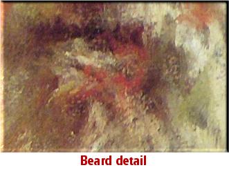
Ramon Kelly discusses edges in his book The 5 Essentials in Every Powerful Painting. Kelly explains, “Sometimes I want to suggest the materials that objects are made from without actually describing them in great detail. For example, in Mountain Man, (pictured below with detail), pastel 16 x 12 (41x 31cm), I wanted to show that his coat was a heavy rough fabric, his hat was fur and his pocket watch was gold. To do this, I used simple, textural strokes to represent the surfaces of these revealing, yet secondary objects. Merely suggesting the objects’ surfaces kept them from becoming too obvious and pulling attention away from his face and expression.” Kelly 1
1 The 5 Essentials in Every Powerful Painting P. 89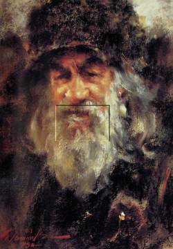
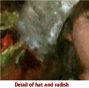
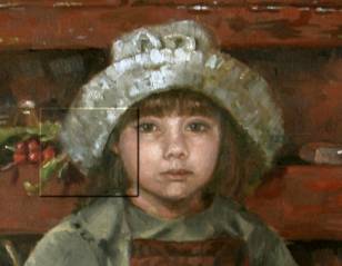
I have tried to learn from Kelly by incorporating his methods in painting the hat and vegetables loosely in this detail of a painting of my daughter, Katie. How do you decide which edges are important and which aren’t? It’s easier if you “squint” at your subject, which reduces the values and makes you aware of the really strong contrasts. Choose one of these areas (an interesting and important one) and make it your focal point. A focal point is the place in your painting you want the viewer to see first.
ACTIVITY NO. 1
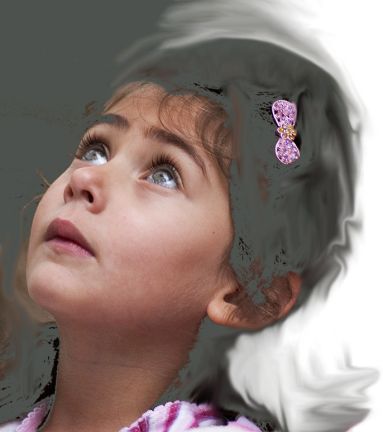
Using one of the two photo references below, paint or draw the subject’s features and add a hairstyle of your own design. Use black, white and an earth colored red like burnt sienna or red ochre. If you’re a beginner it’s better to use the black and white reference.
While you are working on the features make a deliberate effort to consolidate the tones into five values: very light, medium light, medium, medium dark, and dark. If you discern that you see a value that doesn’t quite match one of these five values, consciously mix and choose to apply the in-between value. As you work on the hair try to suggest it with simple strokes and two or three values. Visualize in your mind the direction you want this person’s hair to flow from their face and try to come up with a good compositional reason about why you are doing it this way. Keep the focus on the face.
Feel free to post your studies in this thread.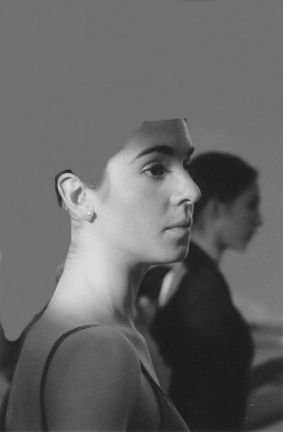
That’s it for now… I’ll post the BACKGROUNDS part in a few days.
May 2, 2005 at 10:15 am #1051245Nora,
Thanks so much for this wonderful, comprehensive demo. I am at a stage in painting where this information about edges is so very helpful. The images you chose illustrate your points beautifully (and that’s a lovely portrait of your daughter, by the way ).
).A terrific demonstration! I will be waiting eagerly to see the demo on backgrounds. We so appreciate the time you are taking to put this together for us!
Eileen
If you hear a voice within you say "you cannot paint," then by all means paint, and that voice will be silenced.
~Vincent Van GoghMay 2, 2005 at 10:43 am #1051242Nora…..you’ve done such a terrific job addressing edges. Kelly certainly is a master of edges & I have admired his work. Thanks for your extreme generosity in taking the time to share this demo with our members!! Backgrounds always throw me so I will look forward to that as well!

I’ve brought this to the portraiture forum so it will be seen by all. We’ll add it to the other demo in the classroom once it’s completed.
Cathleen~
[FONT=Times New Roman]~Be COURAGEOUS, It's one of the few places left still uncrowded~

[FONT=Times New Roman]~Life is not measured by it's length BUT by it's depth~
May 5, 2005 at 9:08 pm #1051255Thanks for the comments, Eileen and Cathleen. Maybe everyone already knows all this stuff so they don’t want to try the first challenge I posted. C’mon you guys…. take a crack at the ballet dancer or the little girl- they need some hair!!!
Anyway… here is the second part of the lesson, which is all about a part of portraits that I have always found difficult—BACKGROUNDS!!! I hope this is helping someone- let me know if not and i’ll try to answer questions.
BACKGROUNDS IN A PORTRAIT
Backgrounds can add excitement to your portrait or they can ruin it. Personally, I have a hard time deciding on a background color after the person is already painted in. it’s usually much easier to make this decision before you begin, then you can at least integrate your subject into the background by using some of the same color mixtures. For example, if you have a green color on your palette that you have used for your subject’s shirt don’t mix an entirely new green to paint a plant in the background. Use the same green hue, but “lighten” the shade and add this lighter color somewhere in the background. Backgrounds are lighter than foregrounds and they have less contrast due to atmosphere. Your background colors should never be brighter than the brightest bright on your subject. Why? Because they are further away and they are not as important as the person you are painting.The person is always the most important element in a portrait and this is where you should place your lightest lights and your darkest darks. The human eye is naturally drawn to areas of high contrast, so if you want the viewer to look at the person in your painting, that is where you need to place them. You, as the artist, control where you place your highlights and how light you make them. You can paint a good portrait with no background but you can ruin a good portrait with a bad background, so if you’re in doubt about what to do with a background, leave it a neutral color.
Use what you know or learned about lost edges to enhance the illusion that your figure inhabits the space in the background. We’ve all seen portraits where the head appears cut out and placed against another painting. This happens often when the artist doesn’t consider his or her background in the same context of the subject. One of the most important rules I have learned in my studies is to incorporate a color of the background into the shadows of my subject.
It’s best to paint the background colors FIRST and OVERLAP the colors into the area where you will be painting the head or figure. This will help create the illusion of depth you need and eliminate the need to carefully paint your background color around your subject. Which can give you a strange cut-out effect, needless to say.
According to Helen Van Wyk, in her book, Portraits in Oil the Van Wyk Way, p. 23-24, you have four choices to make when you paint a background into your portrait.
1) You can use a dark background, which Helen says will make you flesh colors look light and lively.
2) You can paint a very light background, which is more difficult but works nicely for a child’s portrait.
3) You can decide on a medium tone, which is the easiest route to go, or you can
4) paint a gradation from light to dark, which is perhaps the most interesting choice.Helen suggests that a successful background is always one of grayed colors, or paint that has been made less intense by mixing it with black and white or it’s complement.
I prefer to mix my own grays rather than to rely on black and white and if you paint with watercolors you don’t have the option of opaque paint anyway. Beautiful neutrals can be mixed with complements: try ultramarine blue and burnt sienna, and alizarin crimson and viridian or phthalo green. Fascinating things can be done with backgrounds if you take the time to learn how to do them right. Just remember that a background is just that: a background. Save the sharp edges and deeper hues for your center of interest, which will always be the person you are painting.
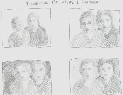
Perhaps the best way to decide on what value you want for your background is to complete a series of thumbnail sketches like the ones I have here before you start the painting. Many times we just want to get some paint on the canvas and don’t start kicking ourselves until we are at a point where we realize something is wrong and we can’t quite put our finger on it. Creating thumbnails can go a long way towards preventing this.
ACTIVITY NO. 2
Begin your next portrait by doing a series of thumbnail value sketches before you start the painting. Feel free to post them here. Or you might choose a photo from a newspaper or magazine and do several black and white value studies with different backgrounds. The sketches should be small (3” x 4”) and drawn quickly.I hope the information I’ve provided here will help you paint or draw better portraits.
Nora
PS: “In the fields of observation chance favors the prepared mind.”
(Louis Pasteur)May 5, 2005 at 9:21 pm #1051248Nora, I am paying particular attention to your classroom as I think backgrounds have often gotten shoved aside when I concentrate on the “object” of a painting.
However, I am so far behind on all my commitments that it is unlikely you’ll see my homework :o but if luck holds I may catch up and surprise you and myself.
This is really helpful and the entire classroom project one of the best on WC.
Many many thanks!!!!
Zoe
May 6, 2005 at 6:59 pm #1051247Like so many people, I am overwhelmed with all I want to do, so am not doing these exercises at this time, but do appreciate all your work in getting the information together. It will be very helpful in the future, I am sure.
Criticisms and comments always welcome.
ConnieMay 7, 2005 at 4:36 pm #1051246It’s best to paint the background colors FIRST and OVERLAP the colors into the area where you will be painting the head or figure. This will help create the illusion of depth you need and eliminate the need to carefully paint your background color around your subject.
Yes, I’ve learned this firsthand by doing it the opposite way :p.
You have really summed up the most important points about painting backgrounds. I have Helen Van Wyk’s book, and I love the way she does backgrounds. There is such depth to them. I sometimes add the gray in there, and sometimes gray it down with a complement. But I do try to always plan out the palette first, and never use a color for a background that is not already in the painting.
Thanks for this demo, Nora, it’s very informative!
Eileen
If you hear a voice within you say "you cannot paint," then by all means paint, and that voice will be silenced.
~Vincent Van GoghMay 7, 2005 at 4:55 pm #1051252Hi Eillen and all subies!!
Thanks dollardays for these lessons. The portrait Classes are a very good reference to all that are starting into portrait.
I am trying to get disciplined about thumbnails sketches but it is very hard to me. Well still a long way to go here. But anywhere I go I hear something about this thumbnails and how they are helpful. Which is good, but I dont get it.
So playing with soft and hard edges has much to do if what you want to convey right?? What means it is very connect with design and composition, my head is spinning!!!
To put paint on canvas is easy, hard is to render a beautiful fine art!! Just a tought.
By the way dollardays your work is very nice!!

Choose only one master - Nature ~ Rembrandt van Rijn
One learns how to paint while failing. ~ Jean-Baptiste ChardinMay 8, 2005 at 3:22 pm #1051244Nora… an excellent workshop from one of my favorite WC artists… THANKS a million!
Bernie"I'm traveling 33 1/3 RPM's in an IPOD world..."May 9, 2005 at 11:16 am #1051249Hi Nora! Well done guide on both edges and backgrounds. I have printed it out and put in in my book of tips and techniques. I appreciate all the time and effort you have put into it.
It’s interesting that you placed backgrounds and edges in the same guide. They are so completely related and yet, for me, so challenging in much different ways. I love edges. The play of hard edges against soft, of lost against found makes a mediochre painting better and a good painting great. To me, there is no more obvious measure of a painter’s progress than the use of edges. Now backgrounds…..What a struggle! I have ruined more than one painting with a poorly executed backgound. Painting the background along with the portrait is definately one way to help integrate them, but for me, it’s the temperature and color relationship to the portrait that makes or breaks a background. I’ve never come across any consistant rules for this relationship. It’s funny, but even good painters seem to have a hard time explaining this. Whenever I get a new book on painting, I look with anticipation to the section on backgrounds. I am almost always disappointed with the advice. Many teachers acknowledge the importance of backgounds, but have a hard time defining the solutions. I struggle with it on every portrait. I’ve yet to come up with a confident approach. I guess I’ll just keep studying the masters – classic and modern – and try my best to follow along.
Thank you once more for all the work you put in on the guide.
Bruce
Bruce B. Hancock
C&C's always welcome!
http://brucehancockart.blogspot.com/
"If a picture wasn't going very well, I'd put a puppy in it." Norman Rockwell 1894 -1978May 13, 2005 at 2:33 pm #1051243Nora….I’ve learned quite a lot from your demo! Thanks for all your hard work in presenting this….these two tricky areas can make or break a painting for sure & your insight has helped so much. I have printed this out also & will be
keeping it by my easel when painting in the future.I see now why I loathe backgrounds by waiting to the end of painting when the choices are more limited, it SHOULD be considered as part of the painting not just the end!
Very valuable demo!!
Many thanks!Cathleen~
[FONT=Times New Roman]~Be COURAGEOUS, It's one of the few places left still uncrowded~
[FONT=Times New Roman]~Life is not measured by it's length BUT by it's depth~
May 13, 2005 at 10:48 pm #1051256Hi Nora! Well done guide on both edges and backgrounds. I have printed it out and put in in my book of tips and techniques. I appreciate all the time and effort you have put into it.
It’s interesting that you placed backgrounds and edges in the same guide. They are so completely related and yet, for me, so challenging in much different ways. I love edges. The play of hard edges against soft, of lost against found makes a mediochre painting better and a good painting great. To me, there is no more obvious measure of a painter’s progress than the use of edges. Now backgrounds…..What a struggle! I have ruined more than one painting with a poorly executed backgound. Painting the background along with the portrait is definately one way to help integrate them, but for me, it’s the temperature and color relationship to the portrait that makes or breaks a background. I’ve never come across any consistant rules for this relationship. It’s funny, but even good painters seem to have a hard time explaining this. Whenever I get a new book on painting, I look with anticipation to the section on backgrounds. I am almost always disappointed with the advice. Many teachers acknowledge the importance of backgounds, but have a hard time defining the solutions. I struggle with it on every portrait. I’ve yet to come up with a confident approach. I guess I’ll just keep studying the masters – classic and modern – and try my best to follow along.
Thank you once more for all the work you put in on the guide.
Bruce
Hiya Bruce! (Bernie-too
)Bruce, I think the main reason I chose to do these two subjects was that they are the most difficult part of a painting for me too. And I thought maybe if I looked more deeply into the “background” of them, I might discover something. What is so hard about them both is that there is no set formula. You can go the easy route of just graying down the colors for a background but you might want to make a statement about the person in the portrait and use a hot red one. Neither choice is wrong. It is a personal choice and it’s entirely up to the artist. Sound procedure doesn’t always make for exciting paintings. I’ve seen beautiful portraits with solid black and brown backgrounds.
Here is a wonderful example by Steve Childs of a background full of wild color that doesn’t detract from the child’s face at all.
http://www.stevechilds.com/websites/SteveChilds/works/1768_24588m.jpg
Nora
May 13, 2005 at 10:51 pm #1051257Nora….
Very valuable demo!! Many thanks!Thanks, Cathleen. I am glad to give something back to WC after learning so much from the site these past few years. And I am glad it was helpful to some.
Nora -
AuthorPosts
- The topic ‘Portrait Classroom: Edges and Backgrounds’ is closed to new replies.
Register For This Site
A password will be e-mailed to you.
Search