Home › Forums › The Learning Center › Color Theory and Mixing › Ultramarine…Warm or cool blue…What’s your opinion?
- This topic has 156 replies, 42 voices, and was last updated 6 years, 9 months ago by
 lfarist.
-
AuthorPosts
-
June 11, 2012 at 9:09 pm #989788
Hello all!

I was watching a video on color mixing earlier today and came across an issue which I’ve noticed before. I wanted to get everyones opinions on it. So many times when watching color theory/mixing videos I hear artists refer to Ultramarine as a warm blue and Phthalo as a cool blue.
To me eyes, when I look at the two colors it seems just the opposite to me. I see Ultramarine as a cold or cool blue (it looks icy and frigid to me) and Phthalo blue as a warm blue like summer skies and tropical waters.
So often I hear the reason behind Phthalo being considered cool and Ultramarine warm as this: Ultramarine blue leans toward red (warm) and Phthalo leans toward green (cool). But, If you think about it that doesn’t really make sense, and here’s is why:
To make the comparison equal, you shouldn’t say one leans toward a primary color while the other leans toward a secondary color. Really what they are saying when Phthalo leans toward green is that it really leans toward yellow. Since, of the two warm primary colors, red is cooler than yellow, then to my mind Ultramarine which leans toward red is cool, and Phthalo which leans toward yellow is warm.
Do you agree? Do you disagree? I am interested to hear your thoughts and how you use the those blues on your palette as warm or cool.
Jason

"Truth is the most valuable thing we have. Therefore, I believe we should be economical with it." —Mark Twain
http://www.WalcottFineArt.comJune 11, 2012 at 10:12 pm #1165462I disagree. I believe Ultramarine is cool and Pthalo warm. I know it with my eyes and their behavior…
Either way it leans toward another primary or a secondary depending how far you go. Ultramarine leans toward purple. Pthalo toward green. Or Ultramarine leans toward red while pthalo leans toward yellow. I personally think purple is a cooler color than green. Even though people categorize green as cool I think compared to purple it is not. Most greens seem rather warm to me, most purples are definitely cool.
I would go so far as to suggest that red-violet and green from bluish to yellowish are medium temperature colors, so only warm reds, orange and warm yellows would be warm while only all blue and purple would be definitely cool. Thus there are “transitional” colors that are not strongly cool or warm. Only orange is absolutely warm, only blue is absolutely cool. Some reds are warm and some are too cool to be called such, while the greens have too much warmth to be pegged as cool–those many, many yellowish greens simply cannot be cool colors in my perception no matter what we were told about three and three warm and cool.
That’s just my experience of the power of these colors. I have no proof. I think drawing what I just put into words might be interesting though, and maybe I will.
June 11, 2012 at 10:36 pm #1165463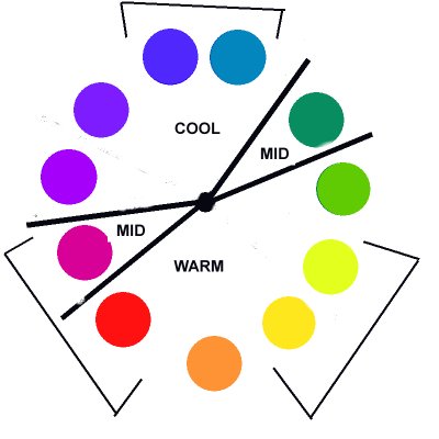
Excuse the primitivity of this image… Actually I don’t think it shows anything useful at all. LOL. But I’ll use it anyway since it at least does put my words into a visual. I am showing split primaries–the primary colors are in brackets.
Jason I meant that I disagree with the video you watched. I actually AGREE with you!
Maybe what I am saying is that I think violet is cooler than green and therefore confirms that ultramarine is cool. Perhaps as you say it is that red is cooler than yellow. Maybe my in-between tepid colors don’t matter.
(Ha ha I edited this and changed the picture to change what I did the first time. It still doesn’t make everything “perfect” but I wanted to tinker. You could maybe have both greens in the “mid” level but regardless I think that greens are a lot warmer than their reputation makes them.)
June 12, 2012 at 2:49 am #1165445Thanks for the input Avena! Nice to know I’m not the only one.

Jason
"Truth is the most valuable thing we have. Therefore, I believe we should be economical with it." —Mark Twain
http://www.WalcottFineArt.comJune 12, 2012 at 9:08 am #1165449Yeah, I agree—I think Ultra Blue is cooler, while Phthalo is warmer. I guess it also depends on the particular tube of Ultra or Phthalo. There is Phthalo “red shade” and “green shade.”
But in general I think Ultra as being cool, not warm.
June 12, 2012 at 1:38 pm #1165416Never mind – Einion’s right.
My website: http://www.rusticportraits.com
My artwork blog: http://llawrencebispo.wordpress.com
My art materials blog: http://sunsikell.wordpress.comJune 12, 2012 at 3:04 pm #1165404Anonymous
don’t throw the baby out with the bathwater.
we should have the freedom to think about things like this even though it is way below my own detection limit.June 12, 2012 at 3:40 pm #1165464Really, if you look at the greenish blue next to the violetish blue, you can tell with your eyes which one recedes visually, or whatever other quality you are wanting to discern.
I have never watched a color mixing video and am a little shocked. I never knew there was a question. Now a pthalo GREEN is a very cool green, compared to other greens, but…
Anyway, it sounds like a lesson to watch fewer videos and not assume that anyone who makes a video is an authority. Best to use your direct experience to form your beliefs.
June 12, 2012 at 5:22 pm #1165405Anonymous
yes, and the thread title says opinion which is apropo.
June 12, 2012 at 7:48 pm #1165456I learned recently that Ultramarine was a purple-blue and Prussian was a green-blue.
I can kind of see it with Ultramarine, and I saw it with Prussian when I tried to mix a colour wheel and my violets ended up muddy, but I can’t see it in the pure Prussian paint. I feel like when I try to distinguish a note in music and I have no idea.
June 13, 2012 at 7:14 am #1165453http://www.handprint.com/HP/WCL/cwheel06.html
Refer to chart, UMB is further away from yellow and closer to purple than Pht B. Therefore, UMB is cooler. The difference is not too great if you look at how colors align with radians. UMB is higher chroma as well.
Other charts aren’t exactly like this one, but similar.
Its not "Yellow Ogre", it's "Yellow O C H R E".
"I am not evil. I only paint that way".June 13, 2012 at 8:14 am #1165444Try reading this:
http://www.handprint.com/HP/WCL/color12.html#topDo Ctrl F, then type in: Whenever you see a tidy
this will take you to where it gets substantial and interesting IMO.His own evaluation based on certain measurement tests is here, for those who only want to know his end result of this question.
Do Ctrl F, then type in: Are there objective criteria for a warm/cool judgment?[FONT="Book Antiqua"]Aspiring Novice
Sorry, English is not my native language June 13, 2012 at 9:11 am #1165406Anonymous
I learned recently that Ultramarine was a purple-blue and Prussian was a green-blue.
I can kind of see it with Ultramarine, and I saw it with Prussian when I tried to mix a colour wheel and my violets ended up muddy, but I can’t see it in the pure Prussian paint. I feel like when I try to distinguish a note in music and I have no idea.
besides me, has anyone else ever noticed how weird prussian blue behaves? it appears to be a violet leaning blue in masstone and I have read that it is, but when tinted out it seems to lean towards a green blue. When they make a prussian blue hue, it is usually with phthalo and black and sometimes a red! how can that tint out to a greenish blue?:confused:
does the hue swing that much when tinted out or am I wrong?June 13, 2012 at 9:43 am #1165402I use prussian blue a lot..and at least in WN and Rembrandt I think it tends to be a greenish blue….no explanation for it here….and I usually mix my prussian with ivory black and this still holds true.
I can see ultramarine as a purple leaning blue..
Becca “Go confidently in the direction of your dreams. Live the life you've imagined.” ........ “Not till we are completely lost or turned around... do we begin to find ourselves.” ........ “All good things are wild and free.” ........ “This world is but a canvas for our imagination.” ...... "Our truest life is when we are in dreams awake.” Henry David Thoreau
Becca's Fine ArtJune 13, 2012 at 1:20 pm #1165446Really, if you look at the greenish blue next to the violetish blue, you can tell with your eyes which one recedes visually, or whatever other quality you are wanting to discern.
I have never watched a color mixing video and am a little shocked. I never knew there was a question. Now a pthalo GREEN is a very cool green, compared to other greens, but…
Anyway, it sounds like a lesson to watch fewer videos and not assume that anyone who makes a video is an authority. Best to use your direct experience to form your beliefs.
I agree! I always follow my own instincts rather than just taking someone’s word for it. But, I just thought it was interesting how often I have heard the Phthalo=cool, Ultramarine=warm in color theory sources, since it seemed so counter to my own experience. I love watching art technique videos on YouTube just for entertainment, but very few of them ever influence how I paint.
Sid: To me, Prussian Blue has always seemed to be a greenish blue in tints, similar to Phthalo Blue but not as intense. It seems to have that same bronzey sheen in mass tone that Phthalo has, so I kind of know what you mean about the violety look. Add just a hint of white and that immediately goes away. I also think it smells kinda funky depending on the brand. Winton is the worst.
Jason
"Truth is the most valuable thing we have. Therefore, I believe we should be economical with it." —Mark Twain
http://www.WalcottFineArt.com -
AuthorPosts
- The topic ‘Ultramarine…Warm or cool blue…What’s your opinion?’ is closed to new replies.
Register For This Site
A password will be e-mailed to you.
Search