Home › Forums › The Learning Center › Color Theory and Mixing › Hall of Fame › Desaturated Yellow… Brown or Olive Green
- This topic has 53 replies, 7 voices, and was last updated 13 years ago by
 Claudia_.
-
AuthorPosts
-
April 5, 2011 at 9:45 am #989039
Would you say that a desaturated Yellow makes Brown or Olive Green?
Janet Bionda
http://janet-coloredpencil.blogspot.com/
 April 5, 2011 at 9:53 am #1147677
 Anonymous
Brown if it is a desaturated yellow (like yellow ochre and some raw umbers), green if it is desaturated and the hue is shifted towards green. I have read that a desaturated yellow looks green but I must believe that if it looks green then it is green and not yellow, for all intent and purposes.
April 5, 2011 at 10:15 am #1147691It’s brown for me usually.
About yellow, lots of paint program don’t display yellow values correctly it seems.
The top is the yellow. The one under that is what I get if I lower the value in RGB. But if you look at a yellow object like a banana that’s already quite desaturated, the yellow is a sort of brown, not green. But in RGB you get green.
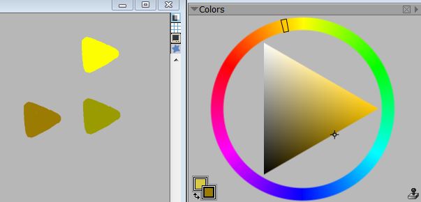
That CMYK wheel you linked does it too. That can’t be correct, it’s way too green looking.
Trying to learn painting by watching someone paint is like trying to lose weight by watching the Olympics.
 April 5, 2011 at 10:43 am #1147654
Thank you Sid and Goldeelocks for the explanation!
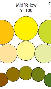
Goldeenlocks, All my color Wheels (store bought color wheels) and Pantone CMYK fandecks do it as well. All the desaturated colors look Green except for the lowest value and chroma which looks like Raw Umber to me. Like this:

Janet Bionda
http://janet-coloredpencil.blogspot.com/
April 5, 2011 at 11:04 am #1147678Anonymous
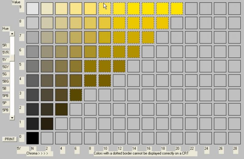
Yes, I believe munsell charts look green too. I don’t see a color close to yellow ochre in there :confused: . Mine was more an opinion than an explanation, I would defer to Einion or someone more knowledgeable about the techinical explanation. In my mind, for painting purposes that is, yellow is yellow and those colors on the chart would make for some nice spring foliage
 April 5, 2011 at 12:08 pm #1147655
I think Munsell uses a Yellow with some red in it as their 5Y (their middle red) which would be the reason the low chroma colors would be brown but if you change it to .52GY which is a true middle yellow the results are the same as HSB or at least similar. Munsell 5Y is about
The Munsell 5Y is 53 hue angle in HSB. Here’s the result in HSB with the lower chroma colors represented. Their also is the Yellow Ochre. In Munsell the 5Y desaturated colors looks more brown then this.

Janet Bionda
http://janet-coloredpencil.blogspot.com/
April 5, 2011 at 1:22 pm #1147656April 5, 2011 at 2:00 pm #1147643Would you say that a desaturated Yellow makes Brown or Olive Green?
This depends quite a bit on the exact hue and how desaturated you mean… plus of course value plays a part.
All true browns are outside the zone of yellows. Similar dark-valued and low-chroma yellows/orange-yellows are more like Raw Umber which can be loosely called “a brown” but that doesn’t mean it’s actually brown (at least not when the hue is a yellow, some Raw Umbers are brown but that’s because they’re atypically orangey).
The dull yellows that look greenish or olive should really be written as ‘olive green’ IMO, to try to help prevent the impression that they’re truly green; people are confused enough about certain aspects of hue without throwing them curveballs

About yellow, lots of paint program don’t display yellow values correctly it seems.
The top is the yellow. The one under that is what I get if I lower the value in RGB. But if you look at a yellow object like a banana that’s already quite desaturated, the yellow is a sort of brown, not green.
…
That CMYK wheel you linked does it too. That can’t be correct, it’s way too green looking.Is it?
If you can find a representative photo of a banana that shows what you mean and post it here (or post a link) we can have a look at the colours in detail. Remember that some things are the colour that they are, not the colour they appear to be or should be according to theory or expectation.
I have read that a desaturated yellow [U]looks[/U] green but I must believe that if it looks green then it is green and not yellow, for all intent and purposes.
So by extension if a blue looks violet it’s a violet?
What about when a grey looks lavender, is it a lavender, or when a red looks blueish…? Einion
Do you know if your colour is off in hue, value, chroma... or all three?

Colour Theory & Mixing forum WetCanvas Glossary Search Tips Advanced Search Acrylics forum Acrylics - Information Kiosk
April 5, 2011 at 2:41 pm #1147692Is it?
If you can find a representative photo of a banana that shows what you mean and post it here (or post a link) we can have a look at the colours in detail. Remember that some things are the colour that they are, not the colour they appear to be or should be according to theory or expectation.
I’ll try, the color of yellow in shadow is always in the brown region for me. Never in the green. Regardless of the saturation the local value has.
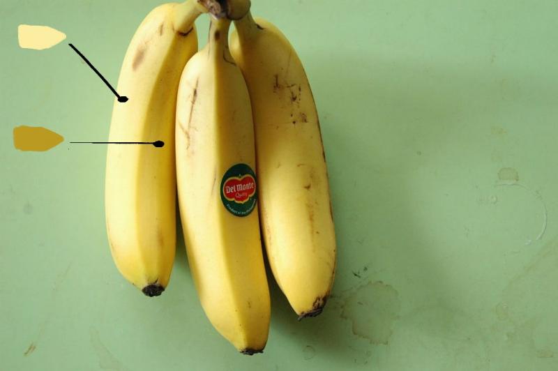
But, when I lower the value of RGB yellow in Painter or PS or any digital program, I get a distinct dirty green. The same thing happens when you lower the saturation in digital programs, they pull the yellow to green.
Trying to learn painting by watching someone paint is like trying to lose weight by watching the Olympics.
April 5, 2011 at 3:14 pm #1147679Anonymous
So by extension if a blue looks violet it’s a violet?
What about when a grey looks lavender, is it a lavender, or when a red looks [i]blueish[/i]…? EinionI did refer to a desaturated yellow. To me, desaturated means lowered chroma but the same hue retained, value could be lower, remain the same, or higher.
To some though, I think desaturated means to mix with white!
Here is what saturation is defined as by wikipedia.
“colorfulness of a color related to it’s own brightness”
and “Saturation is the proportion of pure chromatic color in the total color sensation”.
And then there is the WC Glossary:
“saturation – A similar term to chroma but not exactly synonymous. More correctly it means the amount of colour in relation to its brightness.”
Other sources have other descriptions but none describe a shifting of the hue.So are the charts presented above really attempting to accurately show desaturation or are they showing lowering of value steps?
In my world (albeit somewhat naive theoretically ) a desaturated yellow would still look yellow and a desaturated greenish yellow would look greenish yellow, for my intent and purposes (ie., usage in paintings).
As for a blue that looks violet, I would classify that as a violet blue.
A desaturated lavender should look lavender and could be greyish.
A neutral grey should not look lavender.
Now a red that looks blueish, I don’t know about that one, I would say that the progression of hues that red must go through to get to blue are as follows, starting with a middle blue, then looking violetish blue, then violet, then violet blue, then blue, but a red that looks blueish I don’t know about that one.April 5, 2011 at 3:21 pm #1147657(their middle red) oops above I meant 5Y in Munsell is their middle yellow.
:clap:Einon, Thank you so much that clears things up for me.
I think the banana in shadow would have some red in it because not only would yellow lose chroma but it would be cooler as well if you’re dealing with a warm light source. Also you have to take into consideration reflected light from the surrounding objects. Just my understanding of it.
Janet Bionda
http://janet-coloredpencil.blogspot.com/
April 5, 2011 at 4:08 pm #1147673In my world (albeit somewhat naive theoretically
) a desaturated yellow would still look yellow and a desaturated greenish yellow would look greenish yellow, for my intent and purposes (ie., usage in paintings).I think it depends on whether you’re defining “desaturated” through process or perception. In Photoshop, for example, a hue angle of 60 means nothing more than that you have equal parts of red and green with a smaller part of blue. What it looks like to us is completely irrelevant. Perception agrees with you, but perception is subjective, which is why attempts to define colors in an objective system rely on some objective process for reducing saturation. And those seem to always make a darkened, desaturated yellow look green. It is highly unlikely, however, that the shadows in the banana were desaturated by one of these same processes.
April 5, 2011 at 4:57 pm #1147658Sid, These charts show both Value changes and saturation changes. For example to add white to any color the Value will change and so will the Chroma. Yellow has a very light value so when white is added the value change is negligible.
Janet Bionda
http://janet-coloredpencil.blogspot.com/
April 5, 2011 at 6:21 pm #1147680Anonymous
The munsell chart posted doesn’t look like it is as greenish in lower values as they do in the pantone chart. In fact, I don’t think it is very greenish at all.
The pantone chart goes quite green with lower values.I think that a uniform saturation series should have the same colors such as those on this page as Briggs says, “a single color represented under different amounts of illumination”
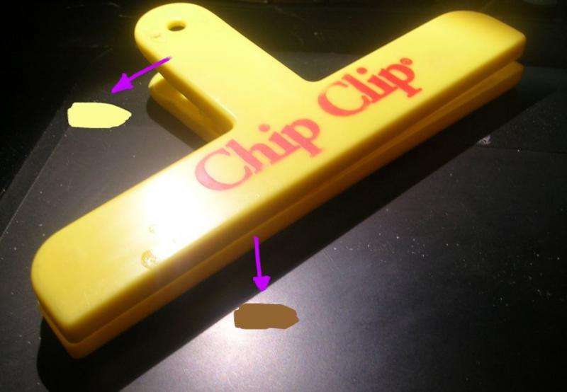
Though other factors such as reflected light may influence the color in those shadows, I think it is basically what you are seeing in the banana and chip clamp photos, ie, the same basic color under different amounts of illumination. We know that both the banana and the chip clamp are the same color in their respective shaded areas. However, they are desaturated by the lower illumination in the shadows and note that they don’t look green in spite of the fact that the bananas’ surrounding color is green! The sampled banana shadow area would receive reflected light from the adjoining banana surface which is the same basic color, yellow.
The sampled chip clamp would receive reflected light from that surface which looks to be fairly neutral in color.
If I were painting those bananas (realist, not expressionist), then I would choose a desaturated yellow like ochre or mix a desaturated yellow myself, but I would not select a color from a chart that would give me a decidedly greenish hue when applied.
A uniform saturation chart may have a match that is a more appropriate color.
Excellent examples Goldey!April 5, 2011 at 8:17 pm #1147693The munsell chart looks better to me at least.
Tried to desaturate and lower value at the same time. It goes from right to left and left to right. With the primaries. A dark yellow doesn’t really exist, it seems to go to brown for me, but I could make this a greener shade too, I just don’t see many yellow objects with a green shade, like Sible says, it’s just what I see in objects.
I seem to be messing up in the last 2 shades though, the less yellow the mixture has, the bigger the jumps away from the yellow are, it’s really hard to control those really dark yellows for me still.

Trying to learn painting by watching someone paint is like trying to lose weight by watching the Olympics.
-
AuthorPosts
- The topic ‘Desaturated Yellow… Brown or Olive Green’ is closed to new replies.
Register For This Site
A password will be e-mailed to you.
Search