Home › Forums › The Learning Center › Color Theory and Mixing › Ultramarine Blue vs Lapis Lazuli – Munsell Comparison
- This topic has 7 replies, 5 voices, and was last updated 9 years, 2 months ago by
 icypinkshimmer.
-
AuthorPosts
-
October 13, 2014 at 10:17 pm #992320
Hello, everyone!
As you must know, I’m painting some drawing paper with acrylics. I learned a lot with this, and I’m sharing the results with you.
Today, the Munsell-style comparison is between Ultramarine Blue (W&N’s Artists’ Acrylics) and Daniel Smith’s Lapis Lazuli. Here it is in full masstone and tints with white:

Since my red cellophane paper does not filter this hue correctly, I had to use my own neutrals to check if the values were correct. These correspond to N4 up to N7 in my scale (dark to light).
It’s no surprise that Ultramarine Blue (PB 29) is far purer in Chroma than Lapis is. In fact, it’s so pure in chroma in this photo that the virst two values are overblown!
Lapis, however, might be interesting for paintings with subtle blue skies.
I should point out Lapis has a much lower tinting strength and it’s transparent. Very transparent. One resource you can try to make it look opaque is to glaze it over a more opaque color.
Old masters used Azurite, but you can use some phthalo blue + Titanium White (PW 6). Here’s how it looks glazed over Phthalo Blue Red Shade (PB 15:1) + Titanium White.
Left is Phthalo underpaint + Lapis, and right is just Lapis.
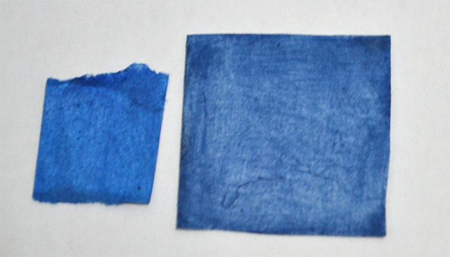
You can still get this by Daniel Smith, which still sells it at $19.88, but if you want to get a similar hue in acrylics and you want a more affordable price, consider Golden’s Azurite Historic Hue. It seems to match Lapis quite well.
I hope this was interesting!
October 14, 2014 at 7:45 pm #1212502Great test samples and pics. I also found genuine lapis lazuli pretty weak. I began to feel the hype about it being so special was like that fable, “The Emperor’s New Clothes.” I’d be curious to know if there are higher grades of it, but at this point my conclusion was that it’s not worth the money based on performance. I suppose if an artist wanted to only use mineral pigments it would certainly qualify. I will use mine up, perhaps in a knife painting or something, rather than let it dry up in the tube. But I’m not likely to buy it again. I also tried their Minnesota pipestone, found it comparably weak, with no special quality that set it apart.
October 18, 2014 at 8:50 pm #1212500Lapis is nice for glazing, or if you simply want a weaker ultramarine. I approximate it by mixing synthetic ultramarine with some chalk paint. Pretty much the same thing.
Ruble has a nice pink pipestone pigment, if you’re willing to grind it, mull it and tube it. I am.
 Great for skin tones.
My website: http://www.rusticportraits.com
My artwork blog: http://llawrencebispo.wordpress.com
My art materials blog: http://sunsikell.wordpress.comOctober 19, 2014 at 6:59 pm #1212497Painters often accuse me of being so steeped in the old, traditional, “old masters” materials that I can’t see the advantage of the new materials.
Well, this may be true in terms of painting mediums, but when it comes to some of the overrated colors of paint used by the old masters, that accusation really holds no water.:)
Some of those weak, insipid, non-lightfast, chemically reactive, oil paint pigments, actually have never held any interest for me, whatsoever.
Nearly any brand of Ultramarine Blue beats the socks off that weak, Lapis Lazuli, in my opinion. I’ve never used the Lapis, but I’ve seen enough examples to know I do not want to.
Vermilion, Lead Tin Yellow, Asphaltum, Lapis Lazuli, and a dozen other forms of traditional pigments of the old masters have, as their modern counterparts, pigments that are far superior in hue, chroma, and lightfastness, than those used by the old masters, in my opinion. One can always dull down a color, or thin it out, but when it comes in such a form in a tube, it is not nearly as versatile a color.
I have actually never even been tempted to gain access to those pigments, in the form of paint, or dry pigment, and I surely would not pay the price to gain something that is not as good as that which I can buy at the corner art store.:D
One exception, of course is Lead Carbonate paint. It provides all the characteristics of white paint that oil painters appreciate.:smug:
Just my opinion, of course, and I’m sure many will disagree.:angel:
wfmartin. My Blog "Creative Realism"...
https://williamfmartin.blogspot.comOctober 20, 2014 at 9:53 am #1212498Painters often accuse me of being so steeped in the old, traditional, “old masters” materials that I can’t see the advantage of the new materials.
Well, this may be true in terms of painting mediums, but when it comes to some of the overrated colors of paint used by the old masters, that accusation really holds no water.:)
Some of those weak, insipid, non-lightfast, chemically reactive, oil paint pigments, actually have never held any interest for me, whatsoever.
Nearly any brand of Ultramarine Blue beats the socks off that weak, Lapis Lazuli, in my opinion. I’ve never used the Lapis, but I’ve seen enough examples to know I do not want to.
Vermilion, Lead Tin Yellow, Asphaltum, Lapis Lazuli, and a dozen other forms of traditional pigments of the old masters have, as their modern counterparts, pigments that are far superior in hue, chroma, and lightfastness, than those used by the old masters, in my opinion. One can always dull down a color, or thin it out, but when it comes in such a form in a tube, it is not nearly as versatile a color.
I have actually never even been tempted to gain access to those pigments, in the form of paint, or dry pigment, and I surely would not pay the price to gain something that is not as good as that which I can buy at the corner art store.:D
One exception, of course is Lead Carbonate paint. It provides all the characteristics of white paint that oil painters appreciate.:smug:
Just my opinion, of course, and I’m sure many will disagree.:angel:
Hi, Bill. Thank you for your comments. They are always insightful!
It is true that Lapis has a weaker tinting strength compared to Ultramarine Blue (PB 29), as well as lower chroma. However, Lapis is as lightfast as Ultramarine Blue.
Regarding Vermillion (PR 106), I suppose you can get an interesting approximation in hue and chroma by mixing Opaque Red Iron Oxide (PR 101) and Cadmium Red Light (PR 108). That should dull Cadmium Red Light a bit and make it slightly more orange.
October 20, 2014 at 11:46 am #1212501I’ve never used the Lapis, but I’ve seen enough examples to know I do not want to.
Bill, I think you might actually like lapis if you tried it, with your glazing technique. That’s exactly what it’s really good at. Although, as I posted above, it can be easily approximated with cheaper materials.
My website: http://www.rusticportraits.com
My artwork blog: http://llawrencebispo.wordpress.com
My art materials blog: http://sunsikell.wordpress.comJanuary 23, 2015 at 2:57 pm #1212503Good point about modern ultramarine vs The daniel smith lapis. The modern is clearly a superior paint but it is not lapis that the masters used. The daniel smith is a low grade lapis paint so it wouldnt be fair to compare ultramarine vs the old masters lapis.
Lapis is made of several minerals and one of them is Lazurite. Lazurite is what is the intense blue colour that is so fabled.
the masters extracted the lazurite from the lapis. The cost of doing this is still very expensive but you can still buy it at $100-200 per 10 grams, its called fra angelico.
January 23, 2015 at 3:21 pm #1212499Good point about modern ultramarine vs The daniel smith lapis. The modern is clearly a superior paint but it is not lapis that the masters used. The daniel smith is a low grade lapis paint so it wouldnt be fair to compare ultramarine vs the old masters lapis.
Lapis is made of several minerals and one of them is Lazurite. Lazurite is what is the intense blue colour that is so fabled.
the masters extracted the lazurite from the lapis. The cost of doing this is still very expensive but you can still buy it at $100-200 per 10 grams, its called fra angelico.
Red, the bright blue obtained from Lapis was really hard to make, making it very expensive. What happened in the past was that ashes from Lapis was made available in several grades. These were widely used in painting.
Vermeer’s “Girl With a Pearl Earring” an example of a grayer quality of Lapis being used:

Lapis is far more transparent than synthetic Ultramarine Blue (PB 29), so it can be layered more easily, as you probably saw on the photo where I glazed it over a phthalo. While phthalos are relatively modern pigments, old masters could have glazed lapis over Smalt or Azurite, producing really bright, rich blues.
-
AuthorPosts
- You must be logged in to reply to this topic.
Register For This Site
A password will be e-mailed to you.
Search