Home › Forums › The Learning Center › Composition and Design › Value Studies for Composition
- This topic has 5 replies, 5 voices, and was last updated 6 years, 6 months ago by
 Wassie.
-
AuthorPosts
-
January 4, 2017 at 7:39 pm #994720
I have a really cool homework assignment right now and I thought some people might be interested in it. The class it’s for is environment design and we are learning about what makes a good scene/ environment particularly for animated films, movies, video games etc, but I plan to apply this science to comics.
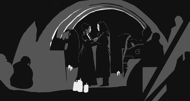
This weeks lesson is over clarity. The exercise is to see if a scene reads when you break it down into its most basic forms. We were asked to find scenes from our favorite movies etc. and render those scenes using 3 values, any 3 values but only 3, no shading or gradients, and see if the scene still makes sense and you can tell what is going on. We have to do 12 studies and were told not to use a formulaic selection of values, meaning use different combinations on the value scale and really focus on the subject matter. It is great practice and I feel like I am finally getting a more than basic grasp of composition by doing these exercises. It is very challenging and some scenes I think would be impossible to get in only 3 values. I’ve spent the past 2 days combing movie scenes looking for usable material and I finally clued in on why some movies are hits and some are B movies, and it’s not just about bad acting. :wink2:
Anyway it’s great fun if you want to try it out for yourself for practice. When you get done you have a cool looking piece of fan art. Here are two solutions I came up with. The first one is from the film Pulp Fiction and the second one is from the series Penny Dreadful.
Oh btw I did these in photoshop but if you had the inclination it could be done with paper. If you did one big enough it would make a very cool poster. Hmmm that is a thought.
http://www.strangeeden.com
"A portrait is just a painting with something wrong with the eyes and mouth." - Stefan BaumannJanuary 5, 2017 at 10:46 am #1263217Value studies, particularly using only three values, is always a very useful and instructive exercise.
I might suggest that one also consider contrast when exploring these exercises. That is, where does one want the viewer’s eye to go and remain in a given design? Wherever that may be is a good area for the strongest contrast, unless one has other painterly intent.
Good illustrations! Thanks for posting!
Sling paint,
VirgilSling paint,
Virgil Carter
http://www.virgilcarterfineart.com/January 5, 2017 at 11:21 am #1263216That’s good homework. What course are you taking that assigned this homework? I’m particularly interested as Visual Composition courses are far and few between. Thinking that it is ‘Cool’ is a very positive attitude. Congratulations.
You might be interested in reading about Notan. Here is a link to a short presentation on Notan I wrote for WetCanvas a while back.
It is only on a basis of knowledge that we can become free to compose naturally. -- Bernard Dunstan
blog.jlk.netJanuary 7, 2017 at 10:22 am #1263219Hello all and thanks. Great article Claude. Learn something new every day. I have been paying attention to this style of art quite a bit recently, but it was never called “notan”. So now I know. I have a book called Framed Ink: Drawing and Composition for Visual Storytellers which goes into this quite a bit. He does noir style drawings and does a gesture drawing of the composition beforehand- essentially notan. I’m interested in noir comics as an art style so this is all very appealing to me.
The course I am taking is an online course through Schoolism.com. It is called Environment Design with Nathan Fowkes. He is an environment design artist with Disney, Dreamworks etc and does four classes with Schoolism all in the vein of light, composition and color in environments. I highly recommend it not only for the amazing quality of the course material but because you can do it for $15 a month for the self study package, which is what I’m doing. I’ve learned more from this place than the two college level art courses I’ve had. Anyway have to fly. Thanks again for the post link.http://www.strangeeden.com
"A portrait is just a painting with something wrong with the eyes and mouth." - Stefan BaumannAugust 7, 2017 at 1:06 pm #1263218On any gallery visit, I always have a notebook with me so that if a picture catches my attention I try to do a thumbnail drawing to see if I can capture what is going on. Nothing sophisticated and often just a few lines, but I find it a useful exercise.
I do a similar exercise with my photographs, to simplify and reduce to the basic elements as the first step in making a new image – in my case usually a collagraph or drypoint.
The link is to some examples posted on my Instargam account.
https://www.instagram.com/p/BW20g0tlBdz/?taken-by=ianbertramuk
Ian
Website - https://ianbertramartist.uk
Instagram: - https://www.instagram.com/ianbertramuk/
Facebook: - https://www.facebook.com/ianbertramartist/October 18, 2017 at 11:36 am #1263215 -
AuthorPosts
- You must be logged in to reply to this topic.
Register For This Site
A password will be e-mailed to you.
Search