Home › Forums › Explore Media › Pastels › Soft Pastel Archives › The Spotlight – January 2017 – Color Temperature
- This topic has 93 replies, 15 voices, and was last updated 7 years, 2 months ago by
 janinco.
-
AuthorPosts
-
December 31, 2016 at 6:58 pm #994700
Welcome artists!
[FONT=Verdana]Here is a quick recap of what The Spotlight is all about!
[/FONT]
The Spotlight is an activity thread for pastel artists of all experience levels working from photos chosen by a monthly host. Most months, the host will choose photos from only one subject, putting that subject into “the spotlight,” so to speak! For example, one month the subject will be painting water, another month will spotlight flowers, etc.Some months, rather than spotlight a subject, the focus will be on a challenge of some sort. In those cases, we might have a wider variety of photo references, but “the spotlight” will be on the challenge itself.
Since this is a group activity, we can pool our knowledge and resources, and grow as artists in a fun, “no-pressure” atmosphere.
And, remember, no critiques unless specifically asked for.
The intent is to have fun, try new things, experiment, and perhaps most of all, to see what our friends and colleagues are painting from the same reference material!
Please note: The photos this month were taken by me or are from the Reference Image Library. You have permission to use the photos as reference to create your artwork and to sell them and/or exhibit them. The actual photos still retain the copyright of the photographer. So you cannot copy the photo to your blog, for example, without the permission of the photographer, or digitally alter or reproduce the photo for any purpose other than for your personal use, with the exception of crops, digital alterations and posts of these photos within “The Spotlight” thread.
This month’s Spotlight is on…Color Temperature!
In my opinion, one of the most important – and yet sometimes most confusing – topics that artists encounter is color temperature. Lots of artists talk about it, art teachers mention it, and you can read about it in many art how-to books. And it seems like the more you read about it, the more confusing it gets – rather than becoming clearer! And now I may just be adding to the confusion by making color temperature the subject of our latest Spotlight!
One reason color temperature can be confusing is that people refer to color temperature in two different ways.
1). As a way of generally dividing the color wheel into warm and cool colors.
2). To refer to warmer and cooler version of the same basic color; for example, a warm or cool yellow.
The first way is usually not too confusing, although not everyone agrees about exactly where the transition or dividing line between warm and cool lies. But, generally speaking we can agree that some colors on one side of the color wheel are warm and some on the other side are cool. For simplicities sake, we’ll call the colors raging from red through orange and yellow warm. We’ll call the cool colors green, blue and violet.
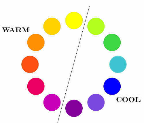
Another reason that color temperature can be confusing is that it is inexact. It is based on individual perception and individual feeling. So, in one book or video, an artist may say that yellow is the warmest color, while another artist may say that orange is. There really is no exact dividing line separating warm and cool either. Green and yellow-green might be considered somewhat neutral as they are near the transition, as are red and red-violet. The simple answer is – it doesn’t matter which is warmest or coolest – or where the dividing line is. We don’t need exact definitions or delineations of warm and cool to use the concept in our paintings!
As for the second way of referring to colors as warm or cool – choosing a warmer and cooler version of the same color – we will discuss that in a future Spotlight!
Creating Mood with Color Temperature:
In many cases, whether we are concentrating on color temperature consciously or not, our paintings are predominantly painted using warmer or cooler colors. We often use color to help us express a certain mood. While each individual has their own perceptions – which can and do differ – for the most part we associate warm colors with warmth, sunlight, fire and passion. Cool colors are often associated with cold, night, quiet and calm.
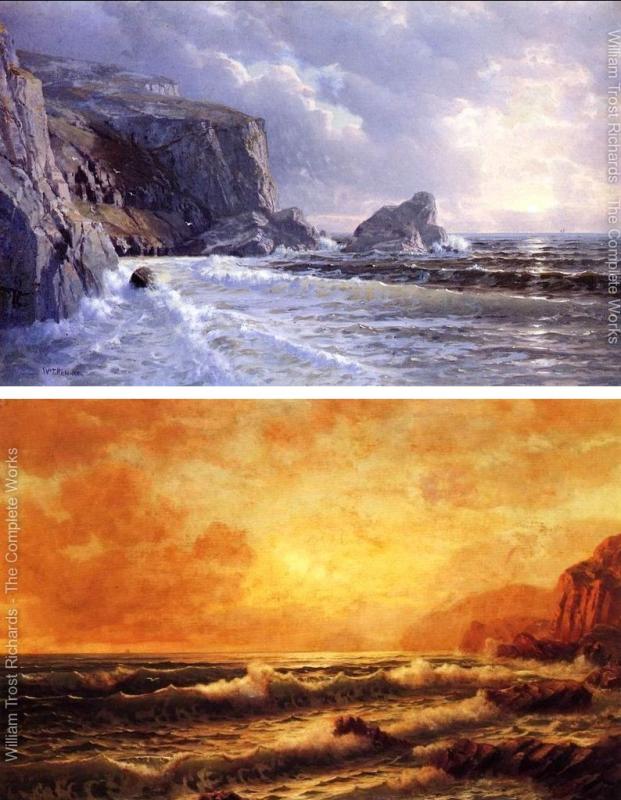
It seems to me that a certain mood is created in the paintings below by their use of predominantly warm or cool colors. On the left, a landscape by William Trost Richards, on the right, a landscape by Paul Cezanne.

When colors are close together on the color wheel, such as in the paintings above, the color scheme is called analogous. When using an analogous color scheme, the usual choice is either predominantly warm or cool colors. Some paintings, such as the Cezanne, will include touches of color from the oppposite side of the color wheel, adding a bit more visual excitement.
Another pair of paintings showing the different moods created by predominantly warm or cool, analogous paintings. Paintings by Richard Trost Williams.
One more example – this time featuring paintings by Degas:
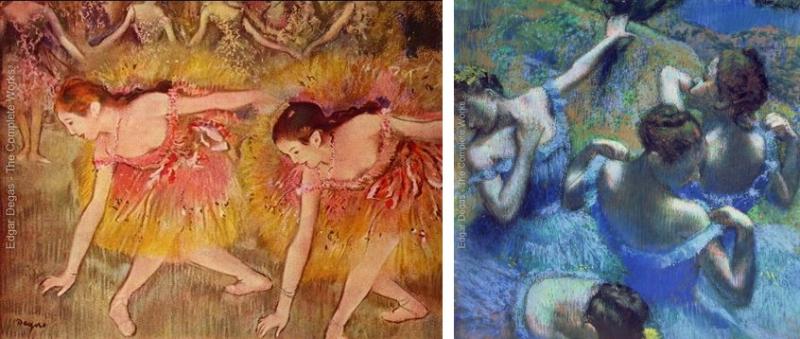
The “cool” painting on the right also has some of warmer colors scattered throughout that – in my opinion anyway – creates more visual excitement than a purely analogous painting does.
That visual excitement created by using contrasting warm and cool colors will be discussed next!
Using Warm and Cool Color Contrast:
As we have discussed in previous Spotlights, contrast is one of the most important aspects of visual art. We often think of contrast as primarily the use of light and dark values. But contrasting warm and cool colors is another way of helping objects stand out against each other, as well as creating excitement and dynamism in a painting.
Let’s look at some examples.
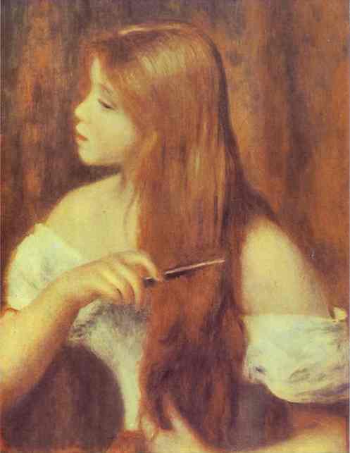
Above is a Renoir portrait painted in all warm colors. With apologies to Renoir, what would the painting look like if it had a cool colored background to contrast with the warm hair and skin? How much would it change?
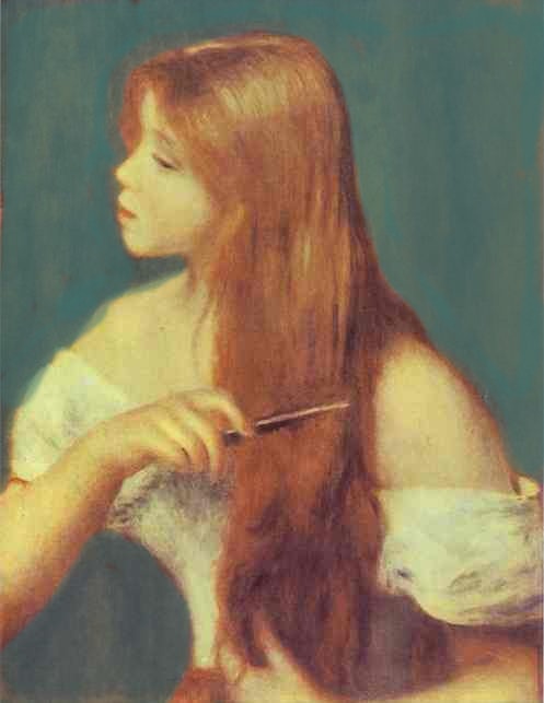
The green background isn’t particularly different in value (dark or light), but the figure – especially the hair – stands out much more! One could find the painting is now more dynamic and exciting as well! At least I do!
Let’s look at another example. A couple portraits by Vincent Van Gogh.
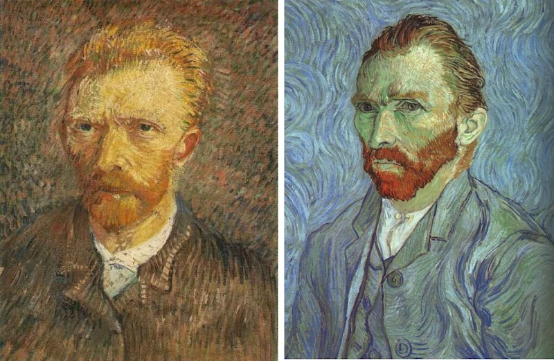
On the left, we have a painting that is mostly warm colors – reds, and browns and primarily orange skin tones. On the right, we have a painting that is almost all cool colors – except the beard! And, my, how that beard stands out! Especially against those greenish skin tones on either side of the beard! Color contrast – especially the contrast of warm and cool – can be a powerful tool for artists!
Here are a few more examples of very dynamic paintings that use color temperature contrast by Van Gogh!

There are many reasons why these Van Goghs are so visually exciting – intense color and bold brush strokes and shapes – but also because of the use of warm and cool color temperature contrast!
Using Color Temperature to create Depth:
I think most of us are familiar with the concept of atmospheric (or aerial) perspective – that as distance increases, colors become cooler and less intense until in the far distance all colors have changed to the blue/gray of the atmosphere.
Here’s a link to a previous Spotlight on Atmospheric Perspective for those who may be unfamiliar with the concept:
https://www.wetcanvas.com/forums/showthread.php?t=1376348
Atmospheric Perspective is especially useful for landscape painters, but many believe that the basic idea of using color temperature to convey depth can be used in other types of paintings as well. The thought is that our brains are so used to the effect of atmospheric perspective, that we associate warmer colors with “closer” and cooler colors with “farther.” Take another look at the “warm” portrait by Renoir and compare it to the altered version with the cooler background. Does the cooler background also seem farther away? If yes, is it because it is cooler, or because it contrasts with the warmer colors of the near figure? Or both? I don’t have a definitive answer, but using the concept “warm colors advance, cool colors recede” is a common strategy. Each person can decide for themselves if it is useful for paintings other than landscapes, and when and where they want to use the idea!
For some additional information on Color Temperature, here are a couple links:
James Gurney’s blog:
http://gurneyjourney.blogspot.com/2007/12/color-warm-and-cool.html
An article on advancing and receding:
https://sites.google.com/site/scienceofcolour/how-colors-advance-and-recede-in-art
OK, we’ve digested a lot of information! For the most part, we’ve limited our discussion to using warm and cool color temperature in general terms or by using them in large areas of our paintings, such as foreground versus background. In future Spotlights we will look at more subtle uses of color temperature!
It’s time to paint!
The references:
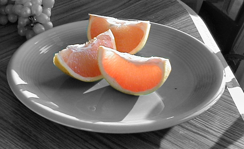
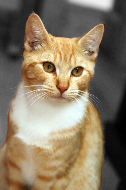
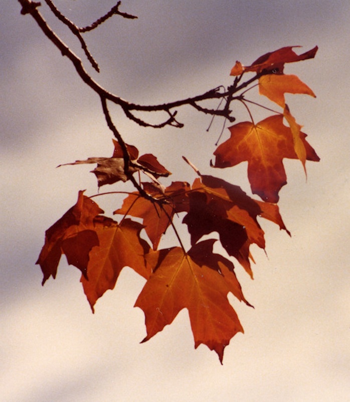
I’ve done something a bit different this month. Since photographs already have their own color scheme, I’ve decided to leave only the foreground objects in color and grayed out the rest of the photo. This way, we can each decide whether to create predominantly warm or cool paintings or whether to use color temperature contrast – and how much! Feel free to experiment! Try some small thumbnails using different color schemes if you like! Share your experiments and your paintings!
Photo by Fagan
[FONT="]Photo by stalksthedawn
 [/FONT]
Photo by Pat Isaac
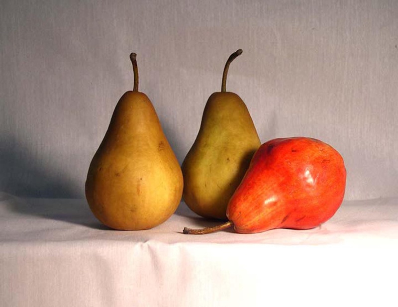
Photo by Dave Slaughter
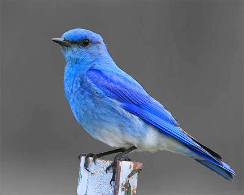
Photo by me
As always, feel free to modify the references!
Have fun painting!
And…Happy New Year!
Don
January 1, 2017 at 10:54 am #1262727Happy New Year, Don!
Great lesson, once again. I have a really hard time with the warm/cool issue, so I really appreciate this…
Thank You.
C&C always welcomed and appreciated
JudiBJanuary 1, 2017 at 11:41 am #1262709Happy New Year, Don! Oh that’s wicked, graying out the backgrounds! This is going to be fun. Tempting to just play with some of these in multiple iterations in small paintings, do both versions! And you had to include the cat! Purr and thanks for including the cat!
Robert A. Sloan, proud member of the Oil Pastel Society
Site owner, artist and writer of http://www.explore-oil-pastels-with-robert-sloan.com
blogs: Rob's Art Lessons and Rob's Daily PaintingJanuary 1, 2017 at 2:26 pm #1262742Happy New Year Don and everyone. Don…you worked hard on this! Very interesting. The choices we get to make will make it exciting. Thank you.
Happy to say "hello". C and C always welcome.
JAY:wave:
January 1, 2017 at 3:40 pm #1262735Happy New year Don and all the Spotlighters! Being a confirmed fan of complementary colour schemes I will try to work on some analogous ones this month….though I guess you’ll see some warm amongst the cool, or vice versa.

My website http://ruthmannpastelart.com/
Pastel Guild of Europe http://www.pastelguild.org/
January 2, 2017 at 11:29 am #1262762Happy New Year All!:wave:
I’ve been quite looking forward to clearing away holiday decorations and getting back to the studio.Don you’ve given us something really interesting to chew on!
As I’m relatively new to the forum I’m going to follow your links to the past before settling on a subject.Just like Christmas candy..so many choices…too many decisions!:lol:
Cheers Leslie
SaveJanuary 2, 2017 at 4:24 pm #1262726January 3, 2017 at 9:58 am #1262787I started a painting yesterday with this lesson in mind. I used a reference from the Jan2016 Spotlight that I found when reading up on that lesson. I’m going to give uploading from my iPad a try again. If it doesn’t work I guess I’ll have to break out my laptop. I did a block in in blue tones on this snow scene and then did an alcohol wash over it. I’m thinking a cool scene with just a few touches of warmth for interest. My lightest lights are actually darker on this underpainting as I’ve found I hadn’t been starting out dark enough so I plan on added the lights on top. I’ll post the photo too, if all goes well with technology. So only the original file of the photo was the correct size. Anyone know of a thread on uploading or resizing on an iPad. I’ve had trouble finding one.
January 3, 2017 at 11:58 am #1262788Trying to post again. If this works Ill add the other photo.
January 3, 2017 at 12:01 pm #1262789I think this is working. OMG, technology hates me.
January 3, 2017 at 12:09 pm #1262790Sorry about so many posts. New to this and trying to get it right. 5 x 7 Uart 500, mix of pastels. Thanks everyone.
January 3, 2017 at 4:29 pm #1262780Hi Cali,
I came across that photo as well last week and did a version of it which I posted in the gallery. It’s called “Winter”‘
As for resizing images on your iPad, I found a free app called Image Size. It’s very easy to use, doesn’t seem to do anything else but if that’s all your looking for, maybe check it out.January 3, 2017 at 5:21 pm #1262791Lucy, Thanks, that’s a great idea. I’ll look at your post as well.
January 4, 2017 at 6:20 pm #1262710Oooh Cali, it’s shaping up beautiful. Love your underpainting. Thank you for sharing stages.
I’m thinking about which one to do myself, but definitely want to do one this time. Maybe two of the same subject. Both the cat and the blue bird appeal to me though, so maybe do different subjects with complementary backgrounds?
Robert A. Sloan, proud member of the Oil Pastel Society
Site owner, artist and writer of http://www.explore-oil-pastels-with-robert-sloan.com
blogs: Rob's Art Lessons and Rob's Daily PaintingJanuary 4, 2017 at 8:17 pm #1262718Cali, Looking good so far! Nice cool winter scene!
Don
-
AuthorPosts
 Leslie
- The topic ‘The Spotlight – January 2017 – Color Temperature’ is closed to new replies.
Register For This Site
A password will be e-mailed to you.
Search