Home › Forums › Explore Media › Watercolor › The Learning Zone › Favorite *non-essential* color?
- This topic has 25 replies, 16 voices, and was last updated 6 years, 11 months ago by
 DMSS.
DMSS.
-
AuthorPosts
-
April 22, 2017 at 1:32 pm #995043
We all have our favorite workhorse colors, things that play well together and mix well and which you can use all over the place. But what’s your favorite “optional” color? The color you’d never suggest for a limited palette, the color you’d never point a newbie to — but the color you are always looking for an excuse to use. The color where you think “Oh, if I paint THAT subject, that means I have an excuse to use THIS color!”
My entries in this category are Quinacridone Coral and Cobalt Teal (both Daniel Smith). I live in the Pacific Northwest where I don’t have a lot of uses for a clean, bright turquoise, particularly not in April, but I keep painting beach scenes just so I can use the color!
Kathryn in Seattle
April 22, 2017 at 2:42 pm #1268632Three that I use a lot and are in my travel and my larger palette are Jadeite, Sodalite, and Buff Titanium. I don’t use them in everything, but at least one of them in every painting I do. Jadeite mixes a nice sap green or is interesting on its own. Sodalite has super neat granulation. Buff Titanium instead of a white or gouache. Another one that I think is awesome is a Cotman Turquoise I have. I started this abstract buffalo just so I could use it:) Jadeite is the granulating green color in the background. Sodalite is the dark on the buffalo. Which reminds me that I need to finish this one!! Yea, I admit its a weird painting, but I think that Turquoise is a cool color.
 April 22, 2017 at 2:48 pm #1268635
I love that blue buffalo, to be honest. What a great demonstration of the fact that it’s value, not hue, that sells an image.
Kathryn in Seattle
April 22, 2017 at 5:51 pm #1268625Now I want a tube of Jadeite!
Form the non-essential but I love it pigment is Cobalt Violet. On its own in it an underperformer, but mixed with Yellow Ochre it gives me the most wonderfully granulated grey rocks. We have a lot of grey rocks where I live, so am very glad for this happy discovery. For a while I thought I would never use my CV. Yellow Ochre is a real workhorse on my palette.
I am also in love head over heels with American Journey “June Bug” it is a wonderful blue-green. A mix of PB27 and PG7
"Let the paint be paint" --John Marin
April 22, 2017 at 5:51 pm #1268623Every color is valuable, unless it’s fugitive!

Sling paint,
VirgilSling paint,
Virgil Carter
http://www.virgilcarterfineart.com/April 22, 2017 at 6:06 pm #1268637On my monitor, that Sodalite looks like a close cousin to Payne’s Gray. To get a clearer image in my mind, since every monitor displays things a little differently, how would you say Sodalite differs from Payne’s Gray in use or effect?
April 22, 2017 at 7:01 pm #1268633Sodalite is less intense since it has no black and separates into smaller particles.
Here is an example of each dropped into Winsor Yellow on wet paper
 April 22, 2017 at 7:11 pm #1268624
Effects are rather similar to D. Smith Lunar Black, a transparent black, with its small magnetic particles in the pigment which strongly granulate…
Sling paint,
VirgilSling paint,
Virgil Carter
http://www.virgilcarterfineart.com/April 22, 2017 at 7:45 pm #1268634Dont have that one Virgil. Good to know! I defer to Jane on Daniel Smith evaluations.
April 23, 2017 at 2:25 am #1268619I think for me it is the humble chromium oxide (PG17). Absolutely no reason to use it anywhere, since yellow ochre and prussian can get to it as quickly, but….. oh what granulation… just a mere swipe of the brush can paint foliage just by itself, including leaves and all. It is a bit too strong though, so the rest of the painting has to support it
April 23, 2017 at 4:22 am #1268638I think I may put Sodalite on my palette as one of my “non-essentials”. That will be AFTER I use up this Payne’s Gray, of course. In the meantime, my “non-essentials” consist of everything not red, blue or yellow, so I guess I would toss in Sap Green as my offering here. In the M. Graham variation, at least, it is a yummy green with an almost Ochre-like earth-tone attitude that is challenging to match from RGB in a hurry. Every time I use it, I feel just a little bit lazy, but when the color hits the paper, my misgivings give way. I’m not sure I can call it non-essential, though. If I gave it up, I would have to find another “lazy color” to give me the same sense of decadent consumption. M. Graham Sepia falls into the same category, but I would give it up in a heartbeat if it meant I could keep my Sap Green.
April 23, 2017 at 9:48 am #1268628I’d say graphite gray.
I love how it works since it’s really pencil “lead” made into watercolor.
Goes with a pencil drawing very well since it’s the same stuff. But it granulates like crazy in a really beautiful way.
Good for notans, value studies. It raises these into works of art in their own right.
It’s not a color I use with a palette, it’s more like it’s own palette of one color.
Brian T Meyer
My Site - Instagram[/url] - FacebookUseful links: Watercolor FAQs - Watercolor Handbook - Handprint - Listing of Watercolor Societies - Watercolor Guide (Pigment Listing)
April 23, 2017 at 10:03 am #1268620I love Green Gold in all its different variations and from all the different makers. MG Azo Green and DS Rich Green Gold are deep and coppery, WN and Schmincke are bright yellow greens. Whenever I can I throw some in to a painting. I also like DaVinci Lavender, an opaque light purple that is perfect for painting… Lavender! :0)
April 23, 2017 at 10:04 am #1268618
I have a tube of Moonglow that was free with the purchase of two other Daniel Smith colours. It is formulated with the following pigments:
PR177—Anthraquinone Red
PB29—Ultramarine Blue
PG18—ViridianIt’s a crazy colour that granulates like mad. If I painted a lot of rocks, it would be great for painting rocks. I don’t. But I could. I should. I did fill a half pan with it and can take it out any time I think that I’ll use it. I lend it to my Students who love it.
Char --
CharMing Art -- "Where the spirit does not work with the hand, there is no art." Leonardo DaVinci
April 23, 2017 at 3:10 pm #1268621I just love Cobalt Turquoise! I’m quite sure I could live without it but I don’t want to and somehow it just always ends up on every palette I come up with! Its granulation, lightness, and just plain prettiness make my eyes happy. Plus it does some magical stuff mixed with other colors. Below is a scan of my current plein air palette (I use an En Plein Aire Pro easel and its got 14 wells for colors). Below that is a scan of Cobalt Turquoise mixed with the other colors on my plein air palette. Yummy!
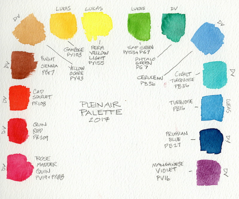

I note that some manufacturers sell Cobalt Turquoise formulated from PB36 (that’s the one I’m using) and others from PG50. I love them both and to my eye they are practically indistinguishable.
-
AuthorPosts
- You must be logged in to reply to this topic.
Register For This Site
A password will be e-mailed to you.
Search