Home › Forums › Explore Subjects › Abstract and Contemporary Art › Immersed in a Square
- This topic has 5 replies, 3 voices, and was last updated 4 years, 3 months ago by
 sundiver Moderator.
-
AuthorPosts
-
December 31, 2019 at 10:29 pm #482081
Earlier this year I was inspired by several paintings that featured a square on canvas so I thought I would make my own slightly more complicated version.
Since I was also inspired by Rembrandt’s drawings at the time I wanted to celebrate both with this piece.
It is painted with acrylics and oils on a 16″ x 20″ canvas. There is a top layer of oil glaze as well.
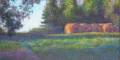
This first picture was taken about four feet away. I used an antique white background to reinforce the old meets new concept.

From across the room it simply looks like a solid square. But if you get really close, there is a sketch-like drawing in the square.

The drawing depicts an artist at work with a sculpture to their left and a flood bursting into their studio on the right.
This is why it is titled Immersed in a Square. The artist is so immersed in their work they don’t notice the flood event, the studio is about to be immersed in water, and the viewer has to be somewhat immersed in the square to see the scene.
Impressions and feedback are appreciated.
Experimental artist.
My Portfolio
My InstagramJanuary 1, 2020 at 12:44 pm #926342You’ve put a lot of work in this one and it is a bit hard to see what is in the square, Misty. Are you going to define it more?
Kay
Moderator: Watermedia, Mixed Media, Abstract/Contemporary
January 1, 2020 at 1:22 pm #926345Hi Kay.
I painted this back around August and loved it because I found it amusing but hated it because it is so simple. I didn’t figure anyone would like it being as simple as it is so it’s been sitting in the closet since then.
I actually had difficulty with the challenge of creating the illusion of a square in the distance and a sketch up close. Too much light and detail in the scene ruined the illusion so I had to really subdue things to get it to work. At the end, I put an earth-tinted oil wash over the square so the sheen would match the oil based antique white of the rest of the painting. But this might’ve been a mistake as now the light tends to glare off it and makes the details even harder to pick out.
I’m not sure how to add more definition without losing the illusion 🤔Experimental artist.
My Portfolio
My InstagramJanuary 5, 2020 at 9:06 pm #926343Hello Misty –
First of all, I have looked at your website and really like the various things
you are doing and admire your skill in creating them.
The red clay pictures are interesting because I have tried similar things,
but the dirty clay here is very dark yellow rather than the red I would like.
I have no artistic training, but I have tried paintings that were supposed
to have very nuanced shadings in white, as inspired by Sargent, but in the
photos of them they were either burned out or too overall gray; a function
probably of values being too close for the camera to adequately distinguish,
even though I thought they were just right to the naked eye in the originals.
The same thing held true when I tried a very dark composition with darker
markings within, very similar to what you are doing with the squares.
I know that there may be some genius who could manipulate the contrast
levels in a editing program, but I doubt it, because of the different ways our
eyes see versus the workings of cameras and monitors.
In any event, it is beyond my reach and also explains why there is nothing
like viewing an actual original painting versus a reproduction IMHO.
I think you are right about the oil glaze working against you. I will be
following what you are doing because you may accomplish somethings that
I have found impossible.
Regards,
Trier
January 6, 2020 at 10:34 am #926346Thank you, Trier.
Regarding the red clay, at one point I tried adding the tannins I extracted from oak galls which was intended for iron gall ink, to the red clay. The tannins reacted with the iron oxide in the clay changing the clay color from red to a dull brown. I say this because the iron in the clay is apparently easily affected.
I’ve read that red clay is just yellow clay that has been well watered but also well drained so that the air can get to the iron oxide in it and increase the sort of ‘rust’ it produces. I also know that in iron gall ink, the iron rusts very quickly within a day or so) after drawing with it if there is excess iron that doesn’t bond with tannins. It may be possible to create a simple red clay out of yellow by a series of hydrating and drying it. Or, what may be particularly interesting, by adding a rust solution to it, then letting it air out. The rust/iron solution I used for iron gall ink was merely distilled white vinegar in which I left an old rusty horseshoe to soak for about 10+ days. Salt might also be an option for promoting ‘rust’ once the iron is abundant. I haven’t found any yellow clay yet or I would try it, myself🙂.
I’ve attempted to get a better photo of the details of this painting and even tried changing the contrast, shown below, but it isn’t much better.

It may not be possible to further improve this painting while keeping the illusion with this medium. My thinking at this point is that it might be possible to do the scene in acrylic, then put a layer of more coarsly ground pigment (not sure what binder) over it. Perhaps the coarse grains could obscure the image enough to look like a fairly solid color from a distance. Yet up close it might be able to get an impressionist quality image in it. That’s just a theory though.
Experimental artist.
My Portfolio
My InstagramJanuary 10, 2020 at 1:29 pm #926344From my experience with acrylics, I would say that sounds like it might work with a final layer of matte medium. I ruined a painting using the matte medium as a final layer when I should have used gloss or satin.. The matte clouded some fine detail passages even though you could still discern the lines close up. In your case, it might give what you are looking for eventually.
Just in case you haven’t done so already, I also recommend checking out the Color Theory & Mixing Forum as they have some very knowledgeable people there and I have seen discussed some very similar projects to what you are doing.
In regard to the iron rust, I have gotten some really cheap iron oxides in red and blackish pigments in powder form from a local pottery supplier; they also ship,but maybe there is one near you.. just a thought.
Good luck.
Regards
Trier -
AuthorPosts
- You must be logged in to reply to this topic.
Register For This Site
A password will be e-mailed to you.
Search